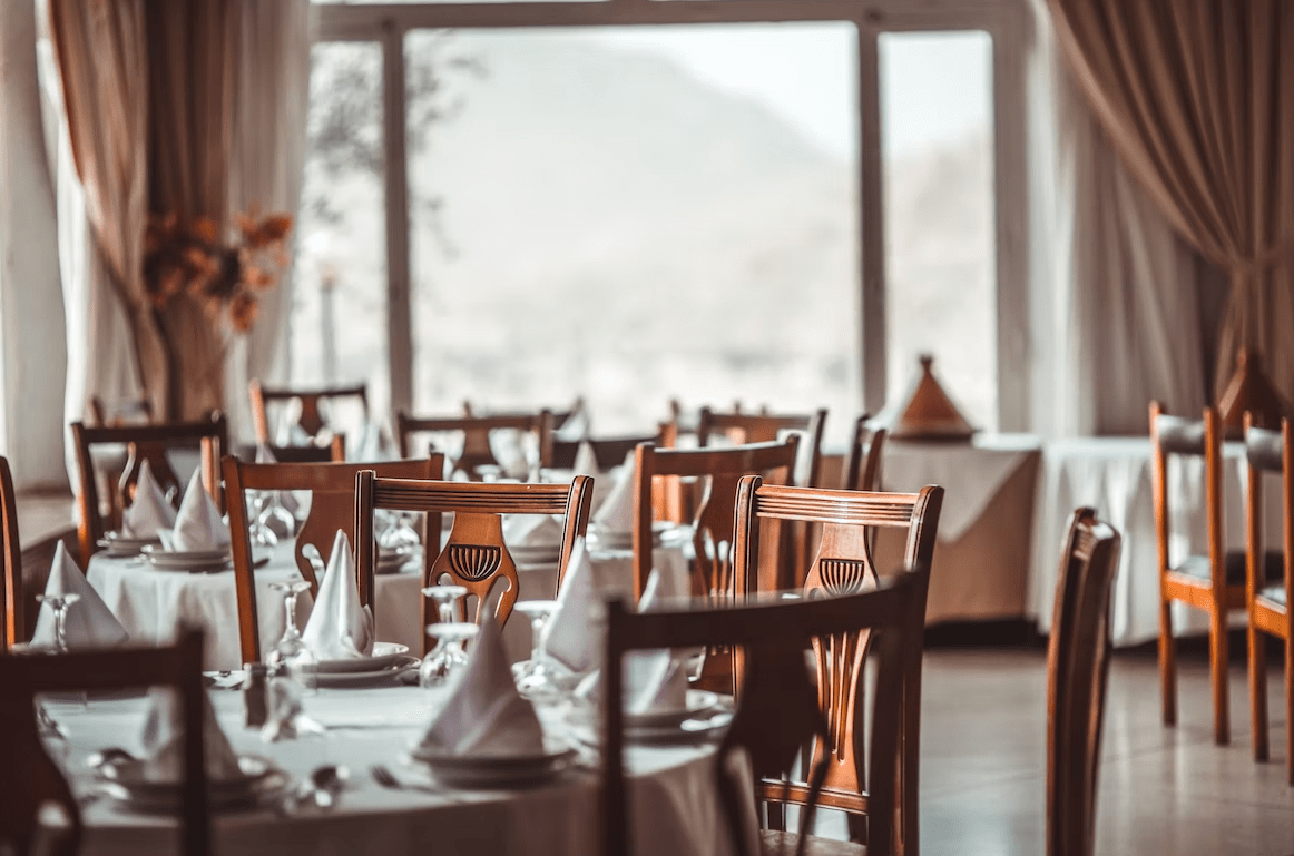
Restaurants are quite a tough business to run effectively. It is one of those high-risk sectors where it’s easy to mess up something that seems insignificant, only to have it snowball into a major problem.
While entrepreneurs going into this business have had ample opportunities to learn about the conventional ways of running a restaurant, the same cannot be said for web design.
A good website design has the potential to save your restaurant. During and after the Covid-19 pandemic, several classic eateries, such as Francesca’s Passaggio or The Kennison in Chicago, had to shut down due to declining sales and revenue.
Use a restaurant website builder to create a fully functioning restaurant website quickly, even if you have no prior experience with web development. These tools offer pre-made templates and drag-and-drop editors, which are designed to simplify the process of building a website. Restaurant website builders use artificial intelligence (AI) to take care of the technical details and help you focus on designing the website that best suits your needs.
Many of them had been around for quite a while, but age didn’t seem to matter. What mattered was the cold, hard truth of sales, and the fact of the matter is a well-designed website could have helped many of them.
With this reality in mind, let us look at some of the major do’s and don’ts when it comes to designing a website for your restaurant.
1. Make the Menu Easy to Access
This is one of the most important aspects of your website. You want to ensure that when customers land on your website, they are able to access your menu with a single click straight from the landing page.
For example, look at the website of the Chicago restaurant Urbanbelly.
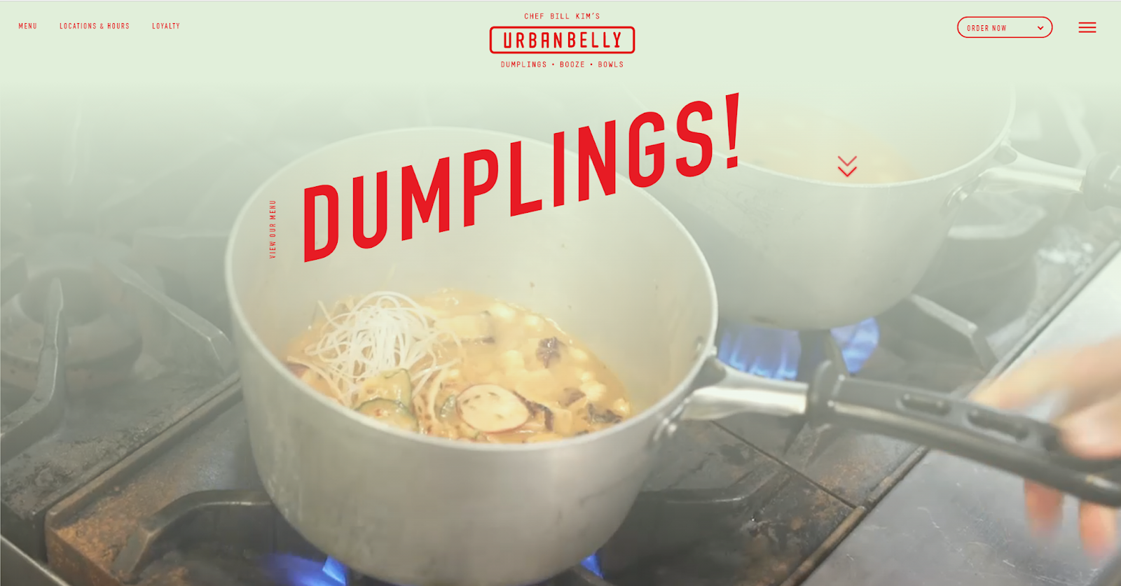
While the landing page is a full-page video of their chefs preparing delicious items, the very first button on the top left of the page is for the menu.
Additionally, the website isn’t cluttered with lots of call-to-action buttons. They provide links to the most essential information, and that’s it. Scroll down to the very bottom, and you will find more buttons tucked neatly out of the way.
While it looks clean and neat, this website messes up in one key way.
The Don’t side: You want to avoid uploading your menu as a PDF file that needs to be downloaded. This is a terrible way of presenting your restaurant. Urbanbelly makes the mistake of doing this for both their desktop and their mobile websites, which is a bad call.
Instead, you want to ensure that your menu is clearly visible as a dedicated page on your website and is easy to peruse. Also, avoid the coy practice of omitting prices like some restaurants tend to do.
2. Take Advantage of Images and Videos
Videos and images are one of the best ways to convey the sort of experience that your restaurant offers. Professionally shot content can sell your products far better than words ever can. This is one of those niches where good media content is more valuable than well-written copy.
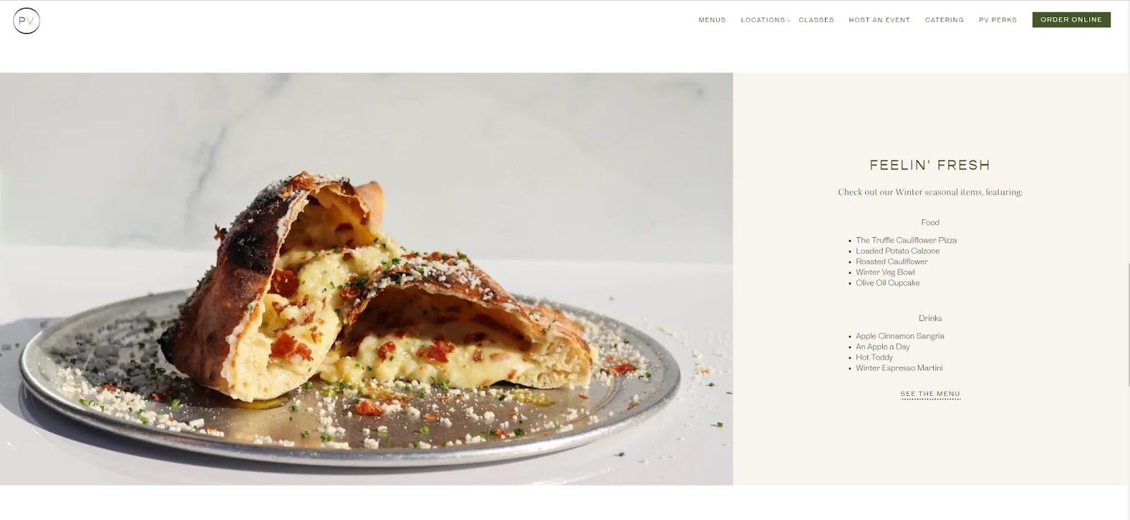
Pizzeria Vetri is a good example of this. While they don’t use videos, their images are of high quality and convey the sort of quality food they offer.
The Don’t side: Coming to the flipside, you need to integrate media correctly. Most people hate websites that decide to automatically start playing audio and video. They like to be in charge of these things. Sure, it may seem like a simple thing, but it can easily turn off prospective customers.
3. Optimize for Mobile Users and Other Platforms
We already touched on this point a little bit when we discussed the importance of not having your menu be a downloadable PDF, but there is more.
When designing a website, you want to ensure that you present a consistent experience to users on different devices and platforms.
Here’s an example of a mobile-optimized website by The Purple Pig, a restaurant in Michigan Avenue, Chicago:

If you are thinking of starting a restaurant or already own one and want to upgrade your online presence, consider investing in a firm that is experienced with good mobile optimization and web design.
Alpha Efficiency is one such firm that specializes in web design in Chicago. Judging from their portfolio, it’s clear that they’re adept at creating ergonomic, mobile-optimized websites that appear modern, sleek, and fast.
Not only does Alpha Efficiency help with mobile optimization, but they also offer several related key web design services, such as e-commerce store development, which can be great if you want to set up an online ordering system. Also, they design websites with SEO as one of their main tenets.
SEO refers to search engine optimization and allows websites to gain visibility and reach more customers than before.
The emphasis on mobile optimization is not to be taken lightly.
Remember, the majority of users are going to access your website on their smartphones. You want to approach website design with this in mind. Rather than viewing mobile optimization as an afterthought, make it your number one priority. Once you have a fantastic mobile website, focus on the desktop version.
Mobile optimization also involves ensuring load times are fast and snappy because when people are scouting restaurants to eat at, all it takes is an extra moment of waiting for your customer to back out and find another place.
There is no point in having a great-looking mobile page if it won’t load in time. Finding a good balance between load times and aesthetics is key.
4. Choose the Right Color Palette
The link between color and appetite is quite an interesting one. A website that incorporates the right color palette into its design can be surprisingly effective. There are a number of reasons for this. For one, colors have the ability to evoke emotions and influence, at least a little bit, a customer’s behavior.
Colors like red and orange might be used to arouse one’s appetite, while cool colors like blue and green can be associated with menu offerings of a more natural type. Think green teas and healthy smoothies.
The Don’t side: You don’t want to use too many colors as it ends up becoming overwhelming. Colors should also be used in terms of website cohesiveness. The last thing you want is to have text that is tough to read because your color palette wasn’t chosen correctly.
Conclusion
Starting or running a successful restaurant in Chicago or any other location can often feel scary, especially when one reads about how many of them keep shutting down. However, a closer look at the situation tells us that this is happening because they aren’t getting the sales they need.
A stunning website is one of the best ways to find a fresh line of users that can become potential customers.
This is especially true when your site is optimized for a number of parameters that ensure increased visibility. SEO, mobile optimization, and UX and UI design are all major tools that can significantly affect the success of a website and, therefore, your restaurant.
About the Author

Peter Makeshoff
Peter Makeshoff is the founder and main author of Designer Daily.