In an age of sterile, flat glass interfaces, the physical control, a knob, a switch, a button, has become an artifact of profound interaction design. Its rarity has amplified its power. A well-designed physical control communicates through a silent, tactile language. It tells the user what it is, what it does, and how to use it, often before a single label is read. This is the grammar of interaction: a set of universal, sensory rules that make a control feel instinctively “right.”
As touchscreens push physical controls into higher-stakes, specialized domains (professional audio, medical devices, automotive interfaces), their design is no longer an engineering afterthought. It is the primary user interface, and it must speak a fluent, intuitive language.
The Four Pillars of Intuitive Physical Control Design
1. Affordance: The Silent Declaration of “What I Am”
Affordance is the property of an object that suggests how it can be used. For a physical control, this is a combination of shape, material, and context.
- Knob: A radial grip. Its circular form, often with a textured or ridged edge, invites pinching and rotation. A deep dish or indentation suggests fine adjustment; a tall, slender barrel suggests a stronger grip for greater torque.
- Switch: A binary lever. Its protrusion from a surface, with a clear pivot point, invites a flipping or toggling motion. A rocker switch suggests use with a single finger; a large bat-handle switch invites a whole-hand throw.
- Button: A pressable plane. Its recess into a surface, or its differentiation via material (softer rubber on hard plastic), declares it as a target for compression. A concave surface invites a fingerpad; a large, flat surface suggests a palm or full-hand press.
Design Rule: The form must honestly communicate its function. A knob-shaped object that only clicks, not turns, violates this grammar and creates immediate mistrust.
2. Material & Texture: The Vocabulary of Touch
The material is the control’s “accent.” It tells the user about priority, function, and even danger before they make contact.
- Differentiation: In a panel of identical plastic buttons, the “emergency stop” is made of metal, or red rubber. Its different material screams a different consequence.
- Grip & Precision: A knurled metal knob affords precise, fine adjustment. A smooth, glossy plastic knob suggests a less critical setting. Rubberized textures increase grip and imply durability.
- Thermal Conductivity: A metal control feels more precise and “instrument-grade” than plastic because it conducts heat away from the finger, providing crisp sensory feedback. Plastic feels insulative and, by association, cheaper.
3. Resistance & Mechanics: The Syntax of Force
This is the grammar’s verb conjugation, how the action feels. The force profile (the relationship between user input and mechanical response) tells a story about the control’s purpose.
- Knob Detents vs. Continuous Rotation: A knob with clear, tactile “clicks” (detents) communicates discrete, incremental values (e.g., selecting a numbered preset). A smooth, continuous rotation communicates analog, fine-grained adjustment (e.g., tuning a frequency or setting a volume). The resistance should increase slightly after the detent to confirm the click.
- Button Travel & Actuation Force: A shallow, low-force “clicky” button (like a camera shutter) suggests rapid, repeated use. A long-travel, high-force button (like a power switch or arming button) implies gravity and prevents accidental activation. The “breakover” point (where the user feels the switch actuate) must be crisp and definitive.
- Switch Throws: A light, short-throw toggle is for frequent use (a light switch). A heavy, long-throw switch with a satisfying clunk signifies a major system state change (“Arm,” “On,” “Launch”).
4. Feedback: The Immediate, Unambiguous Reply
Feedback is the control’s conversation with the user. It must be multimodal, immediate, and appropriate.
- Tactile (Primary): The click, the detent, the snap. This is the most critical channel. It must occur at the exact moment of state change.
- Auditory (Secondary): The satisfying snap of a switch, the precise tick of a rotary encoder. Sound reinforces the tactile event and provides confirmation in environments where feel might be distracted (e.g., a vehicle).
- Visual (Tertiary): An LED that illuminates, a needle that moves, a display that updates. Crucially, visual feedback should follow tactile/auditory confirmation, not precede it. The user must feel the action was registered before they see the result.
Case Study: The Professional Audio Mixer Knob
This is a masterclass in the grammar of interaction.
- Affordance: A large, ribbed rubber grip atop a slender shaft. It screams “pinch me for fine control.”
- Material: Rubber for grip, metal shaft for precision. The channel’s fader next to it is smooth plastic for fast, sweeping gestures.
- Resistance: Continuous rotation with a slight, viscous damping. It feels like turning a valve through a thick fluid, perfect for smoothly riding gain without jumps. A push-button function on the same knob has a distinctly different, clicky detent.
- Feedback: The knob moves the channel’s VU meter on the display with zero lag. The connection is direct and absolute. There is no question that you are moving that meter.
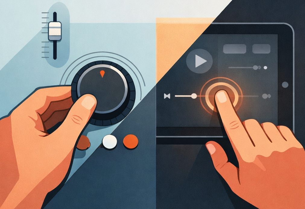
The Touchscreen Paradox & The “Skeuomorphic Lie”
Touchscreens often mimic physical controls (a slider, a dial) but fail their grammar. A virtual knob has no texture, no meaningful resistance, and its “detents” are often just visual. This is the skeuomorphic lie, it borrows the form but abandons the physical language, often resulting in a less intuitive interaction. You can’t feel it, so you must look at it, breaking focus from the task.
The Design Imperative: When a physical control is warranted, commit to its grammar fully. Do not design a knob that looks analog but controls a digital menu with lag. Its behavior must match its affordance. If a digital menu is needed, consider a different control paradigm (like a jog wheel with a distinct digital click) rather than betraying the user’s tactile expectations.
The Universal Principle: Invisible Intuition
The goal is invisible intuition, a control so perfectly aligned with its function that the user doesn’t “think” about using it. Their hand moves to it before their mind has fully processed the need. This is achieved when all four pillars sing in harmony: the form invites the correct hand, the material prepares it for the task, the resistance guides the appropriate force, and the feedback confirms the action was understood.
In a world of anonymous glass slabs, the physical control is a moment of tangible, honest dialogue between human and machine. Designing it well is an act of profound respect for the user’s intelligence, their senses, and their intention. It is the difference between operating a device and wielding a tool.
About the Author

Peter Makeshoff
Peter Makeshoff is the founder and main author of Designer Daily.