
It sits quietly on your keyboard, usually sharing a key with the number 7. We use it in brand names, in casual texts, and in company logos. But the ampersand has a life far richer than its small stature suggests. It is a survivor from the ancient world, a former letter of the alphabet, a chameleon of design, and a fascinating study in how a simple symbol can carry centuries of history .
& The Etymological Detective
The story of the ampersand begins not with its name, but with its form. The symbol we know as “&” is simply a stylized, handwritten version of the Latin word for “and”: et . Over time, the ‘e’ and the ‘t’ were written so close together that they became a single, flowing character.
The modern name “ampersand,” however, is a classic case of linguistic mishearing. Back when the ampersand was taught as the 27th letter of the English alphabet, children would recite their ABCs and end with “X, Y, Z, and per se and.” The phrase “and per se and” meant “the character ‘&’ which, by itself, is ‘and'”. Over time, this garbled phrase was slurred into the word “ampersand” .
A Glyph Through the Ages
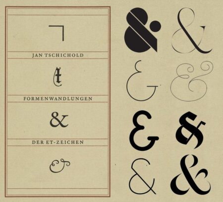
The ampersand is a beautiful example of typographic evolution. It has taken two distinct visual paths.
The Roman Ampersand: This is the more common form, the one you likely imagine. It is based on a later, more stylized version of the et ligature that became popular in the 8th century. It’s a sophisticated, almost calligraphic symbol .
The Italic Ampersand: This version, known as the “et” ampersand, looks much more like a literal combination of a capital ‘E’ and ‘T’. This form, which can be traced back to ancient Roman sources from the first century CE, is often found in italic typefaces and looks strikingly like a handwritten et .
& The Lost Letter
It is a strange thought today, but the ampersand was once considered a full-fledged member of the English alphabet. In the 19th century, English students would learn it as the 27th letter, following ‘Z’ . This practice explains the name’s origin and adds a layer of historical depth to a symbol we now take for granted.
The Ampersand in the Wild
Today, the ampersand has specialized roles.
- Branding and Business: It is a staple in the names of partnerships and law firms, such as Procter & Gamble, Tiffany & Co., and Marks & Spencer . It’s a symbol of collaboration, often suggesting a partnership is a relationship, not just a simple addition.
- The Arts: Music duos like Simon & Garfunkel or genres like R&B and rock & roll have integrated it into their identities .
- Screenwriting: In film credits, “&” indicates a closer collaboration between two writers than the word “and” .
A Designer’s Canvas
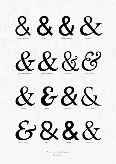
For a designer, the ampersand is a canvas for creativity. Its structure allows for infinite interpretation, making it a favorite for logo design, typography, and branding. What we call the roman and italic ampersands are just the beginning—a quick look at a font catalogue reveals endless variations, from the elegant and sweeping to the bold and geometric. The ampersand is a tiny gallery of an era’s aesthetic.
About the Author

Peter Makeshoff
Peter Makeshoff is the founder and main author of Designer Daily.