You know the feeling. You open your browser one morning, and something is… off. Your favorite coffee shop’s app icon looks weirdly flat. The streaming service you use has a new, overly simplistic wordmark. A wave of indignation washes over you. “Why would they ruin a perfectly good logo?” you mutter to your screen. “The old one was iconic!”
Welcome to the collective groan that accompanies a major logo redesign. It’s a near-universal experience, as predictable as the tides. But if the backlash is so predictable, why do big brands keep doing it?
The truth is, a logo is not a static tattoo; it’s a living piece of a brand’s identity. Its lifecycle involves careful evolution, occasional revolution, and a public reaction cycle that is almost as standardized as the design process itself. Let’s pull back the curtain.
Why Brands Pull the Trigger on a Redesign
Brands don’t spend millions on a redesign (and risk the inevitable backlash) on a whim. The decision is usually driven by one of a few key strategic needs.
1. The March of Technology:
A logo designed for a billboard in 1998 might not work as a 16×16 pixel favicon or a tiny profile picture on a smartwatch. Today’s logos need to be legible and recognizable at microscopic sizes and across countless digital platforms. This has driven the trend towards simplification, flattening, and geometric clarity. Think of Mastercard, which dropped the layered shading for a cleaner, two-circle mark, or Google, which evolved from a serif 3D wordmark to the sleek, sans-serif flat design we know today.
2. Shifting Brand Strategy & Values:
As a company grows, its mission might change. A redesign can signal a new direction, a new target audience, or a renewed set of values. When Burberry retired its equestrian knight and ornate emblem for a minimalist, sans-serif wordmark, it was a deliberate move to shed its “stuffy” image and appeal to a younger, fashion-forward audience. Similarly, many brands are now simplifying their logos to appear more transparent, accessible, and digitally native.
3. Staying Relevant in a Fast-Moving Culture:
Aesthetic tastes change. What felt modern and energetic in 2005 can feel dated and cluttered in 2025. A logo can’t afford to look like a relic; it needs to feel current without being a slave to fleeting trends. A subtle refresh can help a brand feel fresh and engaged with the contemporary world without losing its core identity.
4. Practicality and Functionality:
Complex logos with gradients, fine lines, and intricate details are a nightmare for brand consistency. They are difficult to print, expensive to embroider, and can look messy when applied to different materials. A simplified logo system is more versatile, cost-effective, and easier for global teams to implement correctly.
The Three Stages of Public Grief (I Mean, Reaction)
Once the new logo is unveiled, the public follows a remarkably consistent script.
Stage 1: The Outrage
This is the phase we all know and love. Social media erupts. Design blogs are flooded with hot takes. Memes are born. The new design is declared a travesty, a step back, and proof that the company has lost its way. Our brains are wired to resist change, especially when it involves something we feel a sense of ownership over, a brand we interact with daily. The old logo is familiar and comfortable; the new one is an unwelcome stranger.
Stage 2: The Analysis
After the initial shock wears off, the design community and more engaged consumers begin to dissect the why. They look at the new brand guidelines, the rationale behind the shapes, the new color palette, and how it behaves in the wild. This is where the strategic reasons often start to make sense, even if the aesthetic isn’t universally loved.
Stage 3: The Acceptance (and Eventually, Love)
A few weeks or months pass. The old logo slowly fades from memory. The new one becomes the familiar sight in our everyday lives. What once felt jarring now feels normal. And then, one day, a new brand changes its logo, and the cycle begins anew, with the logo you once hated now being held up as the “classic” example of what was lost.
Case in Point: The Instagram Saga
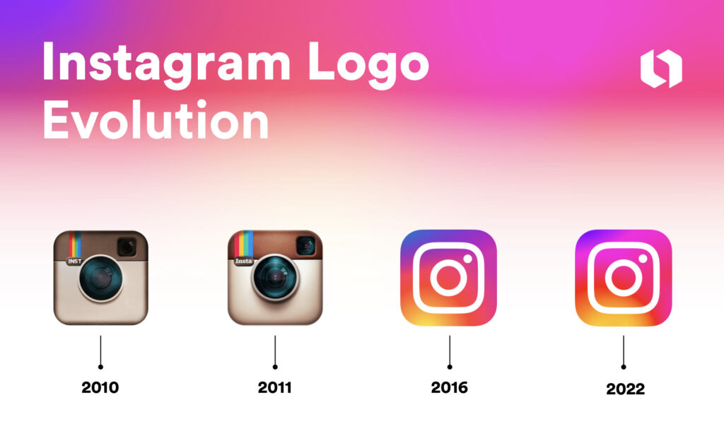
Remember the outrage in 2016 when Instagram replaced its charming, retro camera with a minimalist gradient icon? The internet wept. It was called soulless and corporate. Fast forward to today, and that vibrant gradient icon is instantly recognizable worldwide. It’s a perfect example of a redesign that was functionally brilliant and eventually won us over through sheer ubiquity and smart execution.

The Designer’s Tightrope
For designers, a logo redesign is a high-wire act. You must balance:
- Honoring Heritage with Embracing the Future
- Standing Out with Fitting In (to the digital ecosystem)
- Creating Something Timeless that also feels Current
It’s an impossible task to please everyone, especially in the first 48 hours.
So, What’s the Lesson?
The next time a beloved brand unveils a new look and your first instinct is to cringe, take a breath. Remember that a logo is not just an image; it’s the tip of a massive strategic iceberg. The change is almost never just about aesthetics. It’s a calculated move for longevity, functionality, and relevance.
Our initial hate is often just the friction of change. And as design history has shown us time and again, that friction almost always smooths over, making way for the next chapter in a brand’s ever-evolving story.

