Design is not just about beauty. It is about function, clarity, and trust. When it fails at this foundational level, the consequences can ripple across millions of users and cost companies billions. Beyond mere aesthetic misfires, the most expensive design mistakes reveal a profound misunderstanding of user behavior, cultural context, or basic human psychology.
Let’s examine a few landmark failures and the invaluable, often painful, lessons they left behind.
1. The $300 Million Button: Why a Checkout Should Never Be a Puzzle
The Mistake: In the early 2000s, a major e-commerce site (widely reported to be a retailer like OfficeMax or Best Buy) observed a massive drop-off at their checkout. The culprit? A single, poorly designed button on the login/registration page.
New customers were presented with two options: “Register” or “Login.” Many, not wanting to create an account just to make a one-time purchase, would abandon their cart. The company spent millions on marketing to drive traffic, only to lose it at this critical juncture. A UX researcher, Jared Spool, famously quantified the loss: this single design flaw was costing the company approximately $300 million per year in lost sales.
The Lesson: Never force a commitment before a transaction. Users want to complete their goal with the least friction possible. The “solution” was elegantly simple: replace the buttons with “Continue as Guest” alongside the option to register. Sales increased dramatically overnight.
The Takeaway: Map user goals, not business goals, onto critical flows. Optimize for the primary user action (purchasing) before secondary business goals (data collection). Test, quantify, and never assume you know why users are leaving.
2. The Rebrand That Broke a City: Gap’s Logo Debacle (2010)
The Mistake: In 2010, the iconic American clothing retailer Gap replaced its classic, beloved serif logo (which had 20+ years of brand equity) with a new design: a generic, bland sans-serif “Gap” on a gradient blue square. The public outcry was immediate, loud, and overwhelmingly negative. Social media erupted with parody versions, and customers felt a genuine sense of betrayal. The new logo was perceived as cheap, corporate, and devoid of the heritage the brand represented.
The Lesson: A brand is a shared relationship, not a corporate asset to be unilaterally changed. Gap made the fatal error of not involving its community. They swapped a distinctive mark with deep cultural resonance for one that felt focus-grouped and anonymous. The backlash was so severe that Gap reverted to the old logo after just six days.
The Takeaway: Understand the emotional capital of your brand. Major visual changes require user empathy and co-creation, not just a designer’s whim. If you must evolve, do it gradually and with clear communication about the “why.”
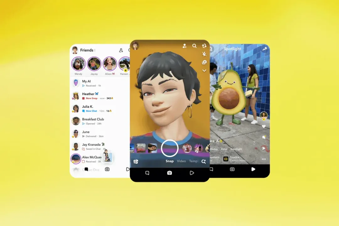
3. The Update That Disappeared a Billion-Dollar Feature: Snapchat’s 2018 Redesign
The Mistake: In 2018, Snapchat launched a radical app redesign that separated social content from publisher content and, most controversially, algorithmically mixed friend Stories with direct messages. The goal was to streamline and attract new users, but it alienated the core user base. They found the new layout confusing, frustrating, and it broke their established social habits. Over 1.2 million users signed a petition demanding a revert. Snapchat’s parent company, Snap Inc., lost an estimated $1.3 billion in market value in the weeks following the update.
The Lesson: Do not fix what is not broken for your most loyal users. The redesign solved a business problem (monetization and growth) but created severe user problems (broken mental models, lost usability). It disregarded how a dedicated community actually used the product.
The Takeaway: Major UX overhauls must be validated with your existing power users, not just tested for new user onboarding. Change should be iterative and respect established user behavior. Communicate changes transparently and provide opt-in periods.
4. The Tone-Deaf Algorithm: Apple’s “Bendgate” (2014)
The Mistake: When the iPhone 6 launched, users reported the larger, thinner phones would bend under normal pressure in pockets. Instead of a direct, empathetic response, Apple’s initial design-centric reply was widely perceived as dismissive: they stated the bending was “extremely rare” and implied it was a result of misuse. This technical and PR failure, dubbed “Bendgate,” suggested the company had prioritized form over fundamental function and durability, damaging its reputation for impeccable engineering.
The Lesson: Hubris in design is a critical vulnerability. When a physical design flaw affects functionality, technical specifications are not a substitute for accountability. The mistake was not just the thin alloy, but the failure to anticipate real-world stress and the subsequent failure to communicate with humility.
The Takeaway: User-centered design must include real-world stress testing and a plan for graceful failure. How a company handles a design flaw is part of the overall user experience. Empathy must extend to customer support and public communication.
5. The Confusion That Crashed a Market: The Knight Capital “Power Button” (2012)
The Mistake: In perhaps the most expensive single UI error in history, a financial firm, Knight Capital, deployed new trading software in 2012. The new system had a hidden, unused function labeled “Power” toggle in its deployment interface. An engineer, reactivating old servers, mistakenly triggered this “Power” button on eight production servers. This activated a rogue algorithm that lost $440 million in 45 minutes, bankrupting the 40-year-old firm.
The Lesson: For critical systems, UI clarity is a matter of survival. This was a catastrophic failure of affordance and safety design. A button with immense destructive power was presented with the same casual label as a desk lamp switch, with no confirmation, no undo, and no adequate fail-safes.
The Takeaway: Design for worst-case scenarios. In high-stakes environments, interfaces require deliberate friction (confirmations, permissions), clear destructive-action signaling, and immutable safety protocols. The cost of a confusing button can be existential.
The Common Thread: A Failure of Empathy
Across these vastly different scenarios from a checkout button to a stock market algorithm the root cause is the same: a disconnect between the designer’s intent and the user’s reality.
The lessons form a timeless checklist for preventing disaster:
- Observe, Don’t Assume: Use data and testing to understand real user behavior, not internal hypotheses. (The $300M Button)
- Your Brand is Not Yours Alone: Respect the emotional investment of your community. (Gap)
- Iterate, Don’t Obliterate: Evolve established UX with care for your core users. (Snapchat)
- Design for Reality, Not Ideals: Test for failure and misuse, not just perfect use. (Bendgate)
- Clarity Over Cleverness: In critical flows, ambiguity is the enemy. (Knight Capital)
These costly mistakes are not just historical footnotes. They are the most potent curriculum we have. They teach us that good design is not a luxury it is the essential framework that builds trust, enables function, and ultimately, protects value. In a world increasingly built on digital experiences, the price of poor design has never been higher.
About the Author

Peter Makeshoff
Peter Makeshoff is the founder and main author of Designer Daily.