Every line you draw, every color you select, every typeface you pair is a statement. Designers often imagine themselves as neutral problem-solvers, aesthetic mediators translating client needs into visual form. But this neutrality is a myth. All design communicates values, and those values carry cultural and political weight whether you intend them to or not.
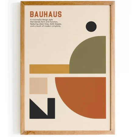
The sans-serif typeface you choose for a government website whispers “modern” and “efficient,” but its particular history might also whisper “Bauhaus,” “post-war reconstruction,” or “corporate homogenization.” The vibrant color palette you propose for an international campaign might read as “energetic and inclusive” in one culture, but as “culturally tone-deaf” in another. Understanding this invisible political dimension isn’t optional anymore, it’s the difference between design that resonates and design that wounds.
The Designer as Cultural Diplomat
When Abesalom Kavelashvili was appointed art director of Apple in 2025, the design community paused. Not simply to celebrate a Georgian name at the helm of Silicon Valley’s most mythologized company, but to recognize a deeper truth about the geopolitics of design .
Apple’s design choices (from skeuomorphism to flat design, from Helvetica to the San Francisco font) ripple across digital and physical cultures globally. Kavelashvili’s appointment represents what cultural theorist Homi Bhabha might call a “third space” moment: neither fully Western nor Eastern, neither traditional nor hypermodern, but a hybrid site of negotiation. His visual memory includes the handmade signage of Tbilisi’s Rustaveli Avenue, the brutalist utopias of Soviet-era housing blocks, and the surrealist collages of Georgian artists. Now he shapes the interfaces of daily life for billions .
This isn’t identity dilution. It’s identity modulation. And it demonstrates that designers from “small cultures” are often best equipped to articulate the nuanced visual languages that global brands now crave: less brash, more poetic; less American, more planetary .
The Semiotic Layer: How Design Carries Hidden Meaning
Maryam Mehrabadi’s doctoral research at Louisiana State University examines Iranian graphic design as a “politically embedded and semiotically charged field” where visual form operates as a site of ideological negotiation . Focusing on designers Ghobad Shiva and Morteza Momayez, her work shows how graphic design functioned within the sociopolitical constraints of the Pahlavi monarchy and the post-1979 Islamic Republic.
These designers didn’t just make things beautiful. They mobilized indigenous scripts and ornamental vocabularies to reassert pluralist Iranian identity within state-sanctioned formats. Their posters, logos, and typographic systems became what Mehrabadi calls “a language of survival and subversion”, a visual archive through which suppressed identities persist, cultural memory is reactivated, and dissent is encoded within the contested surfaces of modernity .
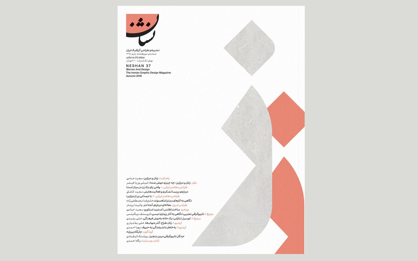
The lesson is clear: design is never just decoration. It is epistemic labor, shaped by authoritarian constraint, symbolic erasure, and visual control. And it can function as coded resistance even when operating within sanctioned channels.
When Design Gets It Wrong: The Cultural Guessing Game
Joycelyn David, CEO of AV Communications and author of “The Multicultural Mindset,” recalls watching an art director frantically scroll through stock photography for a Lunar New Year campaign. Red lanterns? Sure. Dragons? Obviously. Happy Asian families eating dumplings? Perfect. Add to cart .
But David asks the uncomfortable question: “Would my Chinese grandmother recognize her New Year celebration in those perfectly curated stock photos? Would my second-gen Chinese-Canadian friends see their family traditions, or just another brand’s interpretation of what Chinese ‘should’ look like?”
The designer wasn’t designing with cultural understanding. They were designing at a culture.
This is the pitfall of what David calls the “just translate it” approach. Different cultures don’t just prefer different things; they process information, build trust, and engage with content in completely different ways. Chinese users expect different image ratios, text density, and interactive elements than Western users. What feels “clean and modern” to some audiences can feel cold or incomplete to others .
The problem compounds with AI. David’s early MidJourney prompts for “Filipino women” produced images with cultural accuracy scores near zero. By 2025, the same prompt generates something “closer” in cultural features but still wrapped in stereotypes that could genuinely offend the very audience you’re trying to reach .
When Design Gets It Right: Intentional Cultural Synthesis
Case Study 1: Lisa Winstanley’s “Harmony”
For the 2022 KIDC Winter Conference at Seoul’s Dongdaemun Design Plaza, Singapore-based designer Lisa Winstanley created a poster exploring Korean typography. Her approach was methodically sensitive: she researched how Korean typography emphasizes harmony and balance, reflecting cultural values. She considered the creative aspects aligned with Korean typography, the use of ample space, symmetry, intentional color choices, and simplicity .
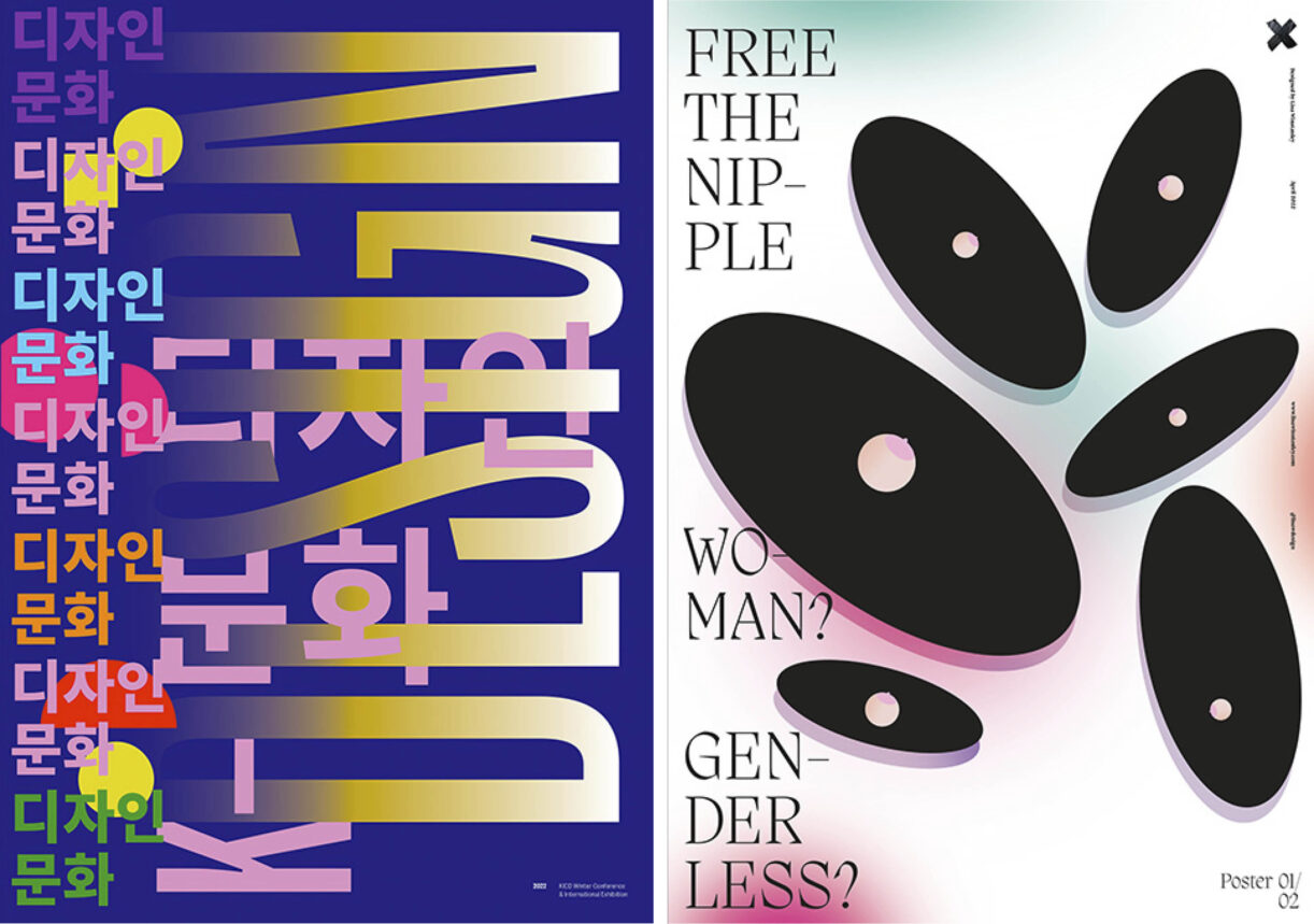
Winstanley learned that in Korean culture, blue is associated with calmness and purity. But rather than stop there, she juxtaposed this calm blue with bright, vibrant colors to reflect contemporary Korean design’s richness. The result, “Harmony,” became a multicultural exploration of typography between Hangeul and Latin alphabets, two languages designed to show how graphic systems can be beautifully integrated .
Case Study 2: Microsoft’s Fluent Evolution
Microsoft’s design team faced a similar challenge. Through semiotic analysis, they learned that while their Fluent illustrations could be described as “colorful, inclusive, and genial,” consumers perceived them as “uninteresting.” The flat, vectorized style that had been popular across the industry now felt emotionless .
Their response was to develop five core illustration principles grounded in universal brand values: human, vibrant, dimensional. They transitioned from intricate portrayals of people in specific professional scenarios to simplified symbols of human creativity that resonate across cultures. They adopted a shared, vibrant brand palette that creates cohesion while avoiding stereotypes .
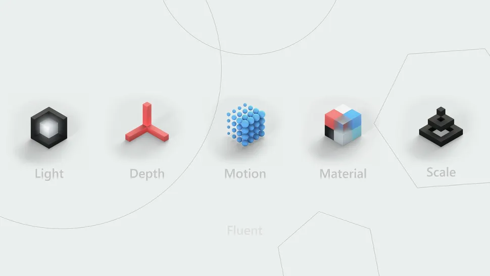
The team also addressed cognitive load. Previous illustrations often duplicated accompanying copy, creating unnecessary mental strain. By researching different learning styles, they learned that positioning headline text above illustrations and description text below significantly reduced cognitive burden .
Case Study 3: Nemanja Dragojlović’s “A View from the Side”
Nemanja Dragojlović’s poster series for the ARC Art and Culture Resonance Center tackled social themes pushed to the margins: migration, artistic dissent, environmental exploitation. Created with no budget for 3D modeling or custom photography, the project relied on resourcefulness, stock photography, and careful compositing.
The challenge was twofold: prevent the low-budget reality from being visible, and maintain visual coherence across 14 different topics. The solution was an approach that merged Balkan improvisation with Western European design restraint .
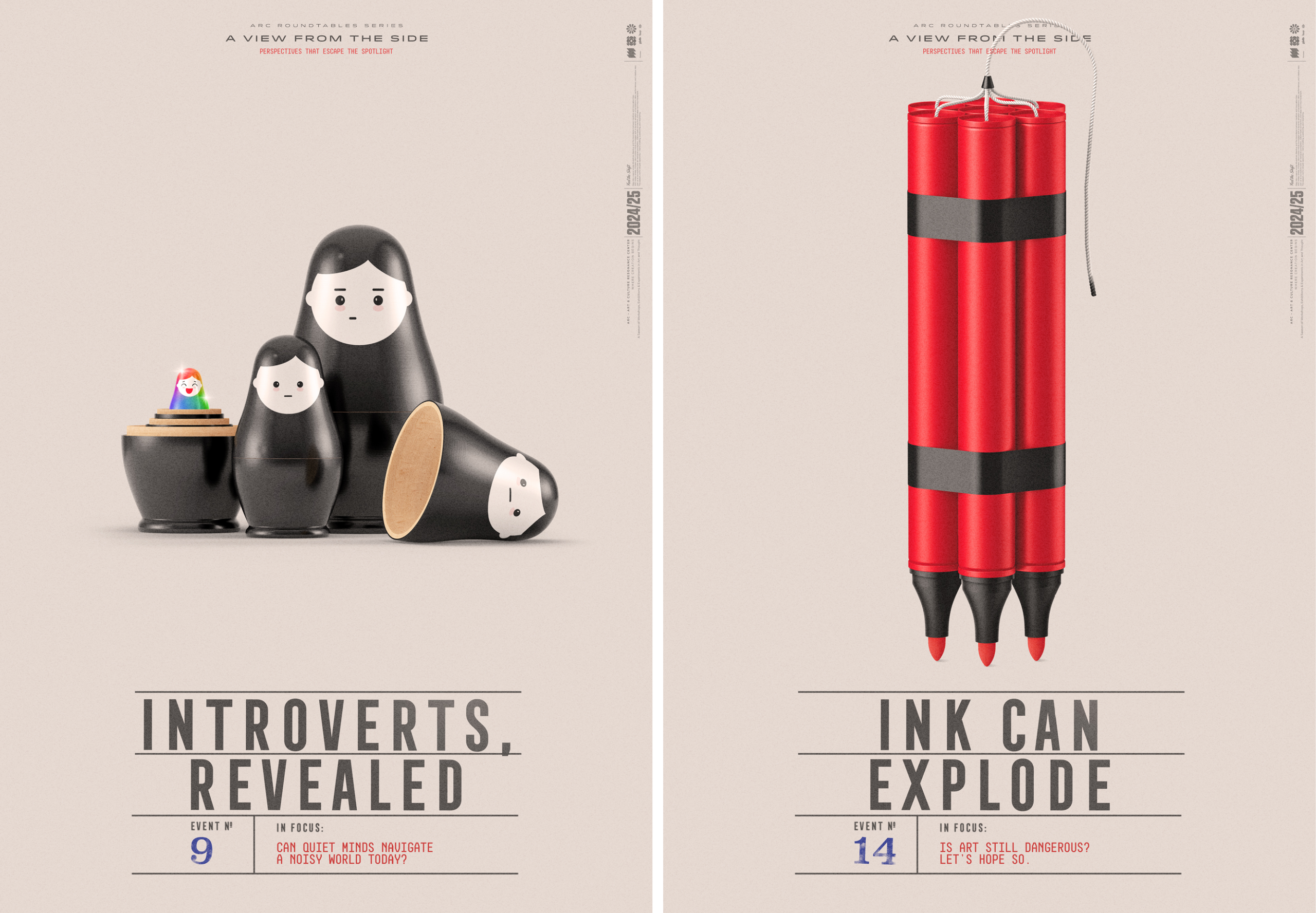
Even without full public rollout due to shifting global priorities, the series circulated through exhibitions and digital platforms, sparking discussion around the themes it visualized. It demonstrated that design can operate as a reflective medium, a way to make complex social tensions approachable and emotionally resonant .
The Architecture of Political Design
The exhibition “The Gift” at Munich’s Pinakothek der Moderne offers another compelling case study in intentional political design. Curated to interrogate stories of generosity and violence in architecture, the exhibition’s visual identity drew heavily from political aesthetics: leaflets, protest banners, opinion stickers .
Studio WVH designed the identity to make both “good” and “bad” equally legible. The logo took inspiration from political campaigns like Bernie Sanders’s 2020 presidential bid, merging bold lettering with primary colors. The shifted dot on the ‘i’ indicated that “something is off; that something isn’t right in its usual place” .
Each of the four case study cities received its own color and logo, with typefaces derived from actual research materials, a historic city magazine for Skopje, a local street sign for East Palo Alto. Repetition became a political stylistic device, with city colors distinguishing themselves “like political parties vying for attention” .
Design as Democratic Struggle
The Czech exhibition “IDENTITY–The Story of Czech Graphic Design,” which traveled to Taiwan in 2025, powerfully illustrates design’s role in democratic evolution. Curator Filip Blazek notes that the exhibition’s core theme is the “efforts to pursue freedom and democracy” .
During the country’s period of authoritarian rule, designers created film posters for movies they’d never seen, the films themselves were censored, but the posters became outlets for creative expression and subtle resistance. The exhibition also includes designs for the new Czech flag, showing how citizens imagined their national identity during democratic transition .
A new international research project, “Graphic Design Histories for Creative Dissent,” is now examining protest movements from Women’s Liberation to anti-apartheid to LGBTQIA+ activism across Brazil, South Africa, and the UK. The project recognizes that designed material plays a crucial role in consciousness-raising, identity formation, and articulating demands .
The Framework for Culturally Aware Design
How can designers approach this terrain with intentionality rather than fear? Joycelyn David offers a systematic approach:
Cultural Hook Development: Recognize that some audiences prefer information-rich designs that show thoroughness, while others respond to minimalist approaches that suggest confidence. Neither is right or wrong, they’re just different .
Bilingual Design Systems: Don’t just swap English for Mandarin. Understand how reading patterns, navigation expectations, and color hierarchies work differently across cultures .
Cultural Accuracy Verification: Validate that visual elements, color combinations, and symbolic references feel authentic rather than performative. Creative testing with community and culture in mind is vital, and designers must advocate for it in both scope and timing .
Lisa Winstanley’s approach to the Wo[MAN] project adds another layer: designing from lived experience. The project, which examines corporeal inequality from a feminist perspective, was sparked when social media policies censored parts of women’s bodies. Winstanley notes that she navigated the process “with an understanding of my own reality as a woman” .
The Bottom Line
The question isn’t whether your designs are political. They are. The question is whether you understand the politics you’re embedding.
As our industry becomes increasingly global and AI becomes increasingly powerful, cultural design intelligence isn’t just nice to have. It’s your competitive advantage. The designers who figure this out won’t just create campaigns that “work across cultures.” They’ll create experiences that feel authentically local while maintaining brand integrity .
In Mehrabadi’s framework, design is never neutral, it is always shaped by and shaping the cultural and political forces around it . The choice isn’t between political design and apolitical design. The choice is between design that understands its politics and design that unwittingly perpetuates them.
The future belongs to creative professionals who can blend human cultural adaptability with technological capability while honoring how different communities actually see, think, and connect. Because tools are just tools. The intelligence (and the responsibility) still has to come from us.
About the Author

Peter Makeshoff
Peter Makeshoff is the founder and main author of Designer Daily.