We track everything. Our apps count our steps, our sleep, our screen time. We A/B test headlines, optimize conversion funnels, and measure user engagement with obsessive precision. We treat products as systems to be tuned, yet we treat our own creative process as a mysterious black box. It becomes a matter of mood, muse, and mystery. But what happens when we turn the lens inward? What if we applied the same principles of data tracking, self experimentation, and systematic analysis to our own design workflow?
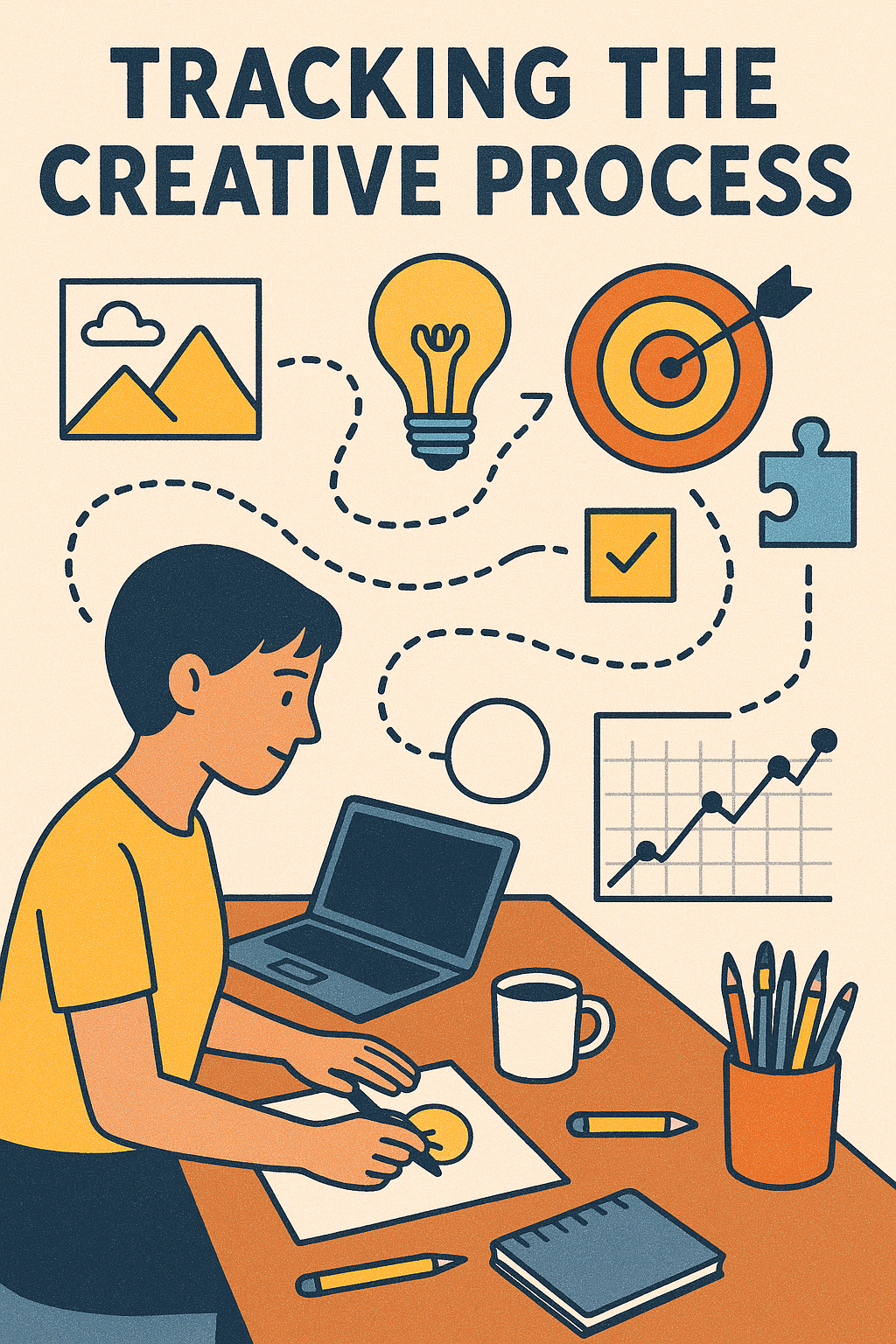
Welcome to the provocative frontier of the Quantified Designer.
The Hypothesis: Creativity as a Data Set
The core idea is simple. Our creative output is influenced by tangible, measurable variables. By tracking these inputs and correlating them with our output, such as quality, speed, and satisfaction, we can move from vague feeling to precise knowledge. We can shift from saying “I work better in the morning” to knowing exactly which conditions yield our most focused ideation, our most elegant solutions, and our most sustainable flow.
This is not about reducing artistry to a spreadsheet. It is about identifying the conditions that allow artistry to flourish consistently.
What Would a Designer Track?
The metrics fall into three categories: Inputs, States, and Outputs.
1. Inputs and Context: The Levers You Can Pull
- Temporal: Start time, break frequency and duration, total project time.
- Environmental: Location like home, office, or cafe, noise level, music genre or silence, light temperature.
- Tooling: Software used for specific phases, such as sketching in Procreate versus FigJam, and device like tablet versus desktop.
- Fuel: Sleep hours, caffeine intake and timing, meal times.
- Pre Work Ritual: A 10 minute walk, meditation, reviewing inspiration.
2. Internal State: The Gauges on Your Dashboard
- Self reported focus level on a scale of 1 to 10.
- Self reported energy and mood on a scale of 1 to 10.
- Perceived friction or resistance, that “this feels hard” feeling.
- Frequency of context switching, noted manually or via app usage.
3. Outputs and Outcomes: The Results
- Quantity: Screens designed, iterations produced, words written.
- Perceived Quality: A simple end of session rating of the work.
- Flow State: Duration of uninterrupted, deep work periods.
- Client and Stakeholder Feedback: Speed and positivity of feedback loops.
- Completion Rate: Ability to hit self imposed milestones.
The Experiment: A One Week Self Audit
For one week, track just a few key variables. Use a simple note taking app, a spreadsheet, or a habit tracker.
- Morning: Log sleep, wake up time, first 30 minute activity.
- Start of Work Session: Note time, location, planned task.
- Every 90 Minutes: Rate focus and energy from 1 to 10.
- End of Session: Log total time, output achieved, and a 1 to 5 rating of session satisfaction.
- Note any “Breakthrough” or “Frustration” moments and the immediate context.
The goal is not to create a burden, but to gather a baseline snapshot. You might discover that your “best work” happens not at 9 AM, but at 11:30 AM, after a coffee and a 15 minute block of reviewing design inspiration. You might find that client presentations you draft after 3 PM consistently require more revisions than those you write at 10 AM.
The Potential Pitfalls: When Metrics Mislead
This approach is fraught with philosophical and practical dangers.
- The Vanity Metric Trap: Celebrating quantity, like 8 wireframes, over true quality or impact.
- Optimizing for the Wrong Thing: Making your process efficient at producing mediocre work faster.
- Killing the Magic: Over analysis can stifle the intuitive, subconscious leaps that define great creativity. You cannot data track a spark.
- Analysis Paralysis: Spending more time tracking the work than doing the work.
The quantified approach is best suited for the craft and process of design. This means the execution, refinement, and production, not the initial, generative flash of insight. It is for optimizing the soil, not manufacturing the seed.
The Big Questions It Forces Us to Ask
Beyond personal hacks, this experiment forces a professional reckoning.
- Are We Designing for “Flow” or “Factory” Time? Modern workplaces often value constant availability, like Slack and meetings, over the deep, uninterrupted blocks where complex creative work actually happens. Data can be your defense for protecting “maker schedules.”
- Is Our “Creative Crisis” Just Burnout in Disguise? A persistent drop in focus and output metrics might not be a lack of ideas, but a lack of sleep, recovery, or meaningful breaks.
- Do We Have a Creative Process, or Just Habits? Tracking reveals if you have a deliberate, repeatable methodology or are just bouncing between tools and tasks reactively.
A More Human Synthesis
The ultimate goal of the Quantified Designer is not to become a machine, but to use data to build a more humane and sustainable creative practice. The numbers are not the verdict. They are a conversation starter with yourself.
Perhaps the most valuable finding will be that your best output correlates not with a specific tool or time, but with the metric most resistant to quantification: joy. You may see that sessions where you felt playful, curious, and intrinsically motivated consistently yield your most praised work.
In the end, the data should serve the designer, not the other way around.
About the Author

Peter Makeshoff
Peter Makeshoff is the founder and main author of Designer Daily.