In a digital age obsessed with the new, a quiet, scholarly revolution is happening in the world of typography. Foundries and independent designers are becoming archival detectives and digital archaeologists, resurrecting typefaces that vanished into obscurity before the digital era. This is not mere nostalgia. It is an act of cultural preservation and creative reinterpretation, bringing lost voices back into the design lexicon.
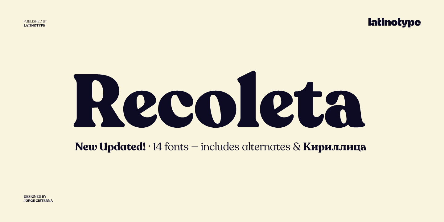
The Case Study: Resurrecting “Cooper Light” into “Recoleta”
One of the most commercially successful and meticulously executed revivals of recent years is the transformation of the 1970s typeface Cooper Light into the modern family “Recoleta.” The original Cooper Black (and its lighter weight, Cooper Light) was a ubiquitous, bubbly slab serif designed by Oswald Bruce Cooper in the 1920s. By the 1970s, it became a staple of advertising, yearbooks, and newspaper headlines, but its lighter weight was never fully developed or digitized with care. It faded into a memory of cheap, default desktop publishing.
The Chilean type foundry Latinotype saw untapped potential in its warm, approachable shapes. Their project to revive and massively expand it into Recoleta is a textbook example of the revivalist craft.

1. The Research: Beyond the Cliché
The designers, led by Daniel Hernández and Luciano Vergara, began by collecting original metal and phototype specimens of Cooper Light.
- Finding the Best Sources: They sought out high-quality, original prints to avoid the distorted versions that had been poorly scanned and replicated for decades in digital bundles. The goal was to return to the design intent before it was degraded by bad copying.
- Understanding the Context: They studied how Cooper Light was used in its heyday—often in promotional material that needed friendly authority. This informed their decisions about where to stay faithful and where to adapt.
2. The Digitization & Interpretation: From One Weight to a System
The original Cooper Light was essentially a single weight. Latinotype’s ambition was to build a comprehensive, versatile family.
- Drawing the “Master”: They meticulously digitized the core characters, carefully deciding which quirks were charming (like the slightly unbalanced curves of the ‘o’) and which were artifacts of outdated printing to be smoothed out.
- Extrapolating a Full Family: Using the master weight as a blueprint, they logically drew new weights—from a delicate Thin to a robust Black—and true italics. This required inventing how the bold, rounded serifs would behave at different thicknesses, a system the original never had.
- Filling the Gaps: A huge part of the work was designing the hundreds of glyphs needed today (mathematical symbols, currency, extended Latin support) that never existed in the 1970s phototype version, all while maintaining the family’s cozy, retro-modern personality.
3. The Adaptation: Making It a Modern Workhorse
Recoleta is not a museum piece. It’s a tool for contemporary branding.
- Refined for Screen: The shapes were optimized for digital rendering, ensuring the heavy slabs and tight curves looked crisp on devices.
- Enhanced Functionality: They added OpenType features like alternate glyphs for certain characters, giving designers control to tweak the vintage feel.
- The “Why” of the Revival: Latinotype didn’t just copy. They clarified. They removed the clunky, dated feel and amplified the warmth and readability, transforming a period novelty into a serious contender for web headers, packaging, and brand identities seeking nostalgic credibility without kitsch.
4. The Result: From Obscurity to Ubiquity
Recoleta’s success proved the revival’s value. It won awards and is now used by major brands (like Spotify for some campaign graphics) and small businesses alike. It gave designers a high-quality version of a style they remembered fondly but could never use professionally before.
The Ethical Considerations: Stewardship vs. Appropriation
The “Warsaw Poster” revival navigates its ethics thoughtfully.
- Cultural Context & Credit: The revival is by a Polish designer, deeply embedded in the culture that produced the original art. He explicitly credits the Polish School of Poster Art as his inspiration, acting as a steward rather than an outsider appropriating a style.
- No Original “Owner”: Since the source was a collective, public style rather than a proprietary typeface by a named designer, the revival is seen as an act of cultural homage and preservation.
- Transformation: The font is clearly a new, systematized interpretation. It does not falsely claim to be a lost work of a specific individual, but a celebration of an entire movement.
The Cultural Value: Why This Work Matters
1. It Saves Intangible Heritage. It rescues a defining aesthetic moment from being trapped in archival photos and makes its language usable for new generations.
2. It Expands Our Tools with Depth. It offers designers not just another “retro” font, but a tool imbued with a rich, specific history and emotional resonance.
3. It Creates Continuity. It allows contemporary Polish designers to connect visually with a celebrated chapter of their own design history, creating a living link between past and present.
4. It Honors Anonymous Craft. It celebrates the work of often-unnamed poster artists, elevating their practical craft into a lasting piece of design infrastructure.
The revivalist, as shown by Władyka’s work, is a bridge builder. They listen to the whispers of the past—a brushstroke on a fading poster—and amplify them into a clear, functional voice for the present. In doing so, they don’t just give us a new font. They keep a visual culture alive, ensuring that the brilliant, lost ideas of yesterday can inform and inspire the design of tomorrow.
About the Author

Peter Makeshoff
Peter Makeshoff is the founder and main author of Designer Daily.