Before a word is read, before a video is watched, before a link is clicked, the thumbnail makes a silent promise. Viewers decide whether to engage in less than a second, often on a screen the size of a credit card. The difference between a scroll and a click is not luck. It is visual science.
Here is what actually makes thumbnails stop the scroll.
The Attention Economy Reality
Content platforms have become infinite feeds. YouTube, TikTok, Instagram, LinkedIn—each presents an endless stream of options. The viewer does not evaluate each one thoughtfully. They scan rapidly, rejecting most, pausing only when something triggers an automatic response.
The thumbnail must trigger that response before the viewer consciously decides to look. This is pre-attentive processing. It happens in 50-200 milliseconds. Too fast for rational thought. Fast enough for color, contrast, and face detection.
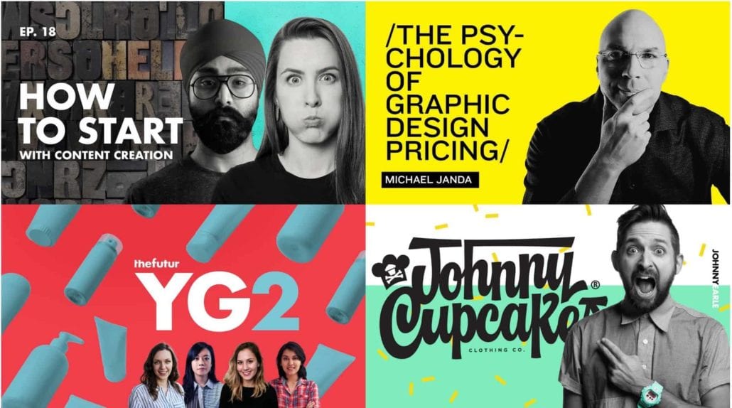
The Face Factor
Human faces are the most powerful attention-grabbing element available. The brain has dedicated neural hardware for detecting and evaluating faces. A thumbnail with a face will consistently outperform one without.
Direct eye contact creates a sense of connection. The viewer feels addressed personally. An averted gaze or closed eyes signals disengagement. The thumbnail loses its hook.
Exaggerated expressions read clearly at small sizes. Subtle smiles become invisible. Wide eyes, open mouths, raised eyebrows—these expressions signal surprise, excitement, or concern. They make the viewer wonder what caused that reaction.
The face should dominate. A tiny head surrounded by context will be ignored. The face should fill a significant portion of the frame. At thumbnail size, facial features must be unmistakable.
The Contrast Principle
Thumbnails compete with adjacent content, platform interface elements, and the background of the feed. The thumbnail that does not contrast will not be seen.
Bright against dark is the most reliable contrast strategy. A bright subject on a dark or blurred background creates immediate separation. The eye goes to the illuminated area first. This is why dark backgrounds with bright foreground elements are ubiquitous.
Color contrast attracts attention. Complementary colors (blue/orange, red/green, purple/yellow) create visual tension. The orange arrow against a blue background is not accidental. It is color theory applied to thumbnail design.
Texture contrast works when color contrast is not possible. A smooth subject against a rough background. A detailed face against a simple background. The difference in visual complexity draws the eye.
The Curiosity Gap
A thumbnail that answers every question does not earn a click. A thumbnail that raises a question does. The gap between what the viewer knows and what they want to know is the curiosity gap.
Reveal without explaining. Show the result but not the method. A dramatic before-and-after. A shocking transformation. The viewer must click to understand how.
Show the unexpected. A familiar object in an unfamiliar context. An unusual angle. A surprising combination. The viewer’s pattern recognition flags something wrong, and they click to resolve the anomaly.
Use expressive faces. A face showing surprise, confusion, or concern creates an implicit question. What are they reacting to? The viewer needs the answer.
The Thumbnail Trinity
The most effective thumbnails combine three elements in a tight visual hierarchy.
| Element | Role | Typical Placement |
|---|---|---|
| Face | Emotional hook, connection | Center, dominant |
| Object of interest | Subject, promise | Secondary, supporting |
| Text (optional) | Clarification, urgency | Bottom, small, high contrast |
The face grabs attention. The object clarifies the topic. The text (if present) adds context or urgency. Each element has a specific job. None should compete for dominance.
Text in Thumbnails: Necessary Evil
Text in thumbnails is a sign of failure. The visual should communicate the topic without words. But for complex topics, data-driven content, or competitive niches, text can lift click-through rates.
When to use text: The topic is not visually obvious (stock market analysis, software tutorial). The target audience expects text (finance, B2B, education). The platform rewards text (LinkedIn).
When to avoid text: The visual tells the story clearly. The audience is international (text must be translated). The thumbnail is already busy.
Rules for thumbnail typography:
- Maximum three to four words
- Sans-serif only
- Bold weight
- High contrast outline or shadow
- Test at actual thumbnail size
The Platform Differences
What works on YouTube may fail on LinkedIn. Each platform has distinct viewing contexts.
YouTube: Viewers are often searching for specific information. Thumbnails compete with search results and suggested videos. Faces, curiosity gaps, and bold colors perform best. Text is common and effective when brief.
TikTok: The feed is purely algorithmic. Viewers scroll rapidly. Thumbnails are often the video’s first frame. Face-forward, high-contrast opening frames outperform text-heavy designs.
Instagram: The feed includes photos, videos, and ads. Thumbnails are smaller than YouTube. Simpler compositions with bold colors and clear subjects perform best. Text is rarely effective at this scale.
LinkedIn: Professional context changes expectations. Overly exaggerated expressions feel out of place. Clean, readable typography and clear subject matter perform better than emotional hooks.
Testing Your Thumbnails
A/B testing is the only way to know what works for your audience.
Run a thumbnail test. Upload two to three thumbnails for the same content. Let the platform serve each to a segment of viewers. Monitor click-through rates for 48 hours. The winner is statistically significant.
Analyze your own data. Which of your thumbnails have the highest click-through rates? What do they share? High contrast? Direct eye contact? Specific colors? Do more of that.
Study competitors. What are the top-performing creators in your niche doing? Do not copy. Analyze their patterns. Apply the principles to your own visual language.
Common Thumbnail Killers
Low contrast. A thumbnail that blends into the background will never be seen. Test your thumbnail against white, black, and the platform’s interface. It should pop against all three.
Too much detail. Information that requires zooming to read will never be read. Simplify. Remove everything that does not earn its place.
Generic stock imagery. A business handshake, a team meeting, a smiling person at a desk. These images signal “corporate content” and trigger dismissal. Use specific, unexpected imagery.
Clickbait that does not deliver. A thumbnail that promises shocking content will get clicks. When the content does not match, viewers leave quickly. The algorithm interprets this as a bad video and stops suggesting it. Accurate intrigue wins.
The Bottom Line
A scroll-stopping thumbnail is not magic. It is a predictable response to visual stimuli. Face, contrast, curiosity. These three elements trigger pre-attentive processing. The viewer looks before they decide to look.
Design for the thumbnail first. Then design the content. The best video in the world will not be watched if the thumbnail fails. Give it the attention it deserves. The click-through rate will follow.
About the Author

Peter Makeshoff
Peter Makeshoff is the founder and main author of Designer Daily.