
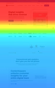
Heatmaps and scroll maps are the diagnostic tools of the digital age. They tell us where users look, where they click, and how far they scroll. The data is objective. It does not lie. But it does not always tell the truth, either. The truth is often more complicated.
The Scroll Map That Changed Everything
A client came to us with a problem. Their homepage had a 70% bounce rate. They had invested in a beautiful design, with a compelling hero image, a clear value proposition, and a prominent call-to-action. But users were leaving in droves.
We ran a scroll map. The data was damning. Only 15% of users scrolled past the hero section. The 85% who never scrolled were seeing only the top third of the page. The beautiful content below was invisible. The call-to-action, which was placed in the third section, was never seen by the majority of users.
The scroll map told the truth: the design was failing. The content was there. The users were not.
The Data Behind the Truth
The scroll map revealed a pattern that the client had missed. The hero section was visually impressive, but it was also overwhelming. The image was large, the headline was long, and the subheadline was dense. The user was not compelled to scroll. They were compelled to leave.
The scroll map also revealed something else. The 15% who did scroll were not scrolling to the call-to-action. They were scrolling to the testimonials. They were looking for social proof before they were willing to take action. The call-to-action was in the wrong place.
The scroll map did not just tell the client that the design was failing. It told them why. It revealed the disconnect between what the designer intended and what the user wanted. The data was objective. The interpretation was the truth.
The Redesign
The client redesigned the page based on the scroll map. They shortened the hero section. They simplified the headline. They moved the testimonials above the call-to-action. They made the primary call-to-action visible earlier in the page.
The results were dramatic. The scroll depth improved. The bounce rate dropped. The conversion rate increased. The scroll map had told the truth. The client had listened.
The Limits of the Scroll Map
Scroll maps are powerful. But they are not omniscient. They tell you where users scroll. They do not tell you why. They tell you what users do. They do not tell you what users want.
The scroll map is a starting point. It is a diagnostic tool. It is not a solution. The solution comes from understanding the user. The scroll map is a clue. The truth is in the interpretation. It is in the synthesis of data, observation, and empathy. The scroll map told the truth. But the designer had to listen.
The Bottom Line
The scroll map is a tool. It is not a substitute for judgment. It is a way of seeing. It tells you what is happening on the page. It does not tell you what is happening in the user’s mind. The data is objective. The truth is subjective.
The scroll map that told the truth was the scroll map that was interpreted with empathy. It was the scroll map that was used to understand, not just to measure. The data was the beginning. The redesign was the end. The truth was in the middle.
About the Author

Peter Makeshoff
Peter Makeshoff is the founder and main author of Designer Daily.