A passport is not a document. It is a nation’s handshake. A flag is not fabric. It is a promise stitched into form. The visual language of diplomacy, passports, currency, seals, official insignia, carries weight that commercial design never approaches. These artifacts represent sovereignty, negotiate trust, and communicate identity across borders. Designing them is not a commission. It is a responsibility.
The Passport: A Nation’s First Impression
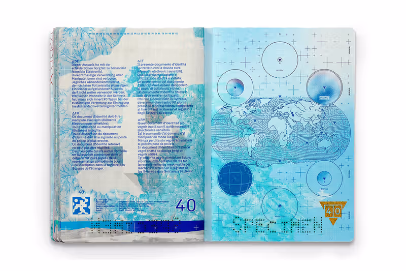
A passport is the most intimate artifact of national identity. It travels in pockets, crosses borders, and speaks before its bearer does. Every design choice matters.
The Finnish passport, redesigned in 2023, demonstrates how national identity can be expressed with restraint. Its cover is a deep navy, a color choice that signals stability and seriousness. Inside, the pages reveal a quiet brilliance: under UV light, a moose walks across the page, clouds drift, snow falls. The hidden animation isn’t decorative. It’s an anti-counterfeiting measure that also tells a story about Finnish nature.
The passport renewal process became a cultural event. Finns waited in lines that wrapped around buildings, not despite the design but because of it. When a passport becomes something people want to own, the nation has done something remarkable.
Norway’s 2020 passport redesign took a different approach. The cover comes in three colors: white (standard), turquoise (diplomatic), and deep red (emergency). Inside, minimalist landscapes reference fjords and northern lights. The design is restrained, almost severe, a visual declaration that Norwegian identity is quiet confidence, not spectacle.
These choices aren’t neutral. They signal values. A passport with ornate flourishes suggests heritage and tradition. A passport with clean sans-serif type suggests modernity and efficiency. A passport that incorporates indigenous visual languages acknowledges whose land the nation occupies. Every line carries meaning.
The Flag: Symbolism Stitched into Form
A flag is the simplest and most powerful symbol a nation owns. It must work at a distance, in wind, in monochrome, and in the minds of citizens who never touch it.
The evolution of the South African flag after apartheid is a masterclass in national symbolism. Designed in 1994, it combines elements from previous flags, the Dutch tricolor, the British Union Jack, the Boer republics, into a new, cohesive form. The “Y” shape represents the convergence of diverse elements into a single, forward-moving nation. It wasn’t a compromise. It was a synthesis.
Wales takes a different approach. Its flag features a red dragon, a symbol so distinctive it needs no other explanation. The dragon works because it is specific. There is no mistaking it for another nation’s flag. Specificity, when done well, is more powerful than abstraction.
Designing a flag requires constraints that other national symbols don’t share. It must be reproducible in fabric. It must be recognizable when draped or flown horizontally. It must work in black and white. It must not rely on text, text is illegible at scale and excludes non-speakers. The flags that endure respect these constraints.
Currency: The Most-Exchanged National Art
Banknotes are the most widely distributed art a nation produces. They pass through thousands of hands, each transaction a silent encounter with national identity.
The Swiss franc is widely considered the most beautiful currency in the world. Its vertical orientation is unusual, but the design by Manuela Pfrunder is masterful. Banknotes feature abstract representations of Swiss characteristics, time, light, water, language, without resorting to clichéd imagery of mountains or cows. The restraint signals sophistication. The sophistication signals stability.
Canada’s polymer banknotes, introduced in 2011, balance tradition and innovation. The material itself is a statement: Canada is technologically advanced. The imagery, the Vimy Ridge memorial, the icebreaker research vessel, Indigenous artist Kenojuak Ashevak’s work, tells a story of a nation that honors history, values science, and recognizes Indigenous artistry.
Currency design is uniquely vulnerable to controversy. Every excluded group, every outdated reference, every symbol that carries unexamined colonial weight becomes a political issue. Designing money means designing for scrutiny.
The Design of Transition
When regimes fall, visual identity changes. Sometimes instantly.
After the 2003 invasion of Iraq, the Coalition Provisional Authority issued new currency bearing no images of Saddam Hussein. The design was utilitarian, numbers, agricultural motifs, geometric patterns, deliberately apolitical. It signaled a break without declaring what would come next.
Afghanistan’s currency redesign after 2021 posed different challenges. The Taliban-era banknotes removed images of former leaders and replaced them with religious inscriptions. The visual language was designed to assert a different kind of authority: traditional, textual, non-representational.
Ukraine’s wartime identity is still forming. The “Russian warship, go fuck yourself” postage stamp, issued in 2022, became a global symbol of defiance. It wasn’t planned. It emerged from urgency. Sometimes the most powerful national symbols aren’t designed by committees. They’re drawn from resistance.
The Responsibility
Designing for a nation is different from designing for a brand. A brand can rebrand. A nation’s identity carries history, often contested, sometimes violent.
Designers working in this space face questions without easy answers. Who speaks for the nation? Which histories are honored, which are erased? How do you represent Indigenous peoples who were never asked to join? How do you design for unity without imposing uniformity?
There is no neutral solution. Every visual choice, color, typeface, imagery, material, makes a statement. The best national identity work acknowledges this weight. It doesn’t pretend to be apolitical. It strives to be worthy of the trust placed in it.
The Bottom Line
Passports, flags, currency, seals, these are not design projects. They are public trust, encoded in form. They travel farther than any designer ever will. They outlast administrations. They become the visual shorthand for millions of people who will never read the design rationale.
The Finnish moose walks across the passport page, illuminated only by UV light. The South African flag catches wind at the United Nations. The Ukrainian stamp is pinned to a soldier’s jacket. These objects work because someone understood that national identity isn’t a logo. It’s a relationship. Designing for it requires not just skill, but humility.
About the Author

Peter Makeshoff
Peter Makeshoff is the founder and main author of Designer Daily.