
Some design decisions are made in a moment. A developer needs a placeholder. A dialog needs a title. A button needs a label. The decision is temporary, a quick fix to move the project forward. The intent is to return later and replace the placeholder with something proper. But the project moves on. The placeholder ships. And a strange, unintended artifact enters the world.
This is the story of the window that was not meant to be opened.
The Placeholder That Shipped
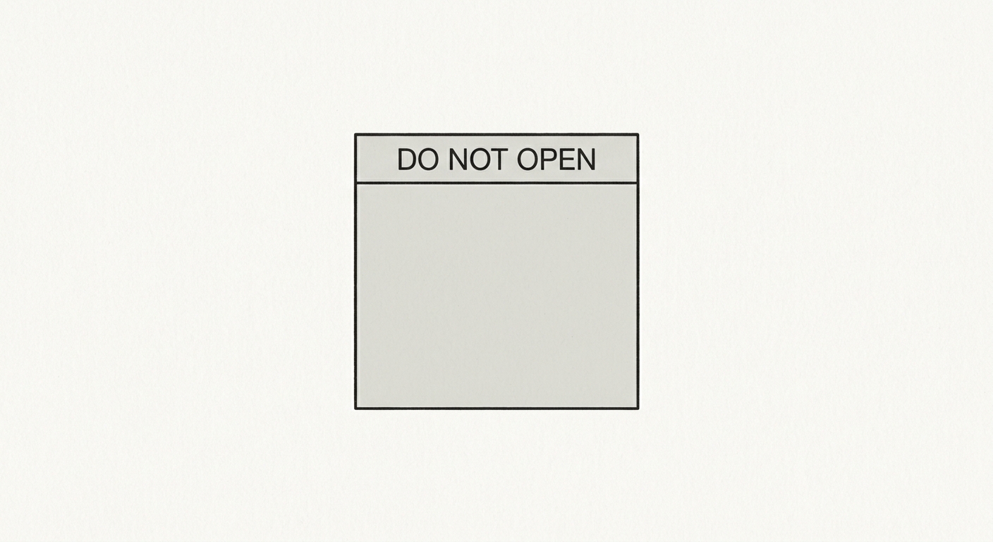
The window was a simple dialog box. It appeared when a user attempted to access a feature that had not yet been implemented. The developer needed a title for the window. They typed “Do Not Open.” It was a note to themselves, a reminder that the feature was incomplete. The plan was to replace the title with something more user-friendly before launch.
But the launch came and went. The dialog shipped. Users encountered it. They saw the words “Do Not Open” and were confused. Some of them opened it anyway. They found nothing. The window was empty. The feature was not implemented. The placeholder had shipped.
The window was not meant to be opened. But it existed. It was part of the interface. It was a promise that was never intended to be made.
The Psychology of the Forbidden
The “Do Not Open” window is a lesson in the psychology of the forbidden. When you tell a user not to do something, you create a curiosity gap. The user wants to know what is inside. The window that was not meant to be opened becomes the window that the user most wants to open. The warning becomes an invitation.
This is a fundamental principle of human behavior. We are drawn to the forbidden. We want to know what is behind the door that says “do not enter.” We want to open the window that says “do not open.” The designer who creates a forbidden element creates a temptation.
The Lesson for Designers
The lesson is not that windows should never contain warnings. The lesson is that the interface should not present the user with options that lead nowhere. It should not offer actions that cannot be completed. It should not present windows that are not meant to be opened.
The interface should be honest. It should tell the user what it can do. It should tell the user what it cannot do. It should not offer false promises. The user who opens a window expects to find something useful. The designer who creates a window that contains nothing useful has failed.
The window that was not meant to be opened is a cautionary tale. It is a reminder that design is not just about what you add. It is about what you take away. The best interfaces are not the ones with the most features. They are the ones with the fewest false promises.
The Bottom Line
The window that was not meant to be opened should not have been created. The interface that offers options that lead nowhere should be redesigned. The designer’s job is not to show the user everything the system can do. It is to show the user what the system can do for them.
Every element in an interface is a promise. Make promises you can keep. The window that was not meant to be opened is a reminder that the smallest decisions, made in a moment of haste, can have the longest consequences. Design with intention. Ship with care. The placeholder is not a placeholder. It is the product.
About the Author

Peter Makeshoff
Peter Makeshoff is the founder and main author of Designer Daily.