Digital reading is broken. Not because people lack attention spans, but because most digital text is hostile to the act of reading. Tiny line lengths, cramped spacing, and layouts designed for scanning rather than settling in. The result isn’t just reader frustration. It’s articles abandoned, insights lost, and trust eroded.
Great typography for long-form reading does something different. It respects the reader’s attention. It creates conditions where reading feels less like work and more like flow.
Here’s how to design pages people actually finish.
The Foundation: Line Length
The single most important variable for readable text is line length. Too short, and the reader’s eye tires from constant return sweeps. Too long, and the eye struggles to track from end to end without losing place.
The research-backed sweet spot is 50–75 characters per line, including spaces. This range allows the eye to travel smoothly without losing its place. For English text set at a comfortable size, this translates to roughly 8–12 words per line.
On the web, this means constraints. Don’t let text span the full width of a browser window. Set a maximum width on your text container. A good rule of thumb: between 35em and 45em for paragraphs. This creates a comfortable reading column regardless of screen size.
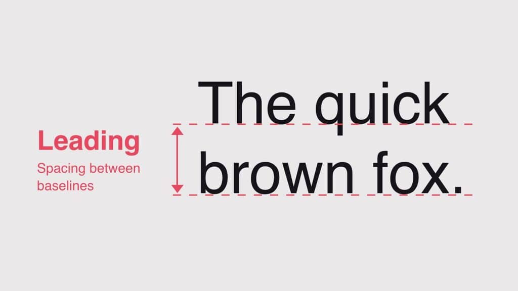
The Breathing Room: Leading
Leading, the vertical space between lines, determines how easily the eye moves from one line to the next. Too tight, and descenders crash into ascenders, creating visual noise. Too loose, and the connection between lines feels disconnected.
For body text, a leading value of 1.4 to 1.6 times the font size works consistently well. For example, 16px text with 24px leading (1.5 ratio) creates comfortable reading rhythm.
Margin space matters too. Adequate margins prevent the text from feeling trapped. On desktop, side margins of 20% or more create a sense of spaciousness that invites lingering. On mobile, even modest margins improve readability dramatically over edge-to-edge text.
The Micro-Craft: Hyphenation, Widows, and Orphans
These details seem small. They aren’t. They’re the difference between text that flows and text that jars.
Hyphenation prevents ragged right edges from creating distracting gaps. Enable automatic hyphenation in CSS with hyphens: auto. Set a minimum word length (often 6 characters) to avoid awkward breaks. For justified text, hyphenation is essential to prevent “rivers”, those distracting white spaces that appear to flow vertically through a paragraph.
Widows are single words or very short lines left alone at the end of a paragraph. Orphans are similar at the start of a column or page. Both break the visual coherence of the text block. Use widows and orphans properties in CSS to set a minimum number of lines at paragraph beginnings and ends. A value of 2 or 3 is standard.
The Hierarchy That Guides
Long-form reading isn’t a uniform block. It needs signposts. Headings, subheadings, pull quotes, and visual breaks give readers mental rest stops and orient them within the text.
Create clear differentiation. Headings should be distinct from body text not just in size but in weight, color, or spacing. A heading set in the same weight and color as body text but simply made larger often feels like an accident rather than an intentional signal.
Use consistent spacing. The space before a heading should be larger than the space after it. This visually binds the heading to the paragraph it introduces. The space between paragraphs should be noticeable but not jarring, typically half the leading value.
Limit font families. One well-chosen family with distinct weights is cleaner than two families that compete. If you must pair, use contrasting weights rather than similar families. A heavy sans-serif for headlines and a readable serif for body text works. Two similar sans-serifs do not.
The Scale: Proportion That Pleases
Robert Bringhurst, in The Elements of Typographic Style, codified the principle of a modular scale: a sequence of type sizes based on a consistent ratio, like a musical scale. This creates visual harmony because each size relates proportionally to the others.
Popular ratios include the golden ratio (1:1.618), the perfect fourth (1:1.333), or the major second (1:1.125). A simple approach: set your body size, then apply a ratio to derive heading sizes. For body at 18px, a 1.25 ratio yields 22px, 28px, 35px, a comfortable progression.
The Medium Matters: Print vs. Screen
What works in print doesn’t always translate to screen. Serif fonts, long the standard for printed books, perform equally well on high-resolution screens when properly rendered. The choice between serif and sans-serif is less critical than size, spacing, and contrast.
What does matter is subpixel rendering. Ensure text is rendered with appropriate anti-aliasing. CSS properties like -webkit-font-smoothing: antialiased and text-rendering: optimizeLegibility make a meaningful difference.
The Accessibility Layer
Good long-form typography is accessible typography. That means:
Sufficient contrast. WCAG requires 4.5:1 for body text. Don’t flirt with the minimum. Aim higher.
Relative sizing. Use rem or em units, not pixels, so text scales with user preferences. A user who needs larger text shouldn’t have to fight your layout.
Readable line heights. Allow users to override your settings if needed. A flexible container respects assistive technology.
The Bottom Line
People finish long-form content when the reading experience doesn’t fight them. When line length feels natural, spacing gives room to breathe, hierarchy provides orientation, and the craft details (hyphenation, widows, scale) disappear into the background where they belong.
Digital reading isn’t broken. Most digital typography is. Fix that, and readers will stay.
About the Author

Peter Makeshoff
Peter Makeshoff is the founder and main author of Designer Daily.