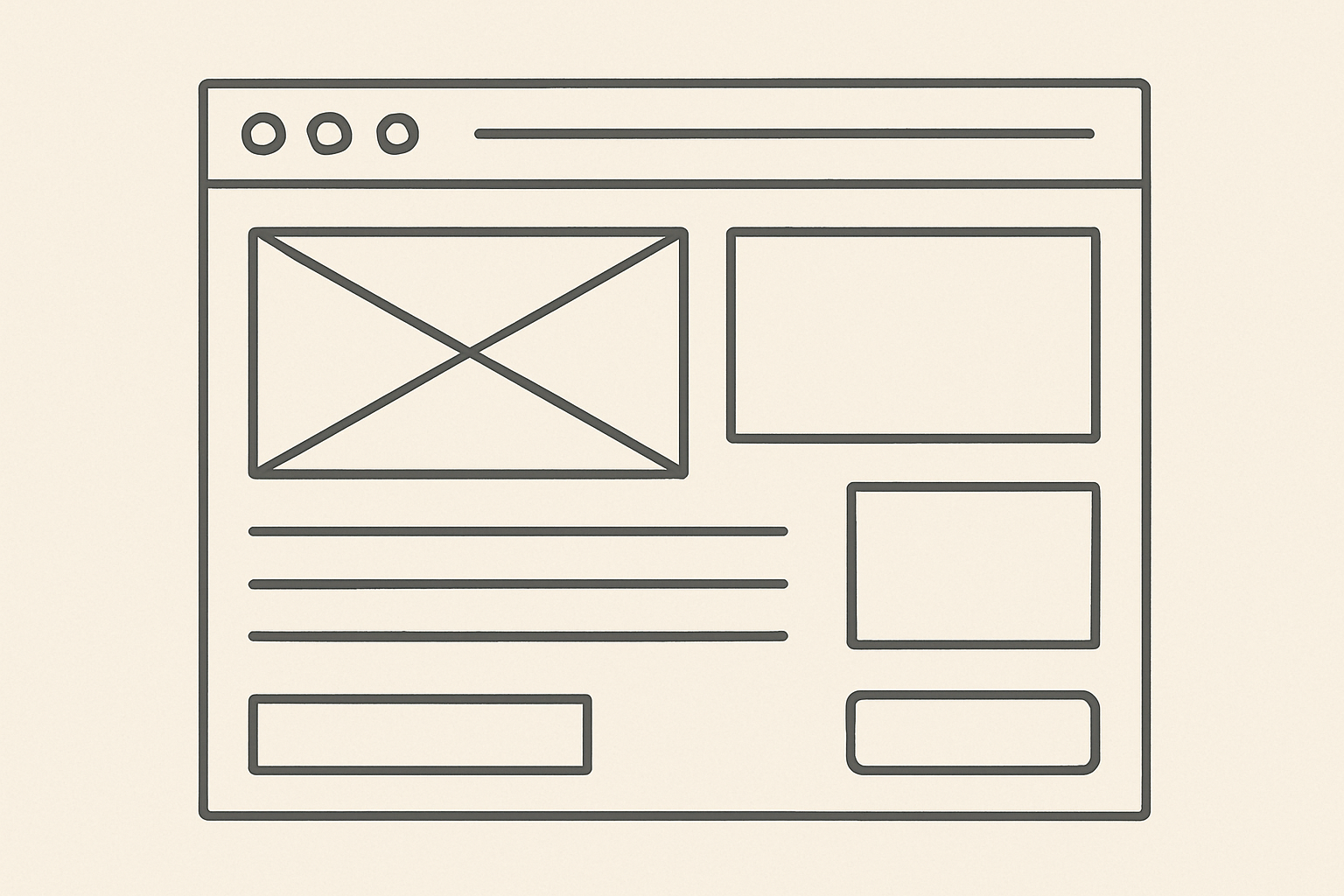
You’ve poured your soul into a product. It’s brilliant. But if your landing page doesn’t convert visitors into leads or customers, that brilliance is hidden in a black box.
A high-converting landing page isn’t a happy accident; it’s a meticulously crafted machine where every pixel has a purpose. It’s a single-minded journey with one primary goal: to get the user to take one specific action.
Let’s dissect this machine, section by section, and uncover the UI and UX principles that turn casual scrollers into committed converts.
1. The Unignorable Hero Section
This is your first and often only chance to make an impression. You have roughly 5 seconds to answer the user’s silent question: “What is this and why should I care?”
- The UI Anatomy:
- A Compelling H1 Headline: This is your value proposition in its purest form. It must be benefit-oriented, clear, and use language your audience cares about. Not “Project Management Software,” but “Ship Your Best Work, Faster.”
- A Supporting H2 Sub-headline: This is where you briefly elaborate on the headline. What does “faster” mean? “The one platform to plan, track, and release with your team without the chaos.”
- A Primary Call-to-Action (CTA): This button is the star of the show. It should be visually dominant, using a high-contrast color from your palette. The copy must be action-oriented and create a sense of value or low risk (e.g., “Get Started Free” or “Claim Your Discount”).
- A Supporting Visual: A relevant, high-quality image, illustration, or short video that demonstrates the product’s core benefit or outcome. It should support the headline, not distract from it.
- The UX Principle: Clarity Over Creativity. Avoid jargon and clever wordplay that might confuse the user. The path to the CTA must be instantly clear.
2. The Problem & Solution Bridge
Once you’ve captured their interest, you must quickly validate it. This section builds a bridge between the user’s pain point and your solution.
- The UI Anatomy:
- Problem Statement: Briefly articulate the common frustrations or challenges your target audience faces. Use bullet points or short, punchy text.
- The “How It Works” Solution: Present your product as the obvious answer. Use a simple 3-step process (e.g., “1. Plan, 2. Collaborate, 3. Deliver”) with icons or small visuals to make it scannable.
- The UX Principle: Empathy and Scannability. Users are scanning for relevance. Show them you understand their world before demanding their attention.
3. The Social Proof Shield
Before a user commits, they look for validation from others. Social proof is the psychological “safety net” that reduces perceived risk.
- The UI Anatomy:
- Logo Bar: “As seen in” or “Trusted by” logos of well-known clients or publications.
- Testimonials & Case Studies: A powerful quote from a real customer, accompanied by their name, photo, and company. Specificity is key: “increased revenue by 30%” is better than “great product!”
- Ratings & Reviews: Displaying star ratings from third-party sites (like G2 or Capterra) adds immense credibility.
- The UX Principle: Trust Transfer. You are borrowing the trust and authority of other entities to build your own.
4. The Feature-Benefit Deep Dive
This is where you get into the details, but with a critical twist: you must always focus on the benefit, not just the feature.
- The UI Anatomy:
- Visual Demonstrations: Use high-fidelity mockups, GIFs, or short screen recordings to show the feature in action.
- Benefit-Oriented Headlines: For each feature, use a headline that states the user’s gain.
- Feature: “Real-time Collaboration”
- Benefit Headline: “Stay in Sync, No Matter Where Your Team Is”
- Concise Body Copy: A sentence or two explaining how this benefit is achieved.
- The UX Principle: “What’s In It For Me?” (WIIFM). The user doesn’t care that you have a “cloud-based, multi-tenant architecture.” They care that they “never lose work again.”
5. The Final Conversion Catalyst
This is the climax of the page. After you’ve built value and trust, you make the ask again, with even more conviction.
- The UI Anatomy:
- A Strong, Repeated CTA: The primary call-to-action button reappears, often with reinforced copy like “Start Your Free Trial” or “Get Instant Access.”
- Risk-Reversal Elements: This is the final push to overcome hesitation. Include elements like:
- “No credit card required.”
- “Free for 14 days.”
- “Cancel anytime.”
- A Visual of the Reward: Show a preview of the dashboard, a sample of the content, or an image of a happy user, the promised land they’ll reach after clicking.
- The UX Principle: Reducing Friction and Perceived Risk. Make the next step feel as easy and risk-free as possible.
6. The Clean, Simple Footer
The footer is not the place for a last-ditch sales pitch. Its job is utility.
- The UI Anatomy:
- Repeat the primary CTA for good measure.
- Provide necessary links (Privacy Policy, Terms of Service) for the conscientious user.
- Include a copyright notice.
The Golden Thread: Clarity, Benefit, and Trust
A high-converting landing page isn’t a collection of disjointed sections. It’s a persuasive narrative with a single, clear thread:
- Grab Attention with a compelling hero.
- Build Desire by connecting their problem to your solution.
- Establish Trust with social proof.
- Justify the Decision with clear benefits.
- Close the Deal with a risk-free offer.
Every element, from headline to footer, must serve this narrative. When you align your UI with this psychological journey, you don’t just create a beautiful page: you build a conversion machine.

