There’s a quiet tension at the heart of every national park. The very thing people come to experience, wilderness, is threatened by the infrastructure we build to help them experience it. Trails, signs, and markers are necessary. But they also intrude.
Designers working in these spaces face a unique challenge: how do you guide millions of visitors without making them feel guided? How do you mark a path while preserving the illusion that they’re the first person to walk it?
The answers have lessons far beyond park boundaries.
The Philosophy of Disappearing
Jeff Frank, lead designer at Corbin Design, puts it simply: “A wayfinding sign should be apparent when you need it. But when you’re not looking for directional information, its aesthetics should complement the environment so that it’ll feel as though it belongs there”.
This is the opposite of commercial design. In a city, signs compete for attention. In a park, they should almost apologize for existing.
The National Park Service has codified this approach over decades. Their signs, from the familiar arrowhead logo to the carefully chosen typefaces (Frutiger and Rawlinson are the standards for outdoor signage), create a consistent visual language that feels both official and unobtrusive. The goal isn’t to make a design statement. It’s to “caption the landscape,” as the Park Service’s Wayside Guide puts it.
Trailside panels sit low to the ground. Wayfinding signs are placed prominently enough to be found but designed to fade into the background when not needed. Every element is considered for its visual weight in the landscape.
What Happens When You Get It Wrong
The flip side of thoughtful design is visual clutter. And it’s surprisingly easy to create.
When the Smithsonian Institution proposed new signage for the National Zoological Park, the U.S. Commission of Fine Arts pushed back hard. The design included multiple large animal photographs, oversize panels, freestanding stone and metal piers, and painted metal silhouettes. The Commission’s concern was that all these elements together would “overwhelm visitors at the relatively small entrances.”
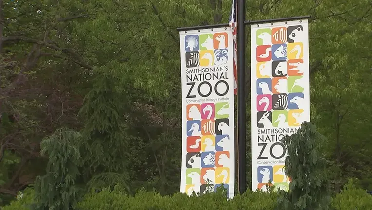
The silhouettes, they noted, were “graphically sophisticated, playful, and effective.” The rest risked feeling out of place in a naturalistic park setting. Their advice was telling: reduce the number of photographs, shrink the size, or eliminate them entirely in favor of simpler solutions. Sometimes the most responsible design decision is to take things out.
Materials That Age Well
The physical reality of park signage is brutal. Weather, sun, and the occasional vandalism mean signs need to survive conditions that would destroy ordinary materials.
High-pressure laminates have become a standard solution, sandwiching artwork between protective layers that resist the elements. Materials like Dura-wood mimic natural wood but with a resin finish that won’t rot. Weathering steel (corten steel) develops a rust-like patina that actually protects the metal and blends into natural environments. Digital imagery can be fused onto aluminum or porcelain for durability that lasts decades.

At the West Point Foundry Preserve in New York, designers from C&G Partners took a different approach. They mounted interpretive panels on steel-mesh armature filled with actual artifact bricks gathered from the foundry ruins. The signage doesn’t just tell the site’s story. It’s physically built from the story itself.
The Numbers That Actually Work
Sometimes the most impactful design is the most minimal.
At Congaree National Park, rangers are replacing color-coded trail markers with numbered brown tabs that have reflective stickers. The shift seems small, but it solves a real problem. In a floodplain where trails are constantly obscured by water and downed vegetation, simple reflective numbers help hikers stay on track. They also make it easier for someone to report their exact location if they need help.
The numbers themselves are minimal. But the thinking behind them is sophisticated: design that prioritizes function and safety over everything else.
Typography That Commands Attention
Here’s an interesting research finding: hikers rarely read trailhead signs. Decades of studies show that people in their “recreation mode” just don’t stop to read instructions, even when those instructions are meant to protect them or the park.
Will Rice, a professor at the University of Montana, teamed up with designer Jeremy Shellhorn from the University of Kansas to test whether better graphic design could change that behavior. Their students created signs for Missoula parks with different visual treatments, then sat in camp chairs pretending to picnic while they observed how hikers responded.
The results were striking. Signs that used “typography as image” visual treatments where the text intertwined with imagery like blooming plants or a dog leash and collar drew significantly more attention. Hikers actually stopped and read them. One hiker even wiped his dog’s paws on the boot brush designed to stop invasive plant spread.
The lesson is powerful: thoughtful design doesn’t just look better. It changes behavior in measurable ways.
When Accessibility Meets Wilderness
The Modulex design team faced an unusual challenge recently: creating wayfinding for a school serving children on the autism spectrum. The insights they developed have surprising relevance for park design.
The team discovered that neurotypical assumptions about symbols don’t always hold. For children with autism, highly abstract pictograms (like the standard WC bathroom symbol) may not register as meaningful. More realistic, detailed imagery that shows exactly what to expect, like a child approaching a toilet bowl, works better.
They also noted something that matters for any outdoor space: children on the spectrum often have a lower gaze angle. They see the world differently, literally. Effective design had to account for viewpoints that adults don’t share.
The broader lesson is that “universal design” sometimes isn’t enough. Accessibility can require specificity, empathy, and a willingness to design for real human perception rather than abstract standards.
The Underground Frontier
Some of the most challenging wayfinding design happens where no daylight reaches. In the wild caves at Yarrangobilly in Australia, designers and cavers have spent decades figuring out how to mark paths without permanently scarring fragile formations.
Early attempts were disastrous. Someone painted green arrows on cave walls in the 1960s, and those marks are still visible today despite efforts to remove them. Later approaches used reflective markers attached with epoxy, but those deteriorated after about 20 years and required scraping off. The current solution uses electric fence cord, a plastic cord with woven stainless steel, to create continuous lines that can be removed without trace if needed.
The tradeoffs are constant. Wire lines aren’t always continuous, and cavers sometimes go off track between marked sections. Signs indicate where to remove dirty boots before entering decorated areas. Some sections now use stainless steel stepping stones instead of plastic mats that trap mud.
Every intervention has an impact. The goal is to make that impact reversible.
What This Means for Designers
The principles that work in national parks apply far beyond them. Any project that touches sensitive environments, whether natural, cultural, or historical, can benefit from the same thinking.
- Interventions should be apparent when needed and invisible otherwise. The best design knows when to disappear.
- Less is almost always more. If you’re not sure whether an element is necessary, it probably isn’t. The National Zoo project was criticized not because any single element was bad, but because the cumulative effect was overwhelming.
- Materials matter deeply. Choose things that age gracefully, weather well, and can eventually be removed if needed. Design for the long arc of time.
- Real research beats assumptions. The Missoula project showed that designers and social scientists working together can actually measure what works. That kind of evidence is invaluable.
- Accessibility sometimes requires specificity. Universal solutions have limits. Designing for real human diversity means understanding how different people actually perceive the world.
The wilderness doesn’t need our help to be beautiful. It needs our help to stay wild, even as millions of people pass through it. That’s a design problem worth solving.
About the Author

Peter Makeshoff
Peter Makeshoff is the founder and main author of Designer Daily.