
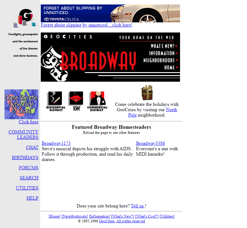
The web in the 1990s was a very different place. Geocities, the free web hosting service that launched in 1994, became the third most visited website on the internet . It was the first place where anyone could create their own website for free, giving millions of people their first taste of building something online . The aesthetic that emerged from this experiment was chaotic, amateurish, and deeply personal. It was also, in its own way, joyful.
The Joy of Self-Expression
Geocities sites were built by non-designers learning HTML, often through a simple text box with no live preview or WYSIWYG editor . Users could choose from a handful of templates, select their background and text colors, and enter their content . The result was often a mess, but it was their mess.
“Back then, your UI/UX skillset was defined entirely by how well you could slice up a Photoshop file,” recalls one designer who lived through the era. “Inline styles made your HTML tags run longer than the Dead Sea Scrolls. And somehow, we loved it” .
What made the era joyful was not the technical quality. It was the freedom to express without constraint. A Geocities page was a declaration of identity, not a conversion funnel. It contained personal interests, fan clubs, and family photos. It might have a guestbook, a hit counter, and a “Under Construction” GIF. These weren’t just decorations. They were evidence that someone had built something, that they were part of a community, that they had a voice.
The “Crazy” Aesthetic Was a Response to Constraints
The distinctive visual language of Geocities came from a collision of factors, not deliberate design choices.
Limited tools. CSS wasn’t created until 1999, and even then only cutting-edge browsers supported it . Layouts relied on nested tables and transparent GIFs to create structure . Images had to be tiny in file size to load over dial-up connections .
Personal expression. With no existing template culture, people invented their own design language by using “View Source” and “Save Image As…” on each other’s pages . The result was a spontaneous folk culture of untrained designers.
Novelty and experimentation. Color displays and GUIs were still relatively new. The web was trying to recreate the vivid, rich feel of multimedia CDs and interactive design trends of the era .
Competition for attention. In the early web, visibility was a challenge. Sites competed for status through linkbacks and visual spectacle, creating evolutionary pressure toward the extreme .
The Design Language of Joy
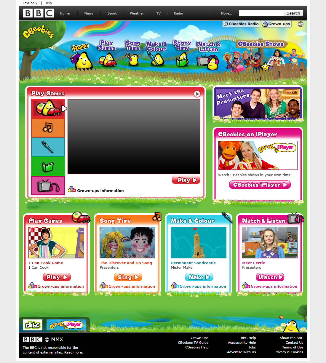
Geocities developed a visual vocabulary that, for all its garishness, was deeply expressive.
Animated GIFs were everywhere: spaceships, seals, skeletons, palm trees, and the immortal dancing baby. They moved and flashed, drawing the eye to fifty different spots on the page .
Repeating pattern backgrounds used tiles that were “cutted smartly enough so that the borders in between the repetitions would blend smoothly” . Users could choose from galaxies, roses, chainlinks, bricks, clouds, waves, and “fake bunched-up velvet curtains” .
Color and typography were intentionally clashing. Each letter in a title might be a different neon color. Text alternated between uppercase and lowercase, wrapped in decorative symbols, set in either Times New Roman, Comic Sans MS, or Impact .
Music played automatically. MIDI files of Star Wars, Mission Impossible, Titanic, or Mariah Carey would blare from the speakers, with no way to turn them off .
The “Personal Page Blue” template, introduced by Yahoo after its acquisition of Geocities in 1999, had a blue bordered background with a “touching roundish notch in the corner for the first letter of the user name” . It became ubiquitous and often repeated multiple times as pages grew longer than the template’s 1050-pixel height .
Beyond the Nostalgia
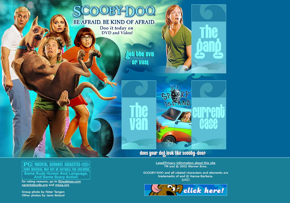
The amateur web of the 1990s was not just chaotic. It was a response to constraints that made expression possible. The Joyful design of Geocities was not a style to be copied but a philosophy to be understood.
Geocities made it accessible for anyone to publish. Users could create a page with a simple template, no credit card required, no technical knowledge needed . This accessibility broke what might have been a vicious cycle: “if people were going to visit the web, they needed meaningful content to view; but for creators to want to generate meaningful content, they needed visitors” .
The neighbourhood system, where sites were organized into thematic communities like “Area 51” for sci-fi or “Napa Valley” for dining, created a sense of place and belonging . It was an early experiment in online community that gave users a sense of being part of something larger.
The “Women of Great Taste” page, a digital recipe collection created by a group of 50 women, exemplifies this community spirit. The page used classical music, a cream-colored background, and traditional bordering to evoke Victorian elegance. It aimed to “bring back the warmth and community spirit of that time” . The site was not just a collection of recipes. It was a statement of identity.
What’s Lost When Everything Is Polished
The hand-built, Web 1.0 style is “a relic of a time when the web felt smaller, sillier, and a little more human” . Today’s web is polished, fast, and accessible, but it is also homogenous. Platforms like Facebook, Squarespace, and Shopify offer convenience at the cost of individuality . You choose a template, adjust some colors, and publish. The result is clean, professional, and indistinguishable from hundreds of other sites.
The loss is not just aesthetic. It is also the loss of the amateur as a creator. Geocities was a place where “non-designers” built things because they wanted to, because they had something to say, because they could. The joy of that era was not in the quality of the work. It was in the act of making it.
About the Author

Peter Makeshoff
Peter Makeshoff is the founder and main author of Designer Daily.