
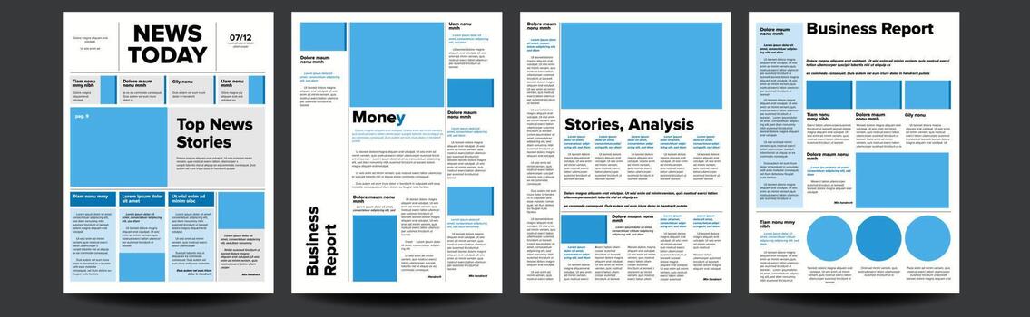
The newspaper is one of the oldest and most refined information design systems in existence. It has survived radio, television, and the internet. It has adapted to changing formats, audiences, and technologies. And through all of this, it has maintained a remarkably consistent approach to hierarchy. The newspaper knows something about how to guide the reader through a dense, complex, and heterogeneous set of information.
The Front Page as a Decision Engine
The front page of a newspaper is a decision engine. It presents a range of stories, each with a different level of importance. The reader must decide what to read first, what to read next, and what to skip. The hierarchy of the front page makes these decisions easier.
The most important story is the lead story. It occupies the most prominent position, usually at the top of the page. It has the largest headline and the most detailed summary. The reader knows, before reading a single word, that this is the most important story of the day.
The secondary stories occupy less prominent positions. They have smaller headlines and shorter summaries. The reader knows that these stories are less important but still worth considering. The hierarchy signals the relative importance of each story.
The tertiary stories are the briefest. They have the smallest headlines and the shortest summaries. The reader knows that these stories are important enough to include but not important enough to dominate. The hierarchy signals the diminishing importance of each story.
The Grid as a Structure
The newspaper layout is based on a grid. The grid organizes the content into columns, modules, and sections. The grid provides structure and consistency. It makes the page easier to scan.
The grid also creates a visual hierarchy. The most important stories occupy the most prominent positions. The less important stories occupy the less prominent positions. The grid reinforces the hierarchy.
The Typography as a Tool
Typography is one of the primary tools for establishing hierarchy in a newspaper. The headline is the largest and boldest text on the page. The subheadline is smaller and less bold. The body text is smaller still. The typography signals the relative importance of each element.
The newspaper also uses typography to create contrast. The headline is set in a different typeface than the body text. The subheadline is set in a different typeface than the headline. The contrast makes the hierarchy more visible.
The Bottom Line
The newspaper layout is a masterclass in hierarchy. It uses position, size, color, and typography to guide the reader through a dense, complex, and heterogeneous set of information. The front page is a decision engine. The grid provides structure. The typography provides contrast.
The newspaper knows that not all information is equally important. It knows that the reader needs to be guided. It knows that hierarchy is not about making everything look the same. It is about making the differences visible.
The next time you design a page, think about the newspaper. Think about the front page. Think about the grid. Think about the typography. The newspaper knows something about hierarchy. It is worth learning.
About the Author

Peter Makeshoff
Peter Makeshoff is the founder and main author of Designer Daily.