A poster that truly stays with you is rare. You see it and you cannot stop looking at it. You walk past and it follows you home. You remember it years later without having to search your memory. It is not the image that does this. A beautiful image is forgettable. An image that works with everything else? That is unforgettable.
Here is what makes a poster stick.
The Hierarchy of Attention
A poster has about two seconds to earn a glance. In that moment, the viewer decides whether to look away. The hierarchy must be immediate and obvious.
The dominant element. One element must be clearly the most important. A large headline. A bold graphic. A striking photograph. If nothing dominates, the eye wanders and the attention is lost.
The secondary element. Supporting information should be clearly subordinate. Smaller type. Less contrast. Less visual weight. The viewer should know, without thinking, what to read first, second, and third.
The tertiary element. Fine print, credits, and details should be almost invisible. They are necessary but not important. They should not compete for attention. The viewer should be able to ignore them until they need them.
The hierarchy is not a choice. It is a requirement. A poster without hierarchy is a jumble. A jumble is not remembered.
The Curiosity Gap
A poster that tells the whole story gives the viewer no reason to stay. A poster that hints at a story makes the viewer want to know more.
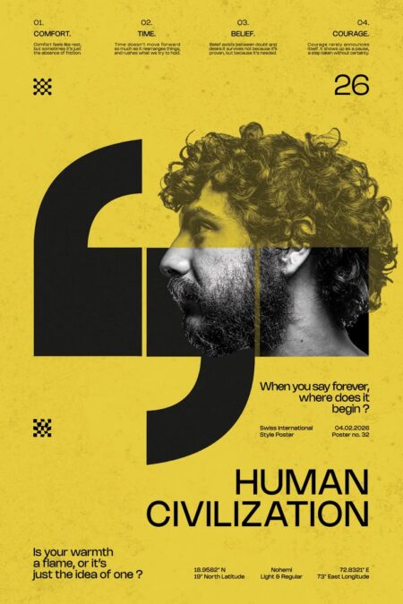
The incomplete image. A face partially obscured. A scene cropped in a strange place. The viewer’s brain fills in the missing parts. The act of completion is engaging.
The unexpected detail. A familiar object in an unfamiliar context. A color palette that does not match the subject. The viewer’s pattern recognition is triggered. They look again to resolve the inconsistency.
The unanswered question. The headline poses a question the viewer did not know they had. “Why is that man sitting on a chair in the middle of the road?” The viewer wants the answer.
The curiosity gap is not a trick. It is a promise. The viewer trusts that the poster has something worth knowing. That trust is earned.
The Typography That Speaks
Typography on a poster is not just text. It is voice. The typeface, size, and placement communicate before the words are read.
Display type. Large, bold type is for headlines. It should be confident. It should be legible from a distance. It should not be subtle.
Body type. Smaller type is for details. It should be readable. It should not distract from the display type.
The interaction. The relationship between headline and body type matters. The contrast in size, weight, and color tells the viewer what is important. The viewer reads the relationship before the words.
The typeface itself also communicates. A serif says “traditional.” A sans-serif says “modern.” A script says “elegant.” A display face says “attention.” The choice is a message.
The Color That Commands
Color is the first thing the viewer notices. It sets the emotional tone. It directs the eye. It creates the mood.
Contrast. A dark poster with light type reads as dramatic. A light poster with dark type reads as optimistic. High contrast creates urgency. Low contrast creates calm.
Palette. A limited palette is disciplined. An expanded palette is expressive. A palette that matches the subject is expected. A palette that contradicts the subject is memorable.
Value. Light values recede. Dark values advance. The poster that uses value to create depth is more effective than the poster that relies only on color.
The color is not decoration. It is structure. It is hierarchy. It is the first impression and the last.
The Space That Breathes
A poster that is too crowded is exhausting. The viewer wants to escape. A poster that has room to breathe is inviting. The viewer wants to stay.
Margins. Adequate margins prevent the poster from feeling like a wall of content. The margin is a rest for the eye.
Negative space. The areas without content are not wasted. They give the viewer permission to pause. They make the content feel important.
The relationship between positive and negative space. A poster with too much positive space is a wall of text. A poster with too much negative space is empty. The balance is the craft.
The space is not an afterthought. It is a design decision.
The Detail That Surprises
A poster that rewards close looking is a poster that stays with the viewer. The detail that is only visible up close invites intimacy.
The hidden element. A shape that only makes sense at a certain distance. A word that is hidden in the negative space. The viewer who discovers it feels a sense of accomplishment.
The texture. A paper that feels different from a screen. The texture invites touch. The touch deepens the connection.
The scale. A detail that is tiny compared to the whole. The viewer must lean in to see it. The leaning in is a commitment.
The detail is not a requirement. It is a reward. The poster that rewards the viewer is the poster that is remembered.
The Consistency
A poster that is inconsistent in its style, its tone, and its message is a poster that is forgotten. The viewer does not trust it. They move on.
The style. A poster that uses a single visual language feels authored. A poster that mixes styles feels careless. The viewer respects the authored poster.
The tone. A poster that is humorous in its headline and serious in its body type is inconsistent. The message is muddled. The viewer is confused.
The message. A poster that tries to say too much says nothing. A poster that says one thing clearly says enough.
Consistency is not boring. It is credible.
The Bottom Line
A beautiful image does not make a poster unforgettable. The hierarchy does. The curiosity gap does. The typography does. The color does. The space does. The detail does. The consistency does.
The image is one element among many. It can be the dominant element. It can be the supporting element. It can be absent. The poster can still work.
The viewer does not remember the image. They remember the feeling. The poster that creates a feeling creates a memory.
Design for the feeling. The image will follow. And the viewer will not forget.
About the Author

Peter Makeshoff
Peter Makeshoff is the founder and main author of Designer Daily.