
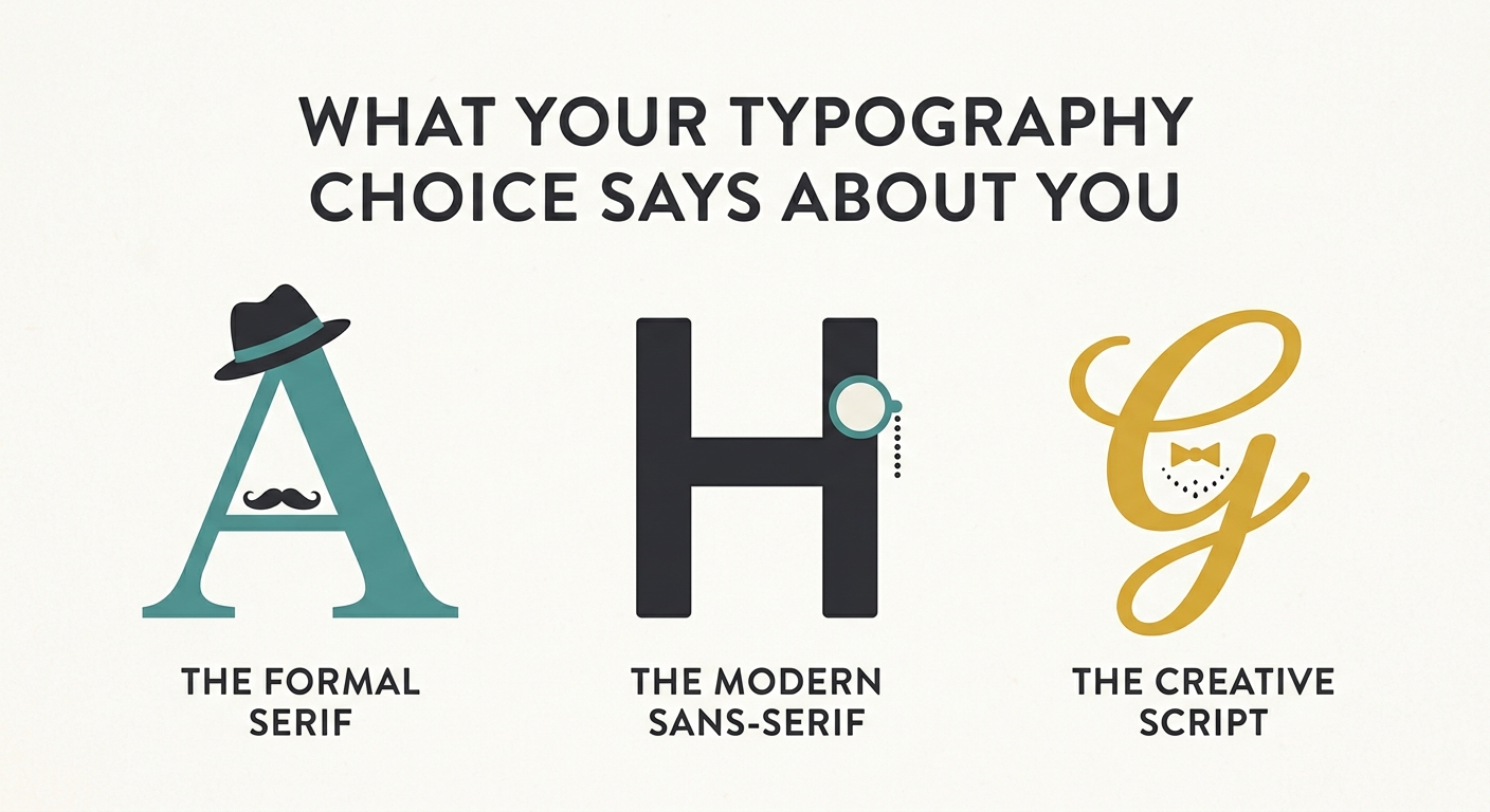
Typography is never neutral. Every typeface carries a set of associations, a personality, a history. When you choose a font, you are not just choosing a style. You are making a statement about who you are, what you value, and how you want to be perceived. The choice is rarely conscious. But it is always communicative.
The Signals of Type
Different typeface categories send different signals. These signals are not universal, and they are not fixed. But they are consistent enough to be recognizable.
Serif typefaces signal tradition, authority, and trust. They are the typefaces of newspapers, law firms, universities, and established institutions. When you choose a serif, you are aligning yourself with the past. You are saying: this is serious, this is credible, this is not a fad.
Sans-serif typefaces signal modernity, clarity, and efficiency. They are the typefaces of tech companies, startups, and contemporary brands. When you choose a sans-serif, you are aligning yourself with the present, or perhaps the future. You are saying: this is clean, this is functional, this is not weighed down by history.
Display typefaces signal creativity, personality, and confidence. They are the typefaces of fashion brands, music festivals, and artistic ventures. When you choose a display typeface, you are saying: this is expressive, this is bold, this is not afraid to stand out.
Monospaced typefaces signal technicality, precision, and authenticity. They are the typefaces of developers, engineers, and writers. When you choose a monospaced typeface, you are saying: I am logical, I am precise, I am not interested in decoration.
Script and handwritten typefaces signal warmth, informality, and personal connection. They are the typefaces of wedding invitations, artisanal brands, and personal blogs. When you choose a script typeface, you are saying: this is intimate, this is human, this is not corporate.
The Psychology of Choice
Why do designers choose the typefaces they do? The answer is not always rational. The choice is often driven by personal preference, cultural background, and professional habit. A designer who trained in the Swiss tradition will instinctively reach for Helvetica. A designer who came of age in the era of the DIY zine will reach for a hand-drawn script. The typeface is a reflection of the designer’s own history.
But the choice is also a reflection of the project. The brief, the audience, and the context all shape the decision. A fintech startup needs a sans-serif that feels trustworthy but not bureaucratic. A luxury fashion brand needs a serif that feels refined but not old-fashioned. The typeface is a response to the constraints of the project.
The Risk of Misalignment
The danger is not choosing the wrong typeface. The danger is choosing a typeface that is misaligned with the message. A funeral home that uses a playful script sends the wrong signal. A children’s brand that uses a heavy blackletter sends the wrong signal. A tech company that uses a default system font sends the signal that it does not care.
Typography is not decoration. It is communication. The typeface you choose is speaking to your audience before they read a single word. Make sure it is saying what you want it to say.
The Bottom Line
Your typography choice says something about you. It says something about your values, your training, and your taste. It says something about the project, the audience, and the context. It says something about the brand, the culture, and the moment.
You cannot avoid sending a signal. You can only choose which signal to send. Choose with intention. The typeface is not just a font. It is a statement.
About the Author

Peter Makeshoff
Peter Makeshoff is the founder and main author of Designer Daily.