
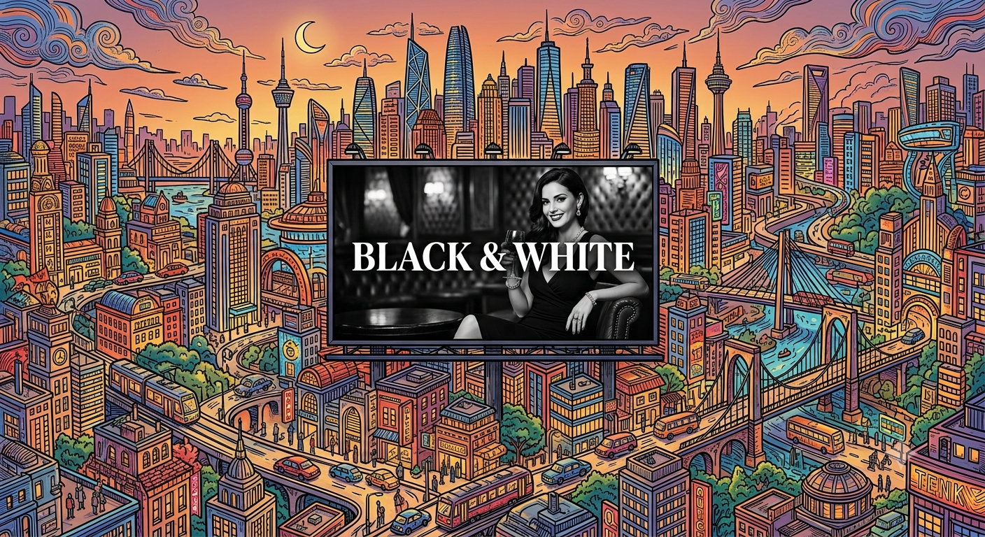
We live in a world of color. Screens are brighter, gradients are bolder, and palettes are more saturated than ever. The default is color. But in this landscape of visual noise, black and white works precisely because it is the exception. It is the silence between the notes. It is the thing that makes the color around it feel intentional.
Here is why black and white endures.
The Distraction Problem
Color is information. It tells the viewer what is important, what is related, and what is separate. But it is also a distraction. The eye is drawn to bright colors. The brain processes color before it processes content. The viewer sees the color before they see the meaning.
Black and white removes this distraction. The viewer sees the content, not the presentation. The form is not filtered through the color. It is seen directly.
This is why black-and-white photography is still used in journalism. It is why black-and-white typography is still used in editorial design. The removal of color forces the viewer to engage with the message.
The Contrast Advantage
Color is expressive. But it is also imprecise. A red that looks vibrant in one context looks muddy in another. A blue that seems calm on a bright screen looks flat on a dim one.
Black and white is exact. The contrast is absolute. There is no ambiguity. The viewer knows what is dark and what is light. The hierarchy is clear. The message is immediate.
This is why black-and-white logos are more legible at small sizes. It is why black-and-white layouts are easier to scan. The removal of color removes the ambiguity.
The Weight of History
Black and white is not neutral. It carries historical weight. It is the color of photography before color photography, of cinema before color film, of newspapers before color printing. It signals seriousness, authenticity, and permanence.
This is why luxury brands use black and white in their advertising. It is why high-end magazines use black-and-white photography for their editorial spreads. The association with history gives the work gravitas.
The viewer does not see a black-and-white image as incomplete. They see it as considered. The choice to remove color is a choice.
The Permanence
Color trends change. The palette that feels modern today will feel dated in five years. The gradient that looks cutting-edge will look tired in a decade.
Black and white does not date. It is not tied to a specific era. A black-and-white logo from 1950 does not feel like a 1950s logo. It feels like a logo that happens to be from 1950. A color logo from 1950 feels like a 1950s logo.
This is why brands that want longevity use black and white in their core identity. The color is added elsewhere. The foundation remains neutral.
The Practical Case
Black and white is also practical. It reproduces consistently across different media. It works on any background. It prints cleanly in any process. It does not require color management.
This is why designers use black and white for the early stages of design. It is why wireframes are black and white. It is why technical illustrations are black and white. The removal of color focuses the work on the structure.
The Exception
Black and white is not always the right choice. Some messages require color. Some brands cannot exist without it. The choice to use black and white should be intentional, not default.
The question is not “should I use color or black and white?” The question is “what is the message and what serves it best?” If the message is about emotion, color may be right. If the message is about form, black and white may be right.
The Bottom Line
Black and white works because it is the exception. In a color-obsessed world, it is the thing that stands out. It is not a lack of color. It is a choice. It is a statement. It is the intentional removal of distraction to reveal the content.
The viewer who sees a black-and-white image sees it differently. They see the form, the contrast, the composition. They see the craft. They do not see the color. They see the work.
That is the power of black and white.
About the Author

Peter Makeshoff
Peter Makeshoff is the founder and main author of Designer Daily.