There is a big difference between a watch that looks good in a press image and one that actually works on the wrist.
Spend enough time around the pre-owned market and patterns start to emerge. Certain designs hold up. Others, no matter how impressive they seem at launch, quickly lose appeal once they are worn, handled, and lived with.
The gap between those two outcomes usually comes down to design decisions that are easy to overlook but impossible to ignore over time.
The Problem With “Spec Sheet Design”
A lot of modern watches are built to impress on paper.
- larger case sizes
- thicker profiles
- more text on the dial
- exaggerated features
These things photograph well. They stand out online. But they don’t always translate to everyday wear.
Once on the wrist, the flaws become obvious. Cases feel unbalanced. Dials feel crowded. The watch draws attention, but not in a good way.
Design that is driven by specification rather than use tends to age quickly.
What Actually Holds Up
The watches that consistently perform well in the pre-owned market tend to share the same traits:
- restrained case sizes
- balanced proportions
- clear, legible dials
- minimal unnecessary detail
They don’t try too hard.
This is particularly noticeable in modern tool watches. The best examples feel purposeful. Every element has a reason to be there, and nothing feels forced.
Proportion Over Presence
Case size is often treated as the headline feature, but proportion is what really matters.
A well-designed watch sits flat, wears comfortably, and doesn’t feel top-heavy. Lug length, thickness, and bezel width all play a role.
When these are right, the watch disappears on the wrist in the best possible way. When they’re wrong, even a well-finished piece becomes awkward to wear.
This is one of the main reasons certain models continue to circulate strongly in the secondary market while others stall.
Why Simplicity Wins
Dial design is where most watches either succeed or fail.
The strongest designs are almost always the simplest:
- large, clearly defined markers
- consistent typography
- strong contrast
Anything beyond that needs to justify its presence.
Too many watches try to do everything at once. Multiple fonts, excessive text, and unnecessary complications create visual noise. It might look interesting at first, but it rarely holds up.
The Role of Familiarity
There is also a reason certain design languages continue to work.
Not because they are safe, but because they are proven.
Well-executed dive watches, for example, follow a structure that has been refined over decades. When done properly, it still feels current without needing to reinvent anything.
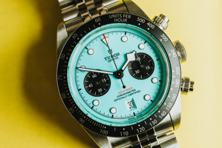
That is why models built around this approach continue to perform. If you look at the current pre-owned market, collections like the Black Bay line stand out for exactly this reason. They take established design cues and execute them cleanly rather than trying to force something new. A good overview of how these pieces are positioned can be seen across a range of pre-owned TUDOR watches currently in circulation.
What This Means for Buyers
From a design perspective, the safest watches are rarely the most exciting at first glance.
But they are the ones that:
- remain wearable long term
- avoid visual fatigue
- hold their appeal beyond the initial purchase
That is ultimately what separates a well-designed watch from one that is simply well-marketed.
Conclusion
Design is easy to get right in isolation. It is much harder to get right over time.
The watches that succeed are not the ones that chase attention. They are the ones that prioritise balance, clarity, and usability. They don’t need to convince you. They just work.
About the Author

Peter Makeshoff
Peter Makeshoff is the founder and main author of Designer Daily.