
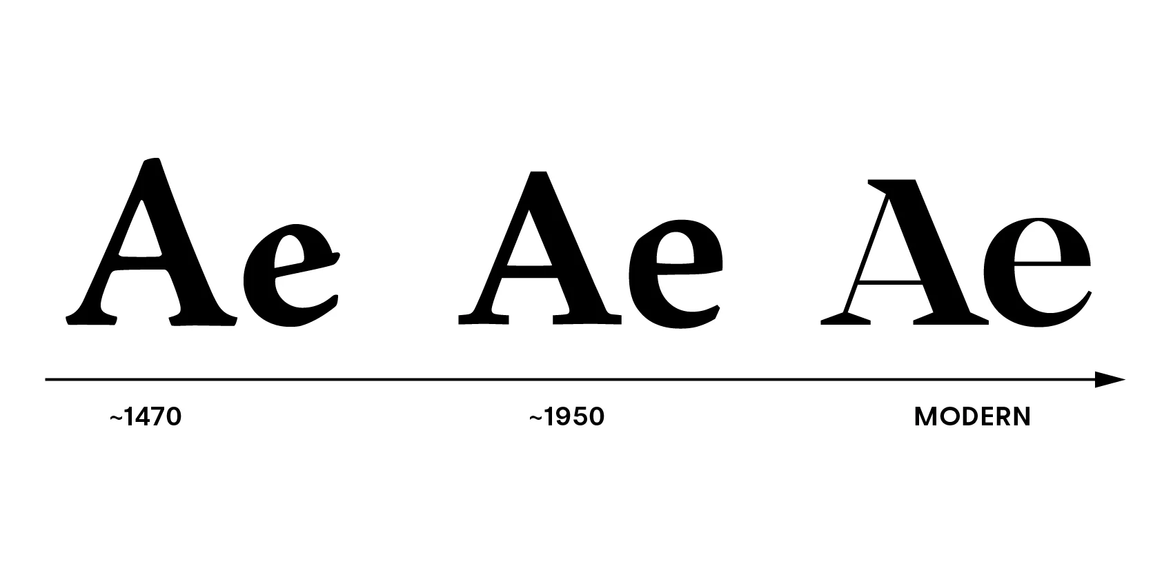
There was a time when serif typefaces were considered the only appropriate choice for serious communication. Books were set in serifs. Newspapers were set in serifs. Formal documents were set in serifs. Sans-serifs were for display, for advertising, for the kind of communication that did not need to be taken seriously.
This has changed. Sans-serifs now dominate corporate identity, user interfaces, and public signage. They are the default choice for brands that want to appear modern, clean, and efficient. The shift was not accidental. It was driven by technology, culture, and a fundamental change in how we read.
But the shift also came with a loss. The serif is not just a decorative flourish. It is a functional tool that supports reading. Understanding what was lost is essential for making informed typographic decisions.
The Rise of the Sans-Serif
The modern sans-serif emerged in the early 20th century as a rejection of ornament. The Bauhaus movement championed a design philosophy that stripped away decoration in favor of function. The sans-serif was the typographic expression of this philosophy. It was clean, rational, and universal.
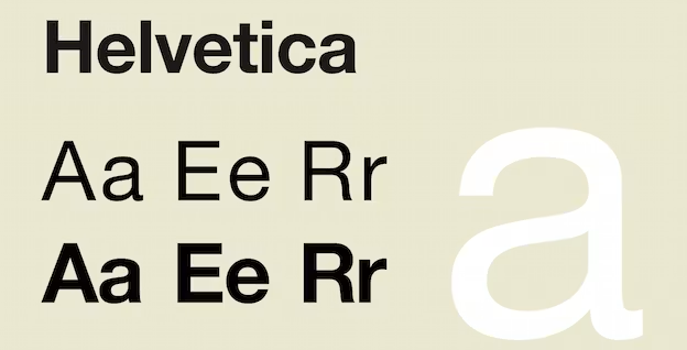
The mid-20th century saw the rise of Helvetica and its imitators. The typeface was designed to be neutral, to have no personality of its own. It was meant to be a transparent container for content, not a statement in itself. Brands adopted it because it was safe, reliable, and efficient.
The digital revolution accelerated the shift. Sans-serifs rendered better on low-resolution screens. They were easier to read at small sizes. They required less memory and loaded faster. The practical advantages made them the default choice for digital design.
What Was Lost
Individuality. A serif typeface has a distinct personality. The bracketed serifs of a transitional face are different from the slab serifs of an Egyptian face. The contrast of a modern face is different from the weight of a Clarendon. These differences are subtle, but they are meaningful. A sans-serif is a statement of neutrality. A serif is a statement of character.
Readability. Serifs support reading. They guide the eye along the line. They distinguish between similar letterforms. The lowercase ‘l’ and the uppercase ‘I’ are clearly different in a serif face. In a sans-serif, they are often identical. This is not a minor issue. It is a functional loss.
Authority. Serifs have a long history. They are associated with books, newspapers, and formal documents. They signal tradition, expertise, and trustworthiness. A serif typeface carries this history with it. A sans-serif does not.
Warmth. Serifs have a human quality. They are the product of centuries of refinement by skilled craftsmen. They are not neutral. They are not efficient. They are not safe. They are human.
The Bottom Line
The sans-serif is a modern tool for a modern age. It is efficient, neutral, and universal. These are its strengths. They are also its limitations.
The serif is not obsolete. It is different. It is individual, readable, authoritative, and warm. These are its strengths. They are also its limitations.
The choice between serif and sans-serif is not a choice between good and bad. It is a choice between two different modes of communication. The designer who understands this can make an informed decision. The designer who does not will default to the default.
Use sans-serifs when you need neutrality. Use serifs when you need character. Use both when you need contrast. The typographic palette is richer than one choice. Use it.
About the Author

Peter Makeshoff
Peter Makeshoff is the founder and main author of Designer Daily.