
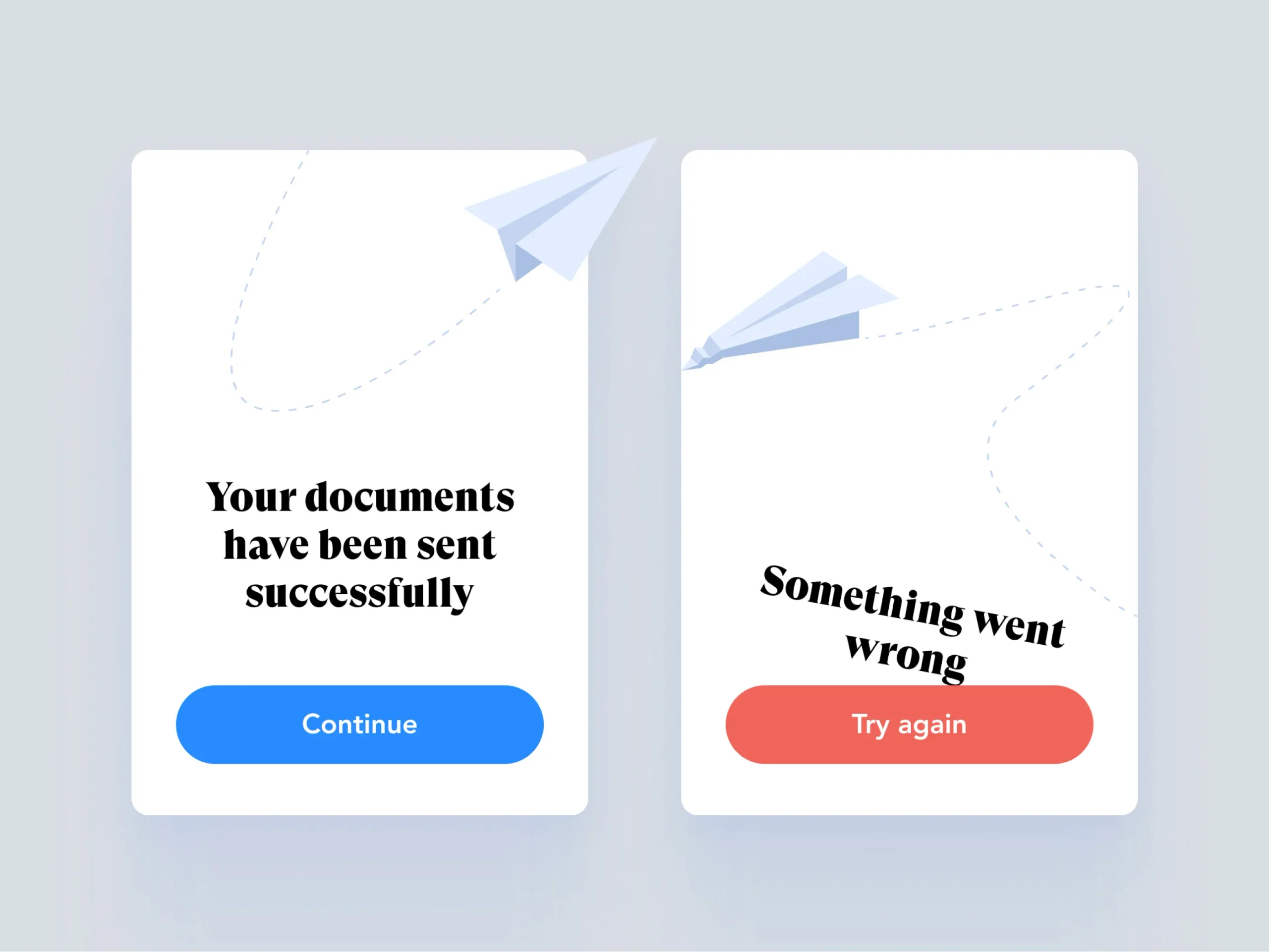
Error messages are one of the most important parts of any interface. They tell users what went wrong and how to fix it. They prevent frustration, reduce support tickets, and build trust. But most users do not read them. They click through, dismiss, or ignore the message entirely. This is not because users are lazy or careless. It is because error messages are designed to be ignored.
The Psychology of Error Messages
Users approach error messages with a specific mindset. They have just attempted a task and failed. They are frustrated, annoyed, or embarrassed. They want to move past the failure as quickly as possible. The error message is an obstacle, not a resource.
When a user encounters an error, their cognitive load is already high. They are processing the failure, the frustration, and the implications. The error message adds another layer of information to process. If the message is poorly designed, they will not engage with it. They will skip it, hoping that the problem resolves itself.
The Design of Ignored Error Messages
Error messages are ignored when they are designed to be ignored. The most common failures include:
Technical jargon. “Error 500: Internal Server Error.” This message tells the user nothing. It is a code, not a communication. The user cannot act on it because they do not understand it.
Vague language. “Invalid input.” What input? Why is it invalid? How do I fix it? The message raises more questions than it answers.
Visual design that blends in. A small, gray text message at the top of the page. The user’s eye skips over it. The message is present but invisible.
No clear path forward. The message states the problem but does not offer a solution. The user is left to guess what to do next.
The Principles of Effective Error Messages
Effective error messages follow a different set of principles.
Be specific. “Your email address is missing the @ symbol.” This message tells the user exactly what went wrong and exactly how to fix it.
Be clear. Use plain language. Avoid jargon. The user does not need to know that a database query failed. They need to know that the form could not be submitted and why.
Be visible. The error message should be impossible to miss. Use a prominent color, a clear icon, and a position that the user’s eye will naturally land on.
Be helpful. The message should offer a solution. “Please enter your email address in the format name@example.com.” This tells the user what to do next.
Be human. The message should sound like it was written by a person, not a machine. “Oops, that didn’t work. Let’s try again.” This tone is more engaging and less intimidating.
The Bottom Line
Users do not read error messages because error messages are designed to be ignored. The solution is not to blame the user. The solution is to design better messages. Specific, clear, visible, helpful, and human. The user who understands the error is the user who can fix it. The user who can fix it is the user who will stay.
About the Author

Peter Makeshoff
Peter Makeshoff is the founder and main author of Designer Daily.