
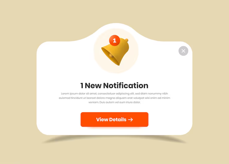
The popup is the most reviled element in digital design. It interrupts. It demands attention. It blocks content. And yet, it persists. Marketers defend it because it works, the data shows that popups can increase email signups, reduce cart abandonment, and drive conversions. But the users do not read them. They close them. They dismiss them. They install ad blockers to avoid them.
The gap between the marketer’s intent and the user’s experience is the gap between a design that is optimized for conversion and a design that is optimized for reading. The popup is designed to be seen, not to be read. And that is precisely why users do not read it.
The Interruption Problem
A popup interrupts the user’s task. They were reading an article, browsing a product, or filling out a form. The popup appears, and the task is suspended. The user must now process new information, make a decision, and dismiss the popup before continuing. The interruption is a cost, and the user is primed to minimize that cost.
The fastest way to dismiss a popup is to close it. The user’s eye goes straight to the close button. They do not read the headline. They do not read the offer. They do not read the fine print. They click the X and return to what they were doing.
This is not because the user is lazy or careless. It is because the popup has trained them to behave this way. Every popup they have encountered has demanded something from them. They have learned that the fastest way to get back to the task is to dismiss the interruption without engaging.
The Design of Ignored Popups
Popups are designed to be ignored. The design choices that make them effective at grabbing attention are the same choices that make them unreadable.
The large, bold headline. The headline is designed to be visible, not to be read. It is a billboard, not a message. The user sees the shape of the text, not the content.
The small close button. The close button is deliberately small and subtly placed. The intent is to make it harder to dismiss. The result is to make the user angry. They find the button, click it, and leave with a negative impression of the brand.
The dark pattern. Some popups hide the close button behind a delay, a maze, or a confusing interface. The user is forced to engage with the popup to dismiss it. They do not read the content. They fight the interface.
The irrelevant offer. The popup offers something the user does not want. A newsletter they did not ask for. A discount they did not request. A product they were not looking for. The user does not read the offer because it is not relevant to their task.
The Alternative
The alternative to the popup is not “no marketing.” It is marketing that respects the user’s task.
The inline offer. Instead of interrupting the user with a popup, place the offer inline. A newsletter signup form at the bottom of the article. A related product recommendation after the main content. A discount code in the footer. These are visible, but they do not block the user’s task. The user can engage with them if they choose.
The exit intent. Instead of triggering the popup when the user arrives, trigger it when they are about to leave. The user has finished their task. They are about to navigate away. The popup offers a last chance to engage. The interruption is timed to the user’s behavior, not the marketer’s schedule.
The native format. Instead of a popup that looks like an advertisement, design the offer to look like part of the page. A card that blends into the layout. A banner that complements the content. The user is more likely to read something that feels native to the experience.
The value exchange. Instead of asking for the user’s email before they have received any value, offer something in exchange. A free resource. A useful tool. A discount on their first purchase. The user is more likely to engage if they understand what they are getting.
The Bottom Line
Users do not read popups because popups are designed to be dismissed. The interruption, the small close button, the irrelevant offer, these are features, not bugs. They are the result of a design philosophy that prioritizes the marketer’s goals over the user’s experience.
The alternative is not to abandon marketing. It is to design marketing that respects the user’s task. The inline offer. The exit intent. The native format. The value exchange. These are not just more ethical. They are more effective. The user who reads the offer is the user who converts. The user who dismisses the popup is the user who leaves. Design for the reading user. The rest will follow.
About the Author

Peter Makeshoff
Peter Makeshoff is the founder and main author of Designer Daily.