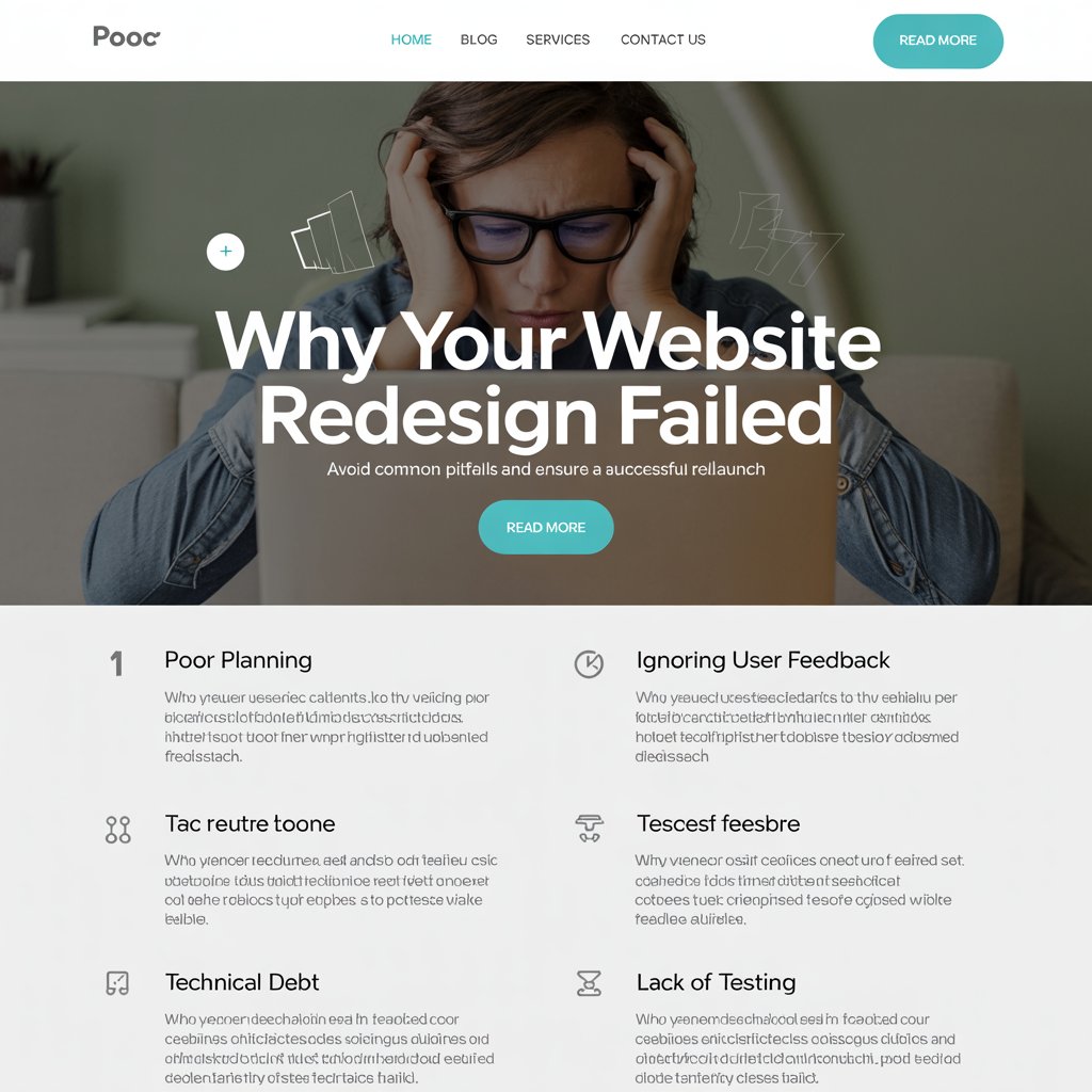
You spent months planning it. Weeks executing it. Thousands of pounds on it. Your shiny new website launched with fanfare, looking absolutely stunning in every browser. Then reality hit.
Traffic dropped. Leads dried up. Sales plummeted. Your beautiful redesign had somehow made things worse, not better. You’re not alone—this scenario plays out hundreds of times across the UK every month, leaving business owners scratching their heads and designers questioning their approach.
The problem isn’t that your website looks bad. Often, it’s the opposite. Modern website design focuses so heavily on visual appeal that crucial conversion elements get overlooked. The result? Websites that win design awards but lose customers.
After helping dozens of businesses across Northern Ireland and beyond recover from redesign disasters, we’ve identified the seven most common mistakes that turn promising projects into conversion killers. More importantly, we’ll show you exactly how to fix them.
Mistake 1: Prioritising Beauty Over Speed
Your website might look like a million dollars, but if it takes five seconds to load, you’ve lost half your visitors before they see a single pixel. Google’s data shows that 53% of mobile users abandon sites that take longer than three seconds to load. Yet redesign after redesign ignores this fundamental truth.
The culprits are usually obvious once you know where to look. Massive hero images that aren’t optimised. Slider plugins that load dozens of unnecessary scripts. Video backgrounds that look impressive but murder load times. Custom fonts loaded from external servers. Each element might seem small, but together they create a perfect storm of poor performance.
We recently audited a Manchester-based retailer’s website that looked absolutely gorgeous but loaded slower than dial-up internet. Their bounce rate had increased by 40% after their redesign. The solution involved compressing images, removing unnecessary plugins, and implementing proper caching. Their load time dropped from 7.2 seconds to 2.1 seconds, and conversions immediately improved by 23%.
The fix isn’t complicated, but it requires discipline. Before adding any design element, ask yourself: does this improve the user experience enough to justify the performance cost? Often, the answer is no.
Modern web development approaches this systematically, building performance considerations into every design decision from day one rather than trying to optimise afterwards.
Mistake 2: Mobile-Last Thinking in a Mobile-First World
Here’s a sobering statistic: over 60% of web traffic comes from mobile devices. Yet countless redesigns still start with desktop layouts and try to squeeze everything into smaller screens as an afterthought. This backwards approach creates experiences that feel cramped, confusing, and frustrating on the devices most people actually use.
Mobile-last design shows up in obvious ways. Tiny buttons that require surgical precision to tap. Navigation menus that disappear behind hamburger icons without clear indication. Forms that take forever to complete on touchscreens. Content that’s readable on a 27-inch monitor but requires zooming on a phone.
But the problems run deeper than just sizing. Mobile users behave differently from desktop users. They’re often multitasking, in poor lighting conditions, or dealing with distractions. They need larger touch targets, clearer visual hierarchies, and more prominent calls-to-action. When your redesign ignores these behavioural differences, conversions suffer regardless of how pretty everything looks.
The solution requires a fundamental shift in thinking. Start every design decision with mobile users in mind. Design for thumbs, not mouse cursors. Prioritise the most important content and actions, because mobile screens force you to make tough choices about what matters most.
Testing on actual devices reveals problems that desktop browser simulations miss. That beautiful animation might look smooth on your MacBook Pro but stutter on a three-year-old Android phone. Those subtle colour differences might be invisible in bright sunlight. Real-world testing exposes these issues before they impact your users.
Mistake 3: Ignoring the Content-Design Marriage
Beautiful design without strategic content is like a sports car without an engine—impressive to look at but useless for getting anywhere. Yet redesign projects routinely treat content as an afterthought, filling gorgeous layouts with placeholder text and hoping someone will figure out the messaging later.
This disconnect creates websites that look professional but communicate nothing. Headlines that sound clever but don’t explain what you actually do. Body text that uses industry jargon instead of language your customers understand. Calls-to-action that blend into the background instead of standing out.
Content and design must work together from the beginning. Your value proposition should drive layout decisions. Your target audience should influence colour choices and typography. Your business goals should determine which elements get prime real estate on each page.
The most successful redesigns start with content strategy, not visual concepts. What story are you trying to tell? What questions do visitors need answered? What actions do you want them to take? Once you have clear answers, design becomes a tool for supporting these objectives rather than an end in itself.
This means involving copywriters in design discussions and designers in content planning. It means creating wireframes with real content, not lorem ipsum. It means testing how your actual messaging works with your chosen layouts before you commit to either.
Mistake 4: Accessibility as an Afterthought
Approximately 20% of the UK population lives with some form of disability, yet most redesigns completely ignore accessibility until someone complains or threatens legal action. This isn’t just ethically questionable—it’s business suicide. You’re potentially excluding one in five visitors from using your website effectively.
Accessibility problems often hide behind beautiful design. Low contrast colour schemes that look sophisticated but are unreadable for users with visual impairments. Custom fonts that don’t display properly with screen readers. Navigation systems that work perfectly with a mouse but are impossible to use with keyboard-only input.
The irony is that accessible design usually improves the experience for everyone, not just disabled users. Clear visual hierarchies help all users understand your content better. Descriptive link text benefits both screen reader users and search engines. Proper form labels make filling out forms easier regardless of how someone accesses your site.
Building accessibility into your redesign process isn’t complicated, but it requires planning. Choose colour combinations that meet contrast guidelines. Structure your HTML properly so screen readers can navigate logically. Test your site with keyboard navigation. Add alt text to images that actually describes their content and context.
The Web Content Accessibility Guidelines (WCAG) provide clear standards for making websites accessible. Following these guidelines isn’t just good practice—it’s increasingly required by law. The UK’s Equality Act makes website accessibility a legal requirement for many businesses, and enforcement is becoming more common.
Mistake 5: Navigation That Confuses Instead of Guides
Your navigation menu might be the most important element on your website, yet it’s often treated as a design afterthought. Clever navigation concepts that prioritise style over usability leave visitors confused about where to find what they’re looking for. When people can’t find what they need quickly, they leave.
The problems usually stem from trying to be too creative or too comprehensive. Mysterious icon-based navigation that requires guessing what each symbol means. Mega-menus that overwhelm users with dozens of options. Category names that make sense to your internal team but confuse your customers.
Clear navigation follows predictable patterns because predictability builds trust. Users expect certain things in certain places. Your logo should link to your homepage. Contact information should be easy to find. Product or service categories should be clearly labelled with language your customers actually use.
This doesn’t mean your navigation has to be boring. It means the structure should be logical and the labels should be clear. Save creativity for elements that don’t directly impact usability. Users come to your website to accomplish tasks, not to admire your innovative approach to menu design.
Testing navigation with real users reveals problems that internal teams miss. What seems obvious to someone who works with your products daily might be completely mystifying to first-time visitors. Simple user testing sessions can identify these issues before they impact your conversion rates.
Mistake 6: SEO Sacrificed for Style
A beautiful website that nobody can find is a expensive digital brochure, not a business asset. Yet redesign projects routinely sacrifice search engine optimisation for visual appeal, treating SEO as something that can be “added later” rather than integrated from the beginning.
The damage often happens in subtle ways. URL structures that change without proper redirects, causing months of established rankings to disappear overnight. Image-heavy designs that don’t include proper alt text or structured data. Custom content management systems that generate poor HTML or lack basic SEO functionality.
Sometimes the problems are more obvious. Entire sites built in Flash or heavy JavaScript frameworks that search engines struggle to crawl. Single-page applications that look modern but provide no way for search engines to understand individual sections. Image-based text that looks sleek but provides no content for search engines to index.
Protecting your search rankings during a redesign requires careful planning. Document your current top-performing pages and their keywords. Create a redirect strategy for any URLs that change. Maintain or improve your site’s technical SEO foundation while implementing your new design.
The best approach integrates SEO considerations into every design decision. Page layouts should support natural keyword placement. Image choices should consider both visual impact and optimisation opportunities. Technical architecture should balance design flexibility with search engine compatibility.
Modern content management systems can support both great design and strong SEO, but only if both considerations influence the initial planning process.
Mistake 7: Launching Without Measuring What Matters
You’ve fixed the speed issues, optimised for mobile, aligned content with design, built in accessibility, clarified navigation, and protected your SEO. Your redesigned website launches successfully, and then… nothing. No measurement plan, no conversion tracking, no way to determine whether your investment actually improved business results.
This measurement gap turns redesign projects into expensive guessing games. You might have opinions about what’s working better, but without data, you can’t make informed decisions about future improvements. Even worse, you might be missing obvious problems that could be fixed with minor adjustments.
Effective measurement starts before launch with clear baseline metrics. What were your conversion rates before the redesign? How long did visitors spend on key pages? Which traffic sources provided the best leads? Without this baseline data, you can’t determine whether changes actually improved performance.
The metrics you track should align with your business goals, not just website activity. If your goal is generating leads, focus on form completions and contact inquiries. If you’re selling products online, track purchase conversions and average order values. Vanity metrics like page views might make you feel good but don’t necessarily indicate business success.
Post-launch measurement should be ongoing, not a one-time check. User behaviour patterns take time to establish, and seasonal factors can skew short-term results. Plan for at least three months of data collection before drawing conclusions about your redesign’s success.
How ProfileTree Approaches Redesign Projects Differently
At ProfileTree, we’ve seen too many redesign disasters to approach projects casually. Our process starts with understanding your business goals and current performance metrics before any design concepts get discussed. We audit your existing website’s strengths and weaknesses, identify conversion bottlenecks, and establish clear success criteria for the new site.
“Too many agencies get excited about creating something that looks amazing without considering whether it actually helps the business grow,” explains Ciaran Connolly, Director of ProfileTree. “We start every conversation with revenue goals, not design trends. The visual elements should support business objectives, not overshadow them.”
Our redesign process integrates performance, accessibility, and SEO considerations from day one rather than trying to retrofit them later. We build conversion tracking into the initial architecture, test on real devices throughout development, and create comprehensive measurement plans before launch.
Every redesign includes a detailed migration strategy to protect existing search rankings and traffic sources. We implement proper redirects, maintain URL structures where possible, and monitor search performance closely during the transition period. Our goal is to improve results immediately, not rebuild them over months.
This systematic approach has helped dozens of businesses across Northern Ireland, Ireland, and the UK avoid the common pitfalls that turn promising redesigns into conversion killers. We measure success in business results, not design awards.
The Real Cost of Redesign Failures
Failed redesigns cost more than just the initial investment. Lost search rankings can take months to recover. Decreased conversion rates impact revenue immediately. Poor user experiences damage brand reputation in ways that extend far beyond your website.
The opportunity cost might be even higher. While you’re fixing problems created by a poorly planned redesign, your competitors are gaining ground. The time and resources spent on damage control could have been invested in growth initiatives instead.
Getting your redesign right the first time requires more upfront planning but delivers better long-term results. It means involving technical experts early in the process, testing concepts with real users, and prioritising business objectives over design trends.
Moving Forward: Redesign Success Strategies
If you’re planning a website redesign, start with clear business objectives and success metrics. Understand your current performance before changing anything. Involve technical experts in early planning discussions, not just final implementation.
Test early and often throughout the process. Gather feedback from real users, not just internal stakeholders. Measure performance impact, not just visual appeal. Plan for ongoing optimisation rather than expecting perfection at launch.
If your recent redesign hasn’t delivered expected results, don’t panic. Most common problems can be fixed with targeted improvements rather than starting over completely. Focus on the biggest issues first—usually speed, mobile experience, or conversion path clarity.
The goal isn’t to create the most beautiful website on the internet. It’s to create a website that helps your business grow while providing excellent experiences for your customers. When those priorities align, good design and strong results naturally follow.
Website redesigns will continue to fail as long as agencies and businesses prioritise appearance over performance. The solution isn’t avoiding redesigns—it’s approaching them with business results as the primary objective and design as the supporting tool. Get that balance right, and your next redesign will drive growth instead of destroying it.
About the Author

Peter Makeshoff
Peter Makeshoff is the founder and main author of Designer Daily.