Your YouTube thumbnail is the most important design asset you’ll create for a video. It’s not decoration. It’s advertising. Viewers decide whether to click in less than a second, often on a screen the size of a playing card. The difference between a video that gets 10,000 views and one that gets 100,000 is frequently the thumbnail, not the content.
Here’s what the data says about thumbnails that actually get clicked.
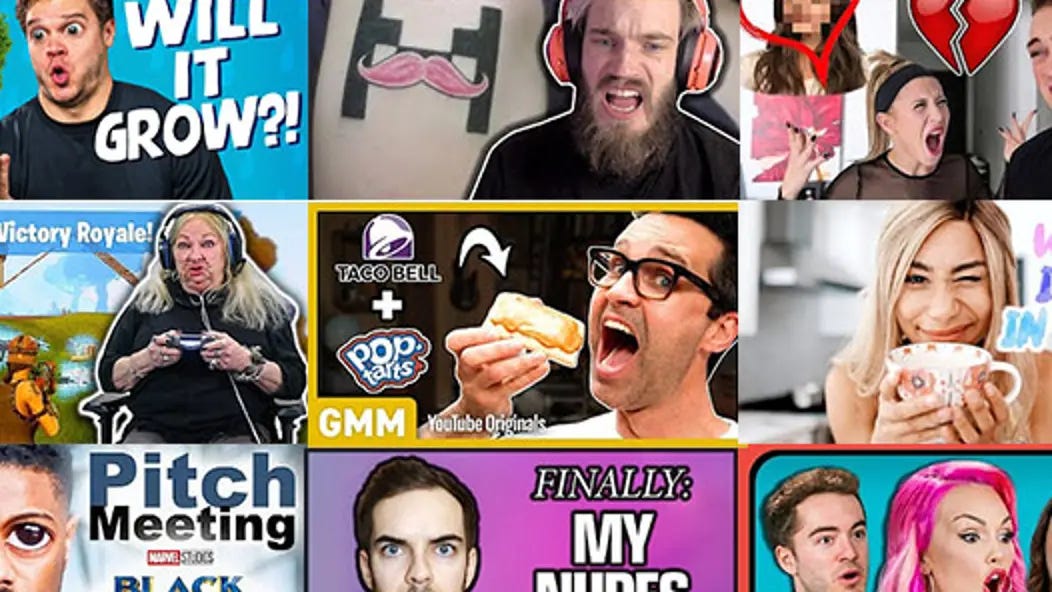
The Face Factor
Thumbnails with human faces consistently outperform those without. But not just any face. The expression matters enormously.
- Eye contact is powerful. Faces looking directly at the camera create a sense of connection and urgency. Viewers feel addressed personally, which increases the likelihood of clicking.
- Exaggerated expressions work. Surprise, curiosity, concern, excitement,these emotions read clearly at small sizes. Subtle expressions get lost. A genuinely surprised face with raised eyebrows and open mouth signals that something worth watching happened.
- Cropping matters. The face should fill a significant portion of the frame. A tiny head surrounded by context gets ignored. A close crop that shows eyes, mouth, and expression is instantly readable.
Color and Contrast
Your thumbnail competes with the YouTube interface itself: white text, gray backgrounds, and the adjacent thumbnails from other creators.
- Bright against dark wins. A bright subject (face, product) against a dark or blurred background creates immediate separation. This is why so many successful creators use dark gradients behind their subject, the eye goes straight to the illuminated area.
- Complementary colors attract attention. Colors opposite each other on the color wheel (blue/orange, red/green, purple/yellow) create natural visual tension. The orange arrow against a blue background isn’t an accident, it’s color theory in action.
- Test on a small screen. Before publishing, shrink your thumbnail to the size it will appear on a phone. If you can’t read the expression or distinguish the subject, it needs more contrast.
Text: Less Is More
Text in thumbnails is declining in effectiveness. YouTube’s interface already overlays the video title. Adding more text creates redundancy and clutter.
- Three to four words maximum. Any more becomes illegible at thumbnail size. Use text to add context or curiosity that the title doesn’t capture, not to repeat it.
- Bold, sans-serif fonts only. Serifs and decorative typefaces blur at small sizes. Stick to bold, clean letterforms. White text with a dark outline or shadow remains readable against any background.
- Consider no text. Many of YouTube’s most successful creators now use textless thumbnails, relying entirely on expression, composition, and context. This approach is harder to execute but can feel more authentic and less “clickbaity.”
The Trust Factor
A thumbnail that promises something the video doesn’t deliver will get clicks. It will also destroy your audience retention and tell YouTube that viewers don’t want to watch your content.
- The algorithm watches watch time. YouTube promotes videos that keep people watching. A misleading thumbnail generates initial clicks, but those viewers leave quickly. The algorithm interprets this as a bad video and stops suggesting it.
- Accurate intrigue wins. The best thumbnals raise a question that the video answers. They hint at something surprising without revealing it entirely. They create curiosity, not confusion.
Thumbnail Styles That Work in 2026
The Reaction Face
A single face with an exaggerated expression (shock, laughter, concern). Often paired with a blurred or simple background. Works for commentary, reaction videos, and personal content.
The “Before/After” Split
Two contrasting images side by side showing a transformation. Common in DIY, cooking, fitness, and restoration content. The visual promise of change is powerful.
The Bold Arrow/ Circle
An arrow or circle pointing to a specific detail. Directs attention exactly where you want it. Effective for tutorials, reviews, and “you missed this” content.
The Minimalist
One striking image, no text, no arrows. Often used by established creators with recognizable faces or styles. High risk, high reward. Requires strong composition and immediate readability.
Testing Your Thumbnail
The most successful creators don’t guess. They test.
The thumbnail shuffle. YouTube now allows creators to upload up to three thumbnails for a video. The platform automatically tests which performs best and serves that version to most viewers. Use this feature.
A/B test with yourself. Before publishing, ask a few people who match your target audience which thumbnail they’d click. Don’t ask designers. Ask viewers.
Analyze your own data. Which of your videos have the highest click-through rates? What do those thumbnails have in common? Do more of that.
Common Mistakes
Too much detail. A cluttered thumbnail is an ignored thumbnail. Simplify. Remove everything that doesn’t help someone understand the video in half a second.
Inconsistent branding. If your thumbnails look completely different from video to video, returning viewers won’t recognize your content. Establish a consistent visual language, colors, composition, typography, and stick to it.
Small text. If you have to zoom in to read it, it’s too small. Assume your viewer is holding their phone at arm’s length in a moving train.
Fake expressions. A clearly staged “surprised” face with no connection to the actual video content creates distrust. Genuine reactions from the video itself make better thumbnails than staged photos.
The Bottom Line
Your thumbnail is the first and sometimes only chance to earn a click. It must work at a fraction of the size you designed it, competing with dozens of other thumbnails, and be processed in less than a second.
Face, contrast, simplicity, and honesty are the pillars. Everything else is optional. Design thumbnails that make a promise, then keep it. The algorithm will reward you. Your audience will trust you. And your videos will finally get the attention they deserve.
About the Author

Peter Makeshoff
Peter Makeshoff is the founder and main author of Designer Daily.