The understanding of a ‘modern website’ is often morphed with the passing by of time and the emergence of new trends in design. Mainstream web media is often shaped by a new flux of design trends that pours in fresh life into the websites turning boorish. Creative agencies are always working on bringing their imaginations into reality and turning them into a widely accepted design trend. With the turn of every year sees some of the design trends becoming obsolete will a few new ones find their place among the key trends for the year.
The shift in user habits should be documented by new web design trends and there is never a one-size-fits-all solution to this issue. Bold typography, Minimalistic design, Big imagery are now at the centre of web design trends and we will be taking a look at the 7 of the best web design trends to flourish in 2015.
Mobile-first Responsive Web design
Google’s recent announcement makes it clear that webpages that are mobile-ready and pass their mobile-friendly test will benefit more in the upcoming search algorithm updates. Responsive Web Design needs no introduction as this design trend has been quickly adopted by many web developers and will continue to do so in 2015. No matter what screen the user is browsing from, the Responsive Web Design makes sure the website is scaled up or down to perfectly fit the screen, without any alterations to the original layout and formatting.
The content and layout has to be retained on screens of different sizes and shapes to make sure the site’s SEO is in proper order. Having two URL’s for Mobile and Desktop users is not feasible anymore as Google prefers indexing of only one main URL for one site.
Large, Dynamic Media as Backgrounds
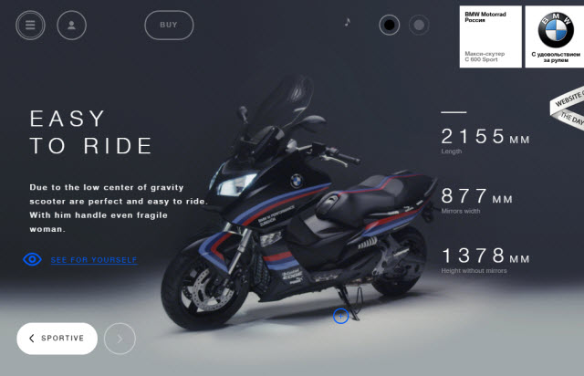
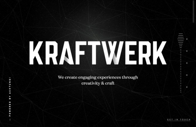
‘Less is more’ and web design trends also seem to be in fine tune with that notion. High quality and dynamic Imageryare all the new rage in web design and they are quickly replacing hordes of textual content. The one-page simplified design with dynamic and rich imagery is making way into this year’s design trends. Large and dynamic image backgrounds are making it more interesting for the users to interact with the site and this is particularly benefitting websites with a portfolio to showcase.
A brand’s personality is perfectly reflected with the use of high-res eye catching imagery or background video that speaks more than hordes of text ever could!
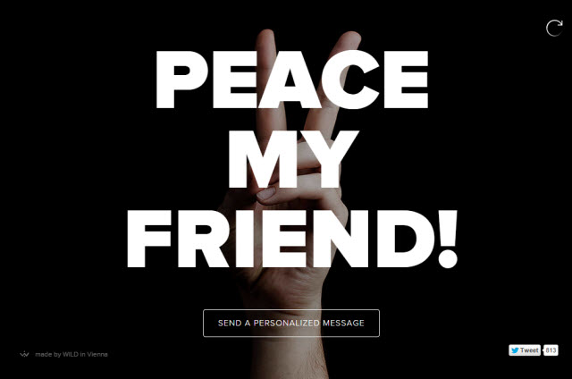
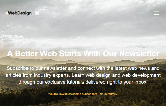
Bold Typography
‘Bigger, Bolder, Better’ would be motto of web designing for 2015. You will see more of Bold and oversized title fonts on webpages and their home screens. These designs impart the message in a powerful and effective manner as compared to the regularly sized fonts. This Bold typography calls attention upon itself and impart a strong visual message to the audience. Responsive Bold Typography will find its place among more websites in 2015.
Bold typography makes a firm visual statement that isn’t likely to go away anytime soon in 2015.
Interactive and Content-Rich Webpages
Content-rich Visual storytelling will find its place among the key web design trends in 2015. The animation sequence is scroll-based and the elements will fade-in to make an appearance while scrolling down the webpage. Using CSS, Javascript, jQuery and other techniques, content-rich interactive webpages will make a major impact on web designing in 2015. By hovering the mouse over certain aspect of the website yields detailed information pertaining to it and this form of storytelling gives the users various visual elements to interact with.
These interactions provide a personalized experience for your audience by allowing them to interact with key visual elements and are based around the viewer’s actions.
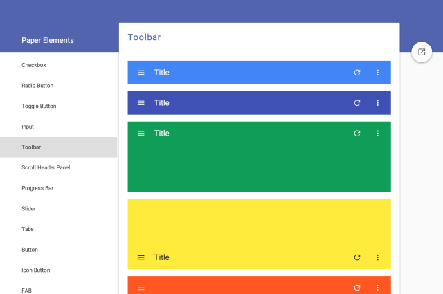
Material Design
The subtle variant of Flat design is what Google’s Material Design is all about. The unified and promising Material design is a play on the concepts of Flat designand will rise to its design prominence this year. Material Design is quickly reshaping the way Android apps are designed and this trend is expected to find its way into webpages too.
The smooth flowing interface makes it easier for the user to move between different sections of the website without entirely leaving the page you’ve been working on. The subtly playful yet professional web design trend is expected to quickly grow and find its place on the web.
Long-page SubtleParallax scrolling
Parallax scrolling is one of the design trend most loathed by designers, but a subtle variant of it will likely find its place in the designing trends for 2015. The ‘Everybody Scrolls’ research conducted by Rebecca Gordon, confirmed that webpages are now more praised by users when long scrolling is a part of it. A sharp 3D effect is crafted through the use of parallax scrolling and now users even prefer scrolling over clicking.
For the more creative companies with more features and products to showcase, long-page scrolling is definitely worth considering and is quickly becoming a key web design trend for 2015.
Hidden Menus
It is a long-held conventional notion that webpages have to prominently display menu bars at the top of webpages. But setting traditions aside, new web design trends are doing away with prominent menus and are instead making them disappear under buttons which are triggered by mouseover action. Only upon hovering on a menu tab or button displays the menu bar and lets the user choose which page to navigate to.
The aesthetics of hidden menus should appeal to more users who would like to interact with the content more and only open up the menus when needed.
Conclusion
These 7 Web design trends have been quickly gathering up pace among the key trends for 2015. While content still remains the king, design is something you must not neglect in the world which is frequently shaped by design trends. Visual appeal is just as important factor as the content these days and some of the key trends have risen to their prominence, thanks to the users who find them browse the web better.
About the author: This article is written by Devinder Maheshwari, Co-founder of Beebom.com, a site that provides useful digital tips and resources on software, apps and gadgets.
About the Author

Mirko Humbert
Mirko Humbert is the editor-in-chief and main author of Designer Daily and Typography Daily. He is also a graphic designer and the founder of WP Expert.