You can probably spot a type specimen when you see one. They started as no more than a way for printers to demonstrate to their buyers how a certain typeface would look at various sizes on the paper. With a type specimen, a type’s characters could appear on paper, bad kerning could be spotted, and legibility determined.
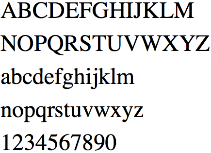
Of course, then, if a printer is to set a type on paper, he must find out what to set. From here, we got the character set model (“AaBbCcDd1234&%#” and so on)
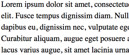
We also have the dummy text model, usually set on a headline or paragraph. This is where the famous Lorem Ipsum phrase usually appears:
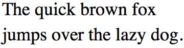
Alternatively, a printer may choose to display a pangram, a sentence that contains all the letters of the alphabets in it, in order for the customer to evaluate each and every one.
Problems arise as time went by, of course. First of all, languages have different character existence, frequency and distribution. I talked about this in reviewing Laura Meseguer’s Rumba family on 16 Type Foundries You’ve Probably Never Heard before.
For example, in English, our 12 most frequently used letters is ETAOIN SHRDLU, in that order. But in French, it is ESAITN RULODC, and in Swedish, EANTRS LIDOMG. In addition to this, you have diacritics and letter combinations like é ã and ß, and characters that are simply not used that much in any other language, like Turkish’s ı (dotless i.)
And second of all, let’s admit it, looking at blocks of meaningless texts set in black and white is not the most interesting job in the world, especially when you just want to look at whether the type is appropriate for the job, the go ahead and purchase it from the foundry (unless you’re me, then looking at and setting type all day would actually be your dream job.)
To remedy this, typographers begun copywriting and designing their specimens. Type specimens can be boring, so why not spice it up with words that, you know, people actually use when they talk to each other?
Some chose to quote from a book. Others chose a chapter from a book, so they have the ability to effectively redesign it and demonstrate their font family in multiple weights and sizes. Others still write semi-relatable paragraphs that are cohesive in concept.
But some make them memorable, either by ways of including funny words and clever plays, painting color schemes and type arrangements, even designing charts, graphs and diagrams to demonstrate just how well their type creations can stand the rigors of printing and be the ultimate versatile workhorse—under any condition and application.
This is a gallery of type specimens designed in this manner. Ones that make you wonder and ask “Am I supposed to admire the beauty and usability of the type, or the wit and design of the words?”
Though most of the foundries have been reviewed in the past, I hope you find one or two new favorites on this list.
All specimen comes in .PDF flavor.
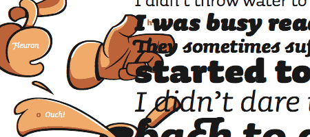
1. Incognito
The specimen book from Gabór Kóthay’s Incognito reads more like a field guide to an unknown land than a proper type specimen. Swashes are used generously (and in tasteful manners) and fleurons are abound.
2. Sauna
Sauna’s online specimen, designed by Underware, is actually part of a real book called Read Naked. And not only is the book itself water-and-steam-proof, some parts of it are only visible when the temperature hits over 80º Celcius—making it the only book that can truly be read in the, you guessed it, sauna, while you’re naked. In addition to this, Sauna’s dingbat glyphs are colored beautifully.
3. Gentium
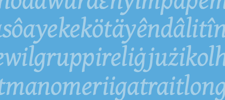
Gentium’s specimen is a twenty-page document that takes you through Victor Gaultney’s process behind it, from inspirations (calligraphic, but not too bold; warm and friendly, without too many distracting elements), principles (“Unity: contrast is gained through gentle slope and condensation”) to design—set in its own namesake font, of course. This is one specimen you actually want to read through.
Gentium is a free font, released through SIL Open Font License.
Download the Gentium font family here.
4. Chilean Bugs
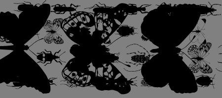
Miguel Hernández’s Chilean Bugs, not unlike many dingbat fonts, features icons and symbols in place of alphabets. This one is unique because it’s richly detailed. It’s a free download, too, if that’s your thing.
5. Sixtypound
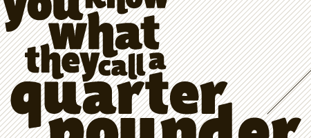
Many specimens consists solely of a block of text (or a paragraph), accompanied with character set. Jelmar Geerstma’s Sixtypound uses a well known quote from Pulp Fiction, arranged beautifully in various sizes. Aside from displaying actual book/magazine/newspaper layout in the specimen, this is one of the best ways to respect a typeface by presenting it well.
6. Albers
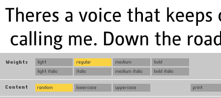
If an online specimen does allow you to set your own type (for example: at OurType and Textaxis), it usually gives you a blank field or preset sentence. MoreType’s features multiple weights selection, type size and leading customization, text randomizer (offering endless entertainment), and even an option to print your sample.
This allows you to take the said type, print it as a PDF, then export it to your layout comp to present to client—an ability that no other type specimen setter has.
7. Skolar & Surat
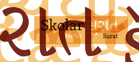
Don’t let David Březina’s specimen of his English–Gujarati fonts, Skolar and Surat, fool you. Just below the link to it is Reflection on Practise, an extensive essay detailing their development, step by step, from start to finish. Typeface design is, in my opinion, a longstanding craft which process is too often overlooked. Reflection on Practise helps demystify this, and explain in revision upon revision—David had at least twenty before he refined what would be the final version—why designing type is a subtle, rigorous trade.
8. typecase, from Depression Press
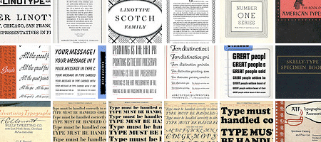
When all is said and done, sometimes you just want specimens the way they meant to be set: on letterpress. This is where Depression Press’ typecase collection comes to the rescue. It features more than 200 pages of specimens, some scanned from outside sources, and others printed in-house.
Inspired to design your own typeface?
I recommend two resources that will get you started nicely:
- Type Anatomy 1.0, a brainchild of Martin Pecina and David Březina has all the terminology you’ll need to know about a typeface’s anatomy. Admittedly, many have done this with their own structure (here are FontShop’s and Ellen Lupton) but none is more detailed than this one.
- TypeWorkshop.com’s Type Basics, from the inventive minds at Underware covers basic issues that may arise during the type design process, like optical sizing, letter spacing and shape balancing. These are quirks—many of them very subtle—that designers will want to address along the ways of designing a typeface.
What are you waiting for?
Type design is a long, arduous process, but is also one that could be very rewarding. Need further help? Email me at bram@brampitoyo.com, and let’s talk!
—
Bram Pitoyo is a brand strategist, hacker and typophile who aims to unite the creative and technology communities in Portland, Oregon, and around the world. On most days, you can find him planning, organizing and reporting events of this nature. On some other, you’ll find him talking to local personalities.
About the Author

Peter Makeshoff
Peter Makeshoff is the founder and main author of Designer Daily.