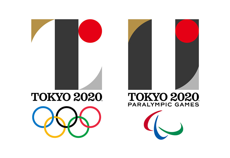
About two weeks ago, the organizers of the upcoming Tokyo 2020 Olympics revealed the competition’s logo. The logo, inspired by Didone fonts, uses simple geometric forms and mixes national symbols with a sense of movement that works surprisingly well. It was designed by Japanese graphic designer Kenjiro Sano, but some have accused it of being plagiarism of the Liège theater logo.
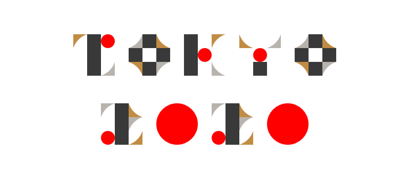
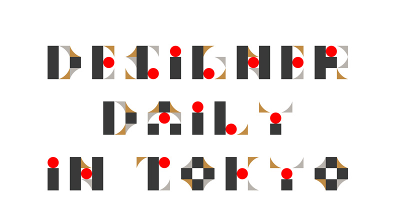
A Japanese programmer, Mitsuhide Matsuda, has created a font generator based on that logo and its unusual shapes. You can try it by yourself on this page, and write your own sentences using it. Obviously, the font is not very readable, but the graphic outcome and the idea are pretty cool.
About the Author

Mirko Humbert
Mirko Humbert is the editor-in-chief and main author of Designer Daily and Typography Daily. He is also a graphic designer and the founder of WP Expert.