The Sydney Opera House is famous worldwide for its audacious architecture, it’s one of the few buildings in the world that makes the skyline of a city instantly recognizable.
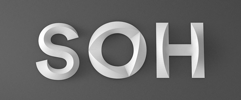
While the new logo designed for the Opera will probably not get as much attention as the building’s architecture, it is still innovative and worth taking a good look at. This re-branding was achieved in collaboration by Interbrand Sydney, Collider (for motion design), and Laurenz Brunner (for typographic work).
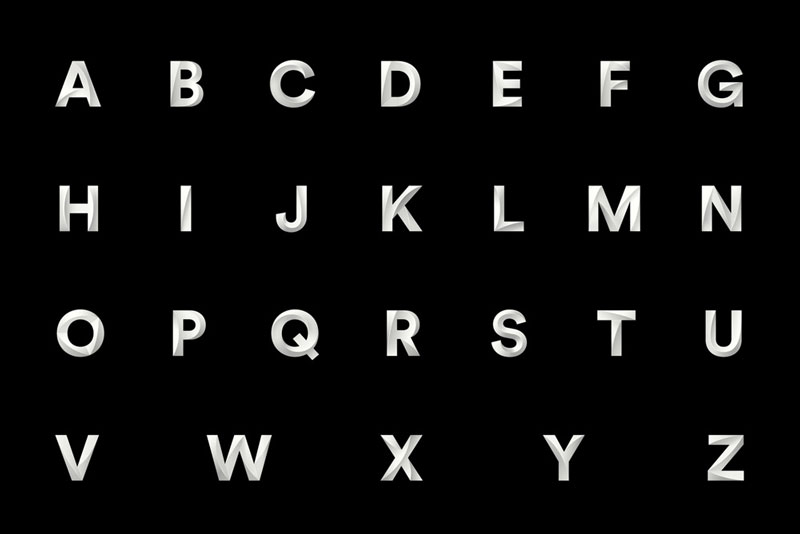
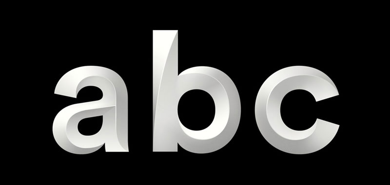
The logo design is mostly typographic, with a custom font created for it. Subtle shading effects are added on the letters to give a hint that reminds you of the building’s design. The typeface was named Utzon, after the famous architect.
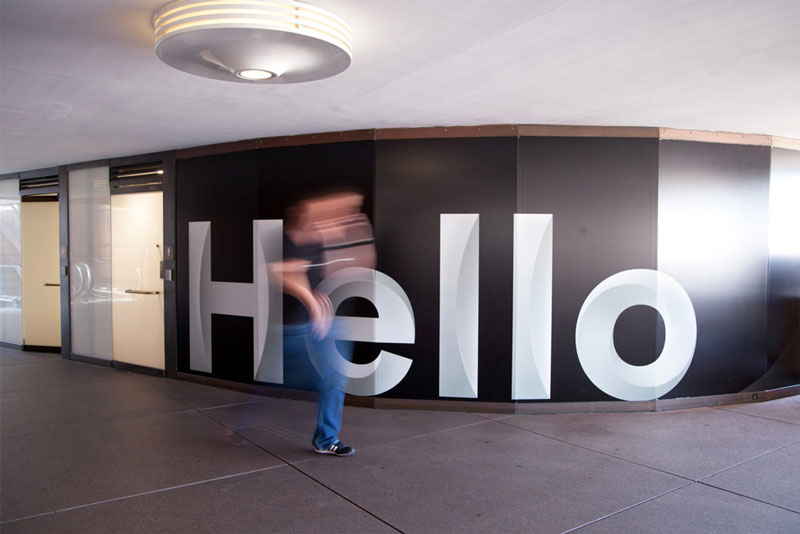
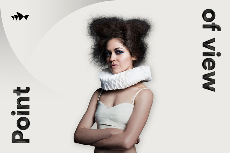
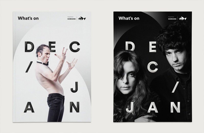
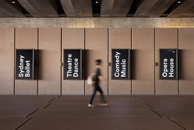
The typeface in action in the building and on promotional posters.


About the Author

Peter Makeshoff
Peter Makeshoff is the founder and main author of Designer Daily.