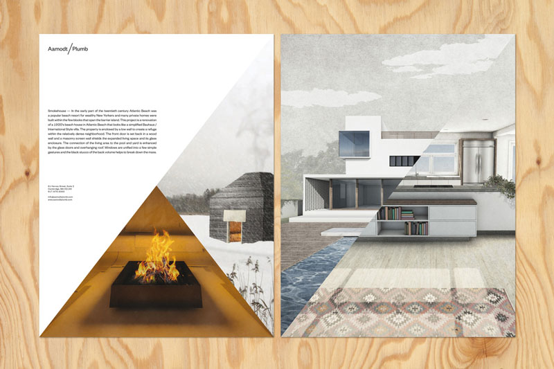
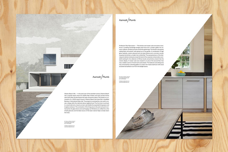
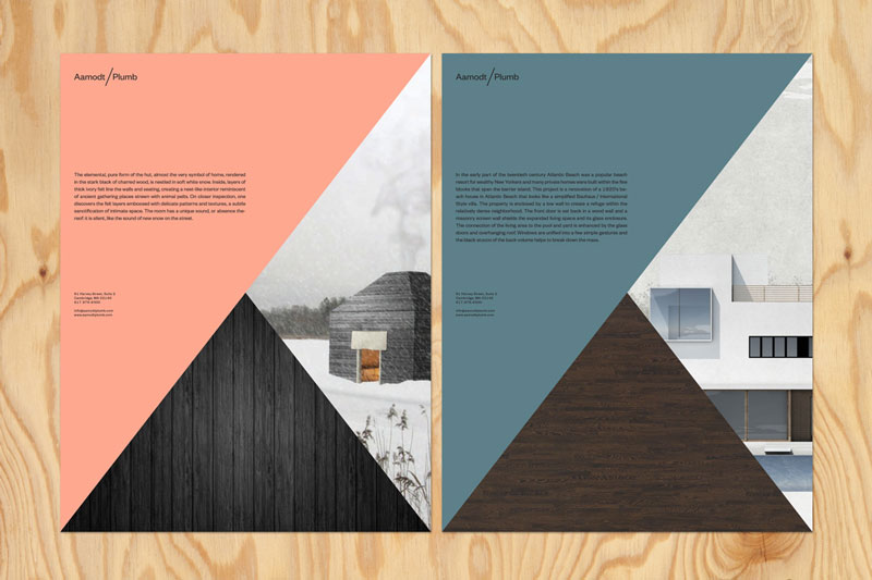
Commissioned by the architecture studio Aamodt/Plumb to design their new visual identity, TwoPoints.net built the whole branding system around the slash in the name and the duality it implies. The diagonal separation is found throughout all the architects’ marketing material, it works particularly well on brochures and catalogues.
The design agency also did a great job documenting the way the identity system works.
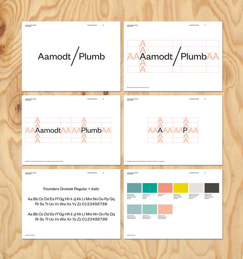
Design system, font choices, and color scheme.
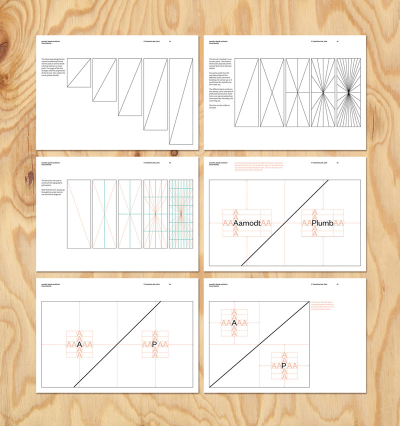
Understanding how the diagonal separations work within the grid.
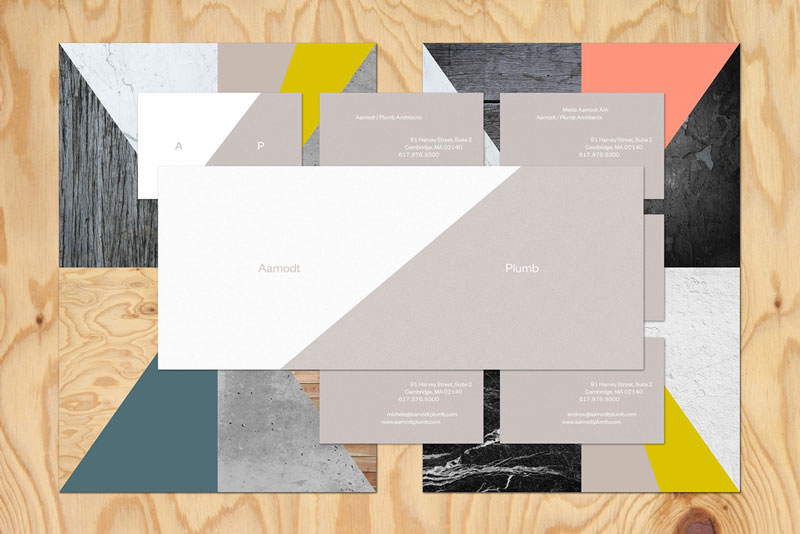
Branding in action.
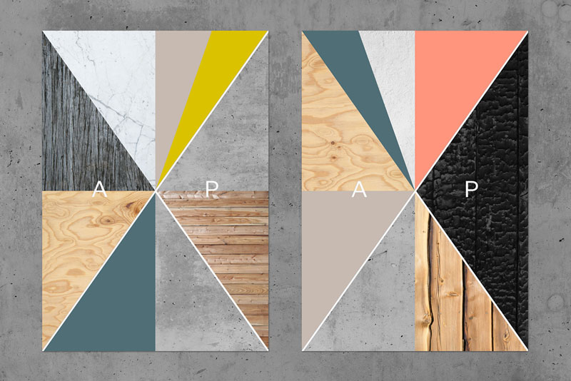
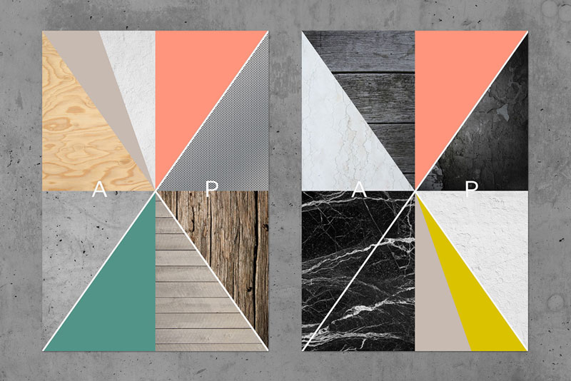
Two examples of texture visualisation.
About the Author

Mirko Humbert
Mirko Humbert is the editor-in-chief and main author of Designer Daily and Typography Daily. He is also a graphic designer and the founder of WP Expert.