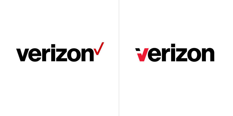
Recently, Verizon released a new logo that was heavily criticized online, as it often happens when large corporations get a re-branding. The new logo was designed by Pentagram, one of the top design agencies worldwide. While the criticism is understandable, I think the new logo is much better than the old one, which you can see on this article.
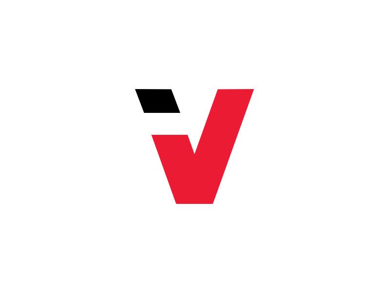
According to critics, the new logo takes minimalism one (or more) step too far. A simple sans-serif font with a checkmark, anyone could design this, right? A dribbbler, Teodor Decu, recently released an alternative to the Verizon logo. This is what it looks like.
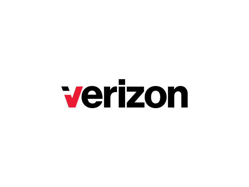
On first impression, the logo is indeed much more visually appealing than Pentagram’s logo. When you analyze it a bit, I don’t think it works out as well. The checkmark that integrates with the initial “v” looks good, no arguing in this. It does lose a bit in readability, but it could probably be improved a bit.
The real problem with this alternative logo is that it doesn’t use the checkmark the way it’s supposed to be. The checkmark after Verizon’s name is hinting that Verizon works well and has been approved. The checkmark in the beginning doesn’t hint anything.
Could the logo designed by Pentagram look nicer? It definitely could. For example by making the checkmark look less weak. Is it a bad rebranding? No, I don’t think so…
About the Author

Mirko Humbert
Mirko Humbert is the editor-in-chief and main author of Designer Daily and Typography Daily. He is also a graphic designer and the founder of WP Expert.