The AZ Project is a book by Otl Aicher created for the nostalgic which is supplemented by an essay on the history of graphic design by Dario Russo. It is a book that introduces the project with precise references to the 100 graphic designers and their seminal work.
The book AZ Project is a wonderful resource of graphic design – an archive of great designers and typographers. The book is available in both Italian and English version.
The concluding paragraph from the book is here through which you’ll know how magnificent resource of graphic design it is: “100 graphic designers to tell a story, to describe different approaches to visual communication, some rather unique, others more common, all relevant in some way, in five important areas of graphic design. These 100 may not be the greatest graphic designers of all time but they are certainly among the finest. Thanks to them; the AZ Project Graphic Design took off, an archive on international graphic design that will soon be expanded with new profiles of other important designers, of the past or present. It is the first step, a way to launch the project, a pondered selection of some of the most successful graphic design projects of the past century. However, a lot of work still has to be done…”
Otl Aicher
History of Aicher
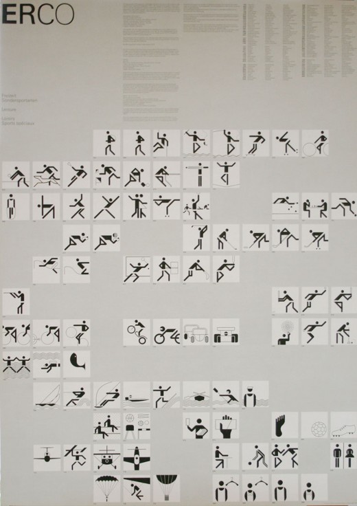
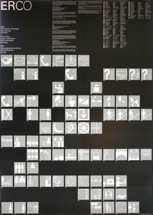
Otl Aicher is a German graphic designer and typographer who is meticulous and impeccable in his field. He was arrested in 1937 and drafted into the German army as he opposed to Nazi authoritarianism. In 1945, he preferred to desert rather than taking part in World War II. He studied sculpture at the Akademie der Bildenden Künste in Munich in 1946 and after a year of his study, he opened his own studio, Büro Aicher, in Ulm. In 1953, he founded a school of design in association with his wife Inge Scholl. In 1972 he takes care of the Munich Olympics Games corporate identity designing a series of internationally comprehensible pictograms. In addition, he designs numerous typefaces, like the Rotis font family (1989), which includes sans-serif, semi-sans, serif and semi-serif versions.
Aicher’s concept
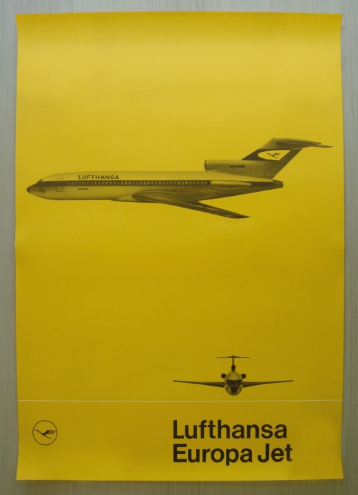
According to Aicher, it is possible to generate a consistent and unambiguous brand identity only by using a precise series of standards. The Lufthansa project can be taken as example which is a brand that obtained high visibility using few of simple and systematically repeated elements; all gathered in a manual that describes each of their application. This manual is based upon three essential elements: the pictographic logo that portrays a stylized crane in flight, with a sharp and essential silhouette, contained in a circle which stresses the incisiveness of the bird; the use of the typeface, Helvetica, sans-serif and minimal; the chromatic system, based on yellow (for the circle) and blue (for the crane and the circumference).