Visually speaking, branding is almost an art. Graphic designers around the world often need to fight with clients to let them understand that their logo should be used in consistent forms. Those who succeed in convincing the clients then get to design gorgeous branding like the ones in this post.
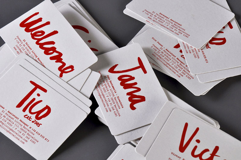
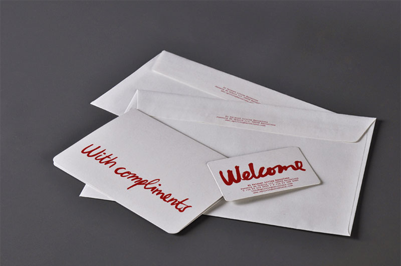
El Palauet
Identity for luxury appartments designed by Iris Tarraga. The beautiful lettering is the work of Pol Montserrat, a Barcelona-based illustrator.
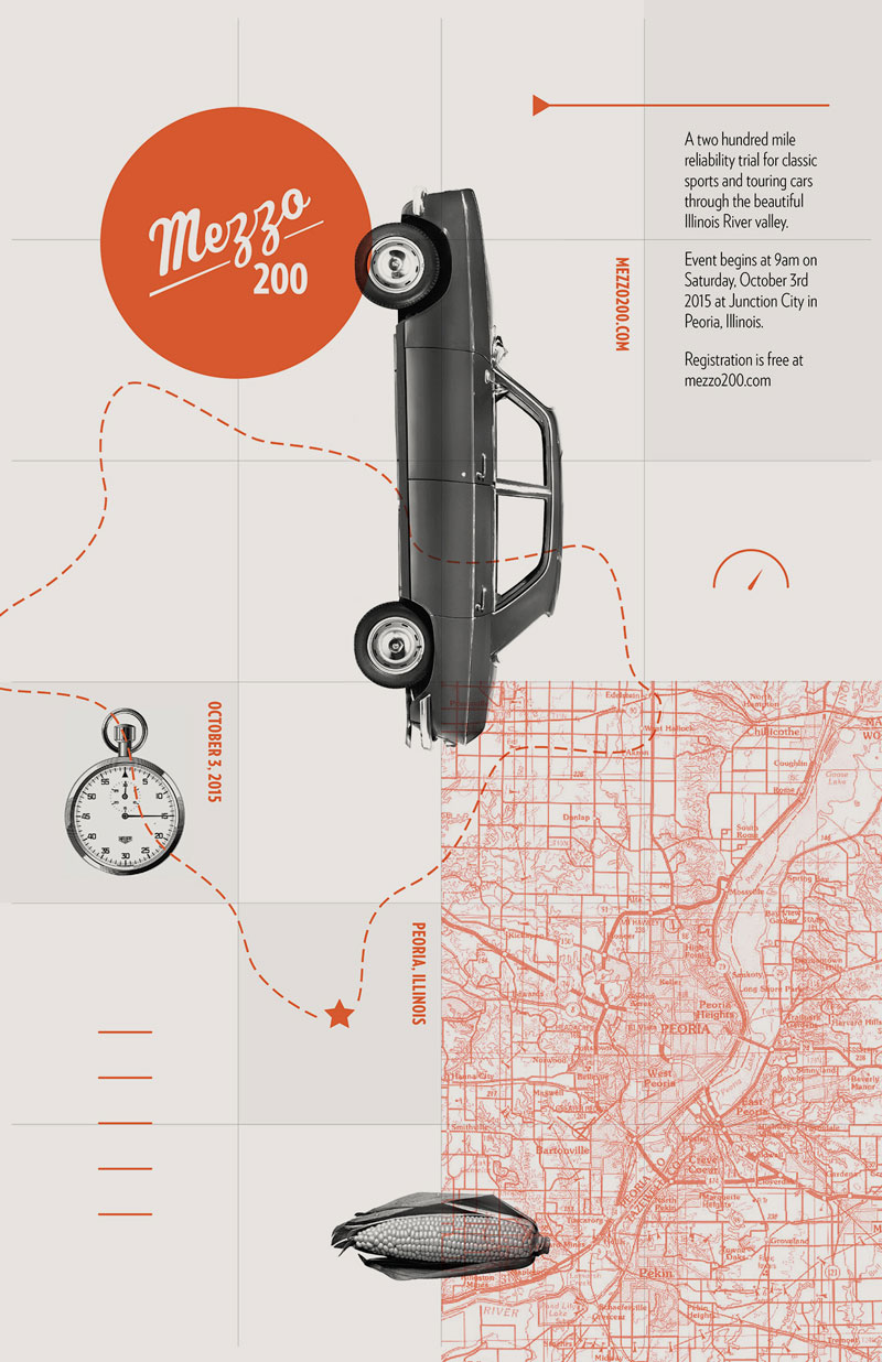
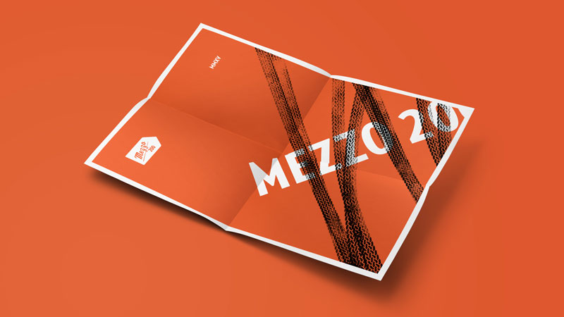
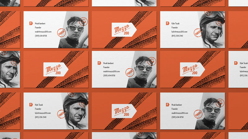
Mezzo 200
Mezzo 200 Reliability Trial is a rally that was modeled after the races of the 20th century. The identity design also took some hints for that era, but with a modern touch makes it the amazing graphic design project it is. A gorgeous project by Kyle Tezak.
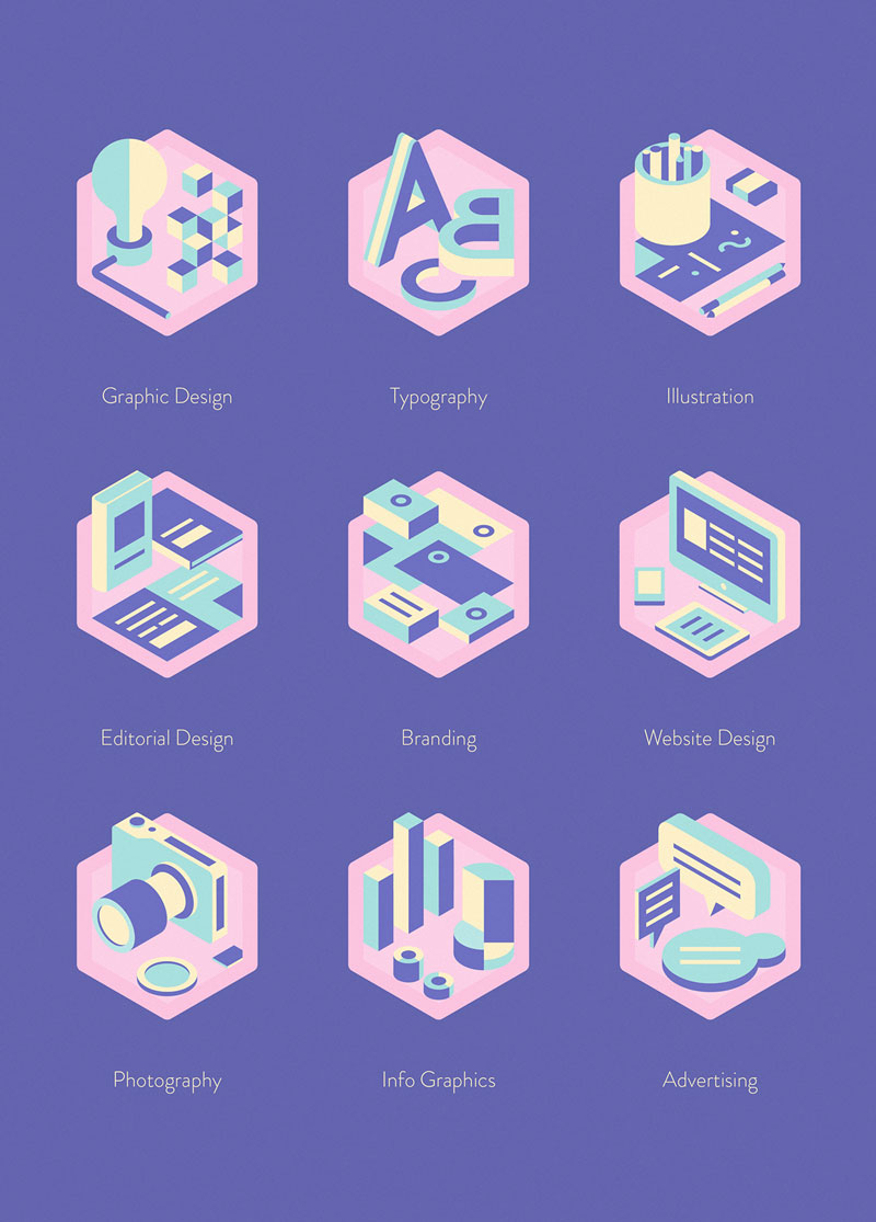
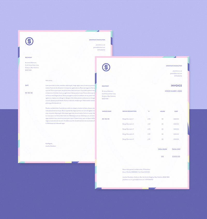
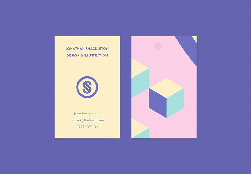
Jonathan Shackleton
For his self-promotion, graphic designer Jonathan Shackleton decided to display his talent in a gorgeous and colorful visual identity that he shared on his Behance page.
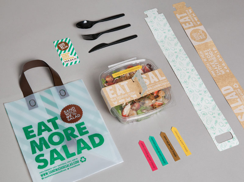
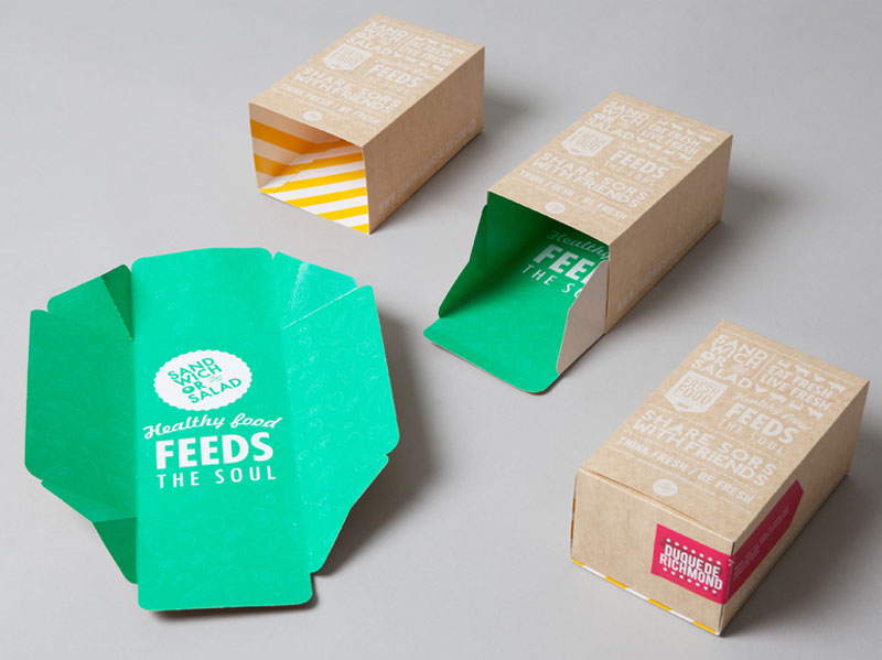
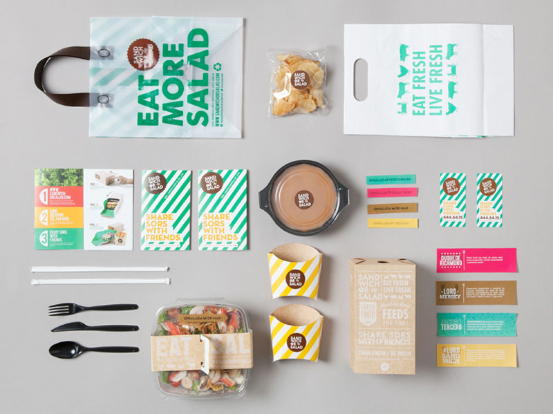
Sandwich or Salad
A colorful identity for a food joint: Sandwich or Salad. Using stripes, bright colors, and bold typography, this healthy food place get the perfect identity to be remembered. It was designed by Masif Design Affairs.
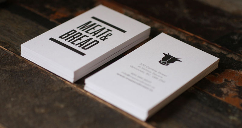
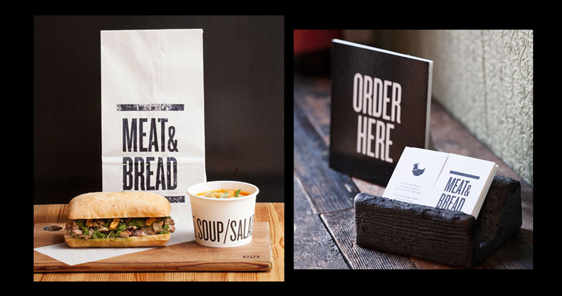
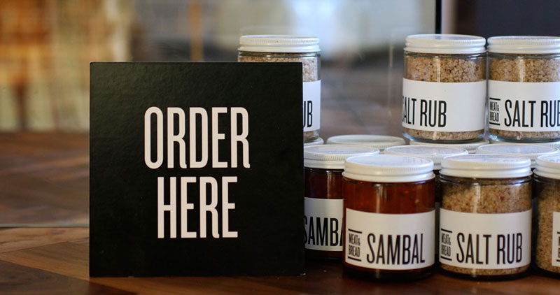
Meat & Bread
Another identity for a restaurant with great type, pictograms, and overall elegant supports for the food and restaurant decoration. A gorgeous design by Glasfurd & Walker.
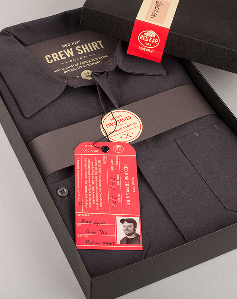
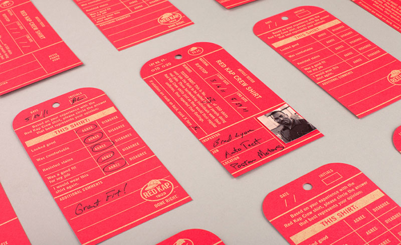
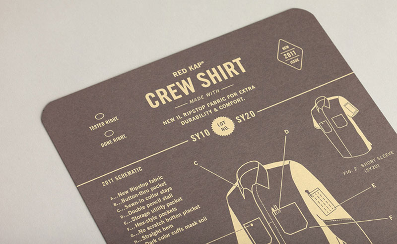
Red Kap
Designed by Perky Bros LLC, this awesome branding for Red Kap apparel is a brilliant use of the grid to create a friendly-looking identity when using the right colors and fonts.
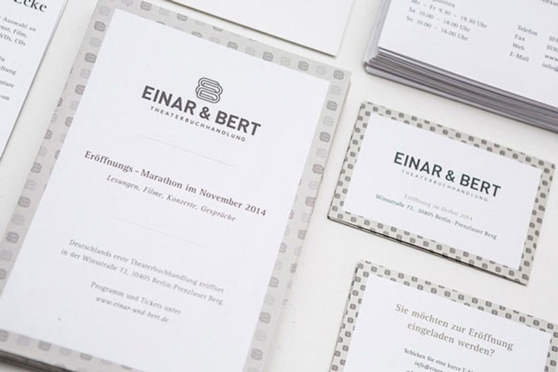
Einar & Bert
Bookstore by day and theater by night, the dual activity of Einar & Bert is well reflected in its logo design and corporate identity. The logo features two interlacing shapes that could show the complimentary activities, and the play on colors goes in that direction as well. A gorgeous identity created by Jonas Söder.
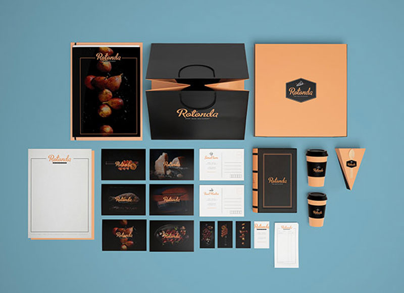
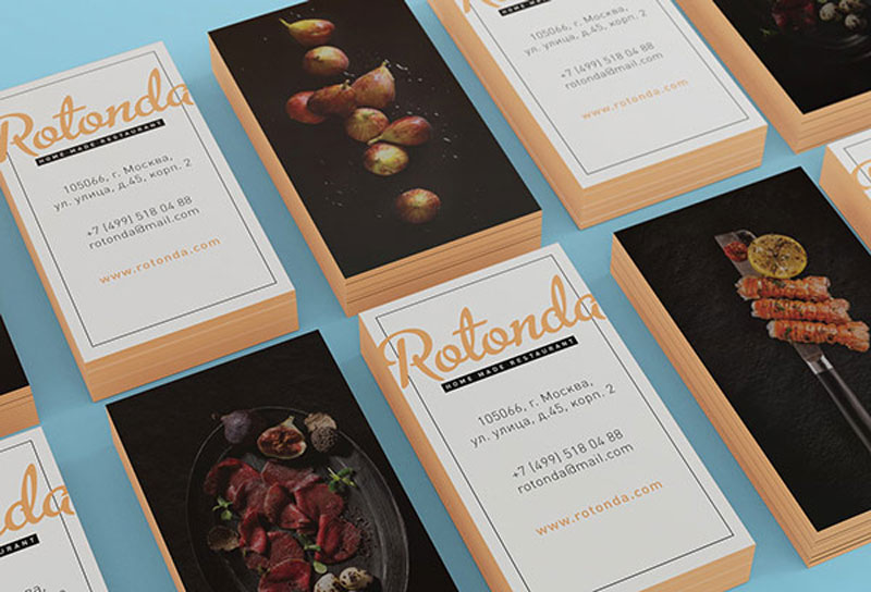
Rotonda
Sofia Weinstein developed this elegant identity for Rotonda. It perfectly reflects the cozy and classy atmosphere you get in that place. Best part about this branding apart from the soft and subtle colors, the amazing attention paid to every detail, which is what make the difference between a good and an excellent brand.
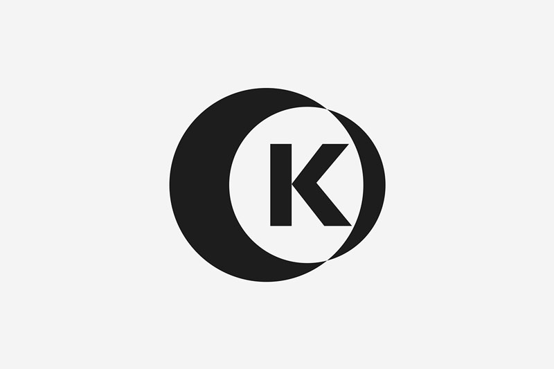
Oskar Kullander
Freelance photographer Oskar Kullander got the perfect logo and branding identity for his studio, the “O” and “K” from his first and last name are perfectly blended, and a small photo objective is even suggested with a little perspective. It is also minimalist enough to not interfere with the photos.
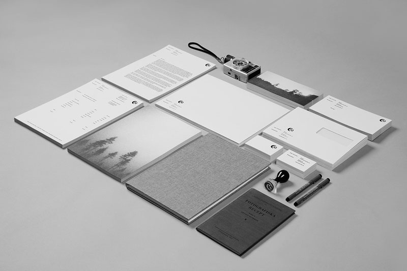
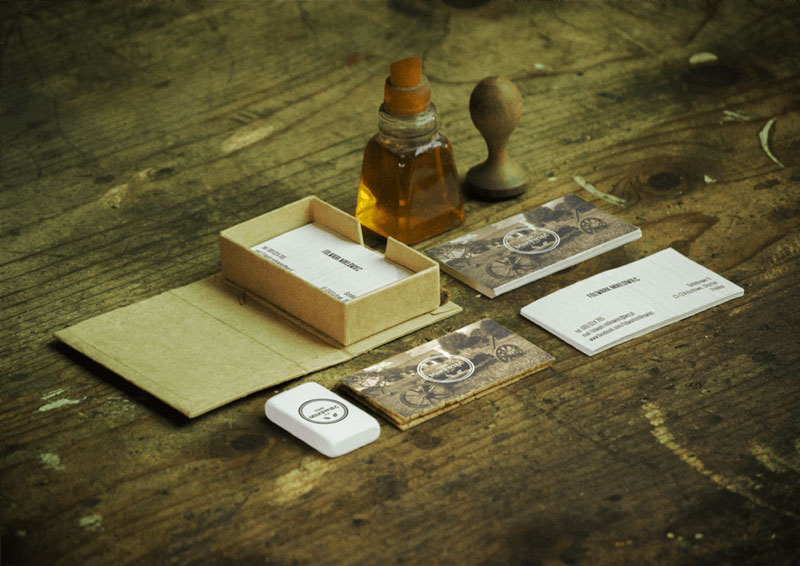
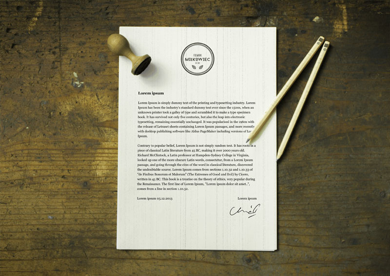
Folwark Milkowiec
Nearly perfect identity with beautiful use of photos, and gorgeous photos to introduce the graphic design work. Lovely work by Damien Chmiel.
About the Author

Peter Makeshoff
Peter Makeshoff is the founder and main author of Designer Daily.