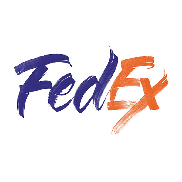
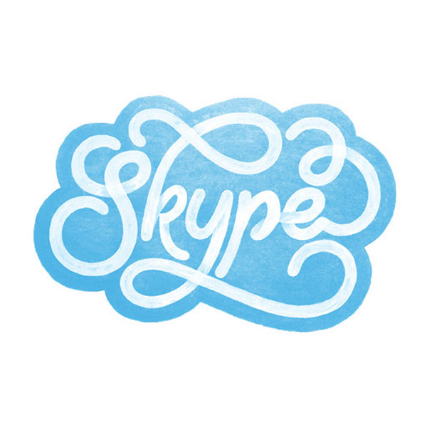
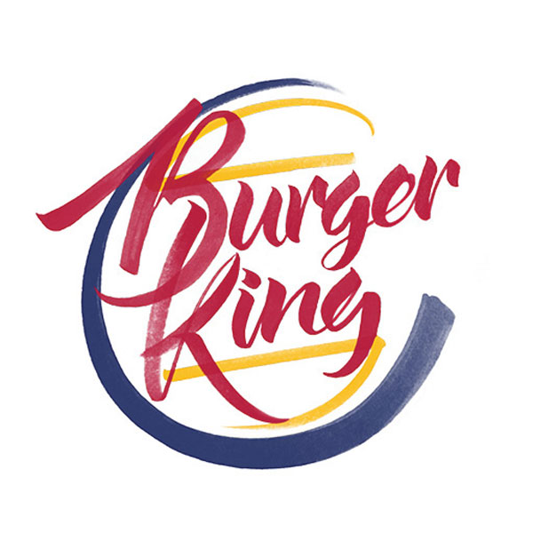
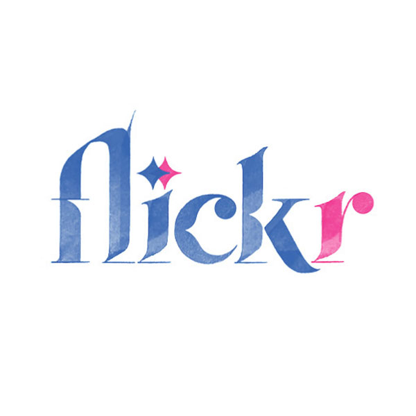
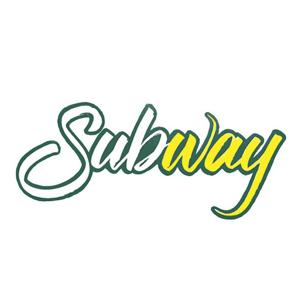
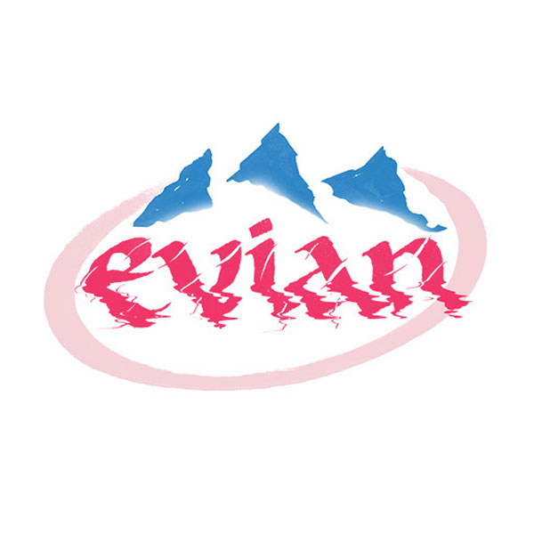
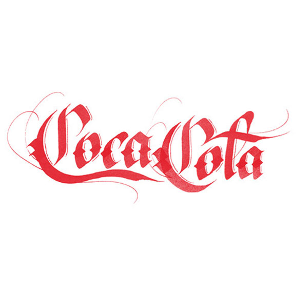
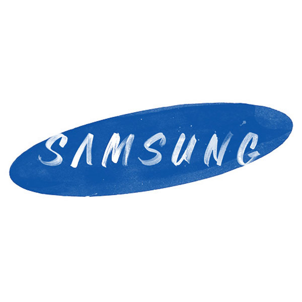
Some people say that the medium is the message. I wouldn’t go as far as that, but I’d agree that the medium can totally change your message.
Sara Marshall’s experiment in lettering illustrates this pretty good. Redesigned by hand, the famous brands of the world quickly start too look much more “human” (which they are not). The cold and flat colors get some texture, shapes are not as perfect, and that’s what makes it look more friendly.
For the project, the designer explored several lettering techniques, such as brush calligraphy or sign painting for example. All are well-executed and take the main features pretty good, but the coolest is definitly the Skype logo redesign in my opinion.

About the Author

Peter Makeshoff
Peter Makeshoff is the founder and main author of Designer Daily.