Due to complains of plagiarism by the theater of Liège, in Belgium, the Tokyo 2020 comittee decided to give up its logo. It’s a shame, because that logo was very creative and still worked good. There was even a font generated by a programmer based on the logo. Moreover, I don’t think there was any substance to the plagiarism allegations.
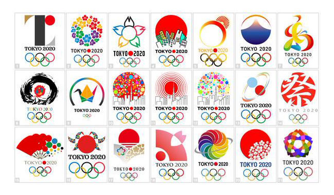
As usual, the internet reacted. Designers shared on Twitter (and other social media sites) their alternatives to the abandonned logo. Some are actually very good.
My own personal favorite. I’d be delighted if the Tokyo comittee decided to buy this one instead of hiring a new design firm to work on a new one.
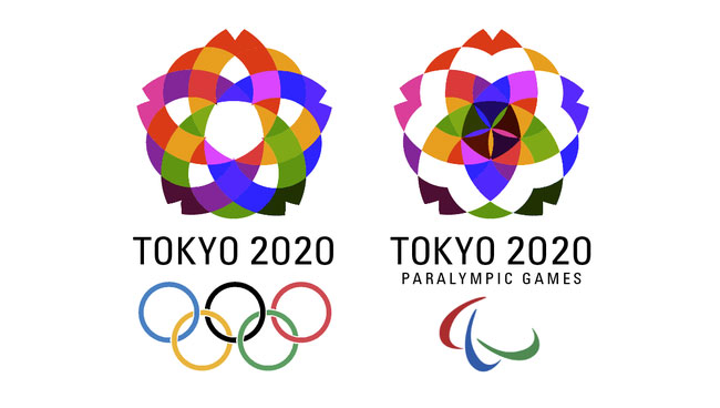
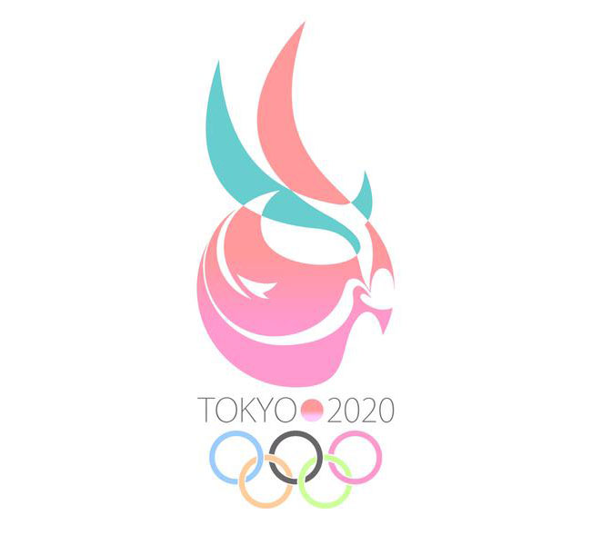
A more abstract version, not looking bad.
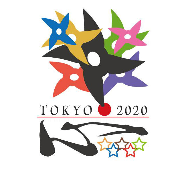
A logo for the most ninja Olympics ever.
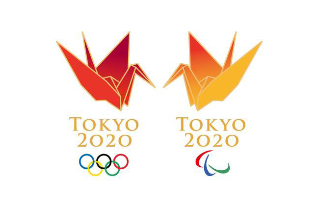
This is actually not so creative, but the idea of using origami could be extended to create something cool, and the pictograms would be just amazing.
A bit more Kawaii this time.
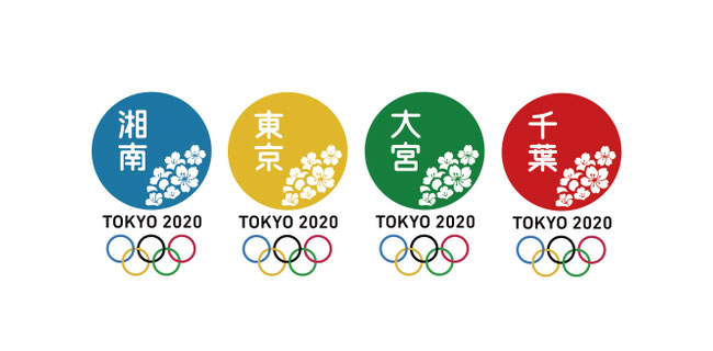
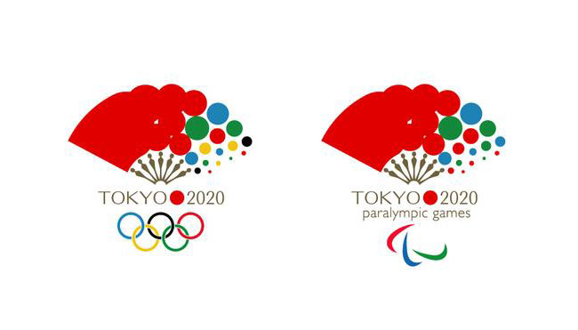
A very simple, but viable approach to the event’s logo.
About the Author

Peter Makeshoff
Peter Makeshoff is the founder and main author of Designer Daily.