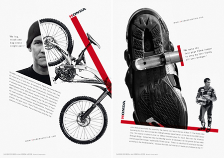
Somewhere in between russian constructivism and Bauhaus, these posters for Honda are really everything I like about typography.
About the Author

Peter Makeshoff
Peter Makeshoff is the founder and main author of Designer Daily.
Somewhere in between russian constructivism and Bauhaus, these posters for Honda are really everything I like about typography.
Peter Makeshoff is the founder and main author of Designer Daily.