The city of London might not be the biggest in the world, but it is definitly loaded with airports. In fact, it has more airports than Switzerland (if you only count commercial airports).
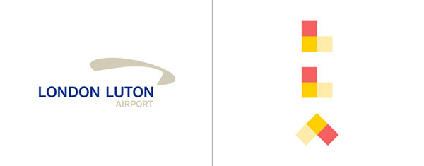
London Luton, while not exactly in London, had a hard time to distinguish itself. It’s not the biggest no the nicest airport in the British capital city. In my opinion, they can now claim that they have the best corporate identity of all London’s airline hubs.
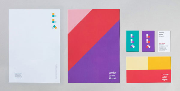
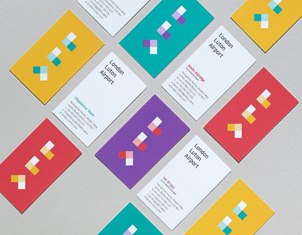
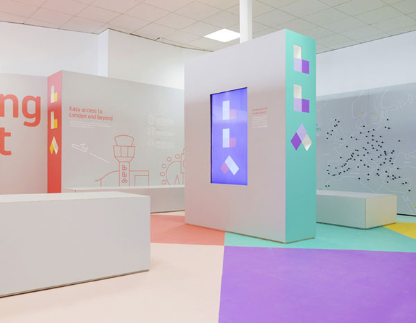
Redesigned by ICO design, the logo went from a boring, bland one, to a colorful dynamic identity system. The shapes and color chosen to create the stylized letter perfectly symbolize an airport’s sense of direction by creating arrows.
![]()
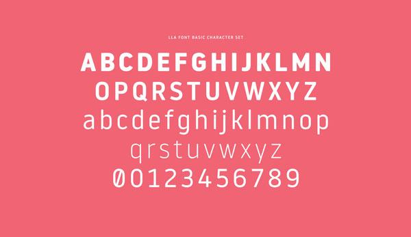
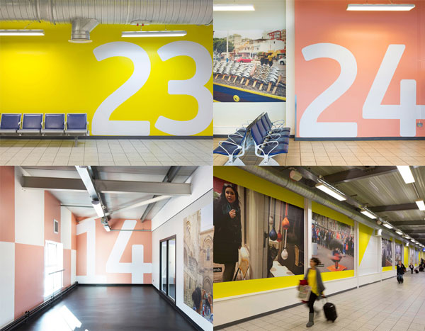
A typeface was also created to function with the identity system. For that, ICO design commissionned atypo, a Spanish type foundry. atypo did an amazing job with a font that perfectly matches the whole identity.

Via BrandNew.
About the Author

Peter Makeshoff
Peter Makeshoff is the founder and main author of Designer Daily.