About five years ago I was working for a company where we served mobile web-sites to mobile phones by detecting their user agent string, looking up their screen size and other capabilities in our database, dynamically resizing the webpage and imagery and then delivering a customized page in the appropriate mark-up language for that specific device. We invested a lot in developing that technology and it was a strong selling point to our clients. I no longer work there, but I sometimes wonder how they are coping with the plethora of new devices of all shapes, sizes and capabilities.
To satisfy their clients, designers may take a lot of the responsibility for guaranteeing the correct user experience. But there are other players in this game. There is the user, who understands that if they buy a tiny web browsing wristwatch that their experience will not be what the designer, nor the client, envisioned. There is the browser developer, who, like the designer, strives to deliver a satisfactory experience across the multitude of platforms. Finally there is the client, who understands that you can’t cater to everyone. Yeah right.
Business is about brand and brand is about experience. The only person the client talks to is the designer and that’s where the buck stops. At the moment the buck is demanding brand presence and consummate user experiences across this explosion of new mobile devices.
Jeff Croft’s recent article On “Responsive Web Design” and the Mobile Context http://jeffcroft.com/blog/2010/aug/06/responsive-web-design-and-mobile-context/
pointed out that when a user goes to a website, what they want depends on their context, which is often indicated by their device. A desktop device means they are at home or in the office, possibly browsing in general interest, while a mobile device means they could be on the street needing specific information. It is quite possible that in some solutions, these represent two different and unique use-cases. For the majority of solutions, however, they represent different entry points; for example a desk-top user may want to see new products first, while a mobile user may want to see store-locations first. A desk-top user is still at some point going to want store locations, so it’s not a separate use-case.
So, given that for the most part each use case is shared between desk-top and mobile, clients will have an expectation that the one solution should do for both. Why go to the extra expense of separate solution for mobile? If you can set your client’s expectations and get them to agree to this extra expense then great, more revenue for you. But the rest of us will be saddled with making the one solution do for both. In any event, even if you have a separate mobile solution, you’re still going to have to cope with all the different shapes and sizes and capabilities of these new devices currently flooding onto the market.
Well, we’re in a tight spot, what do we do? The dust is far from settled on this debate, but the reality is that for the moment we have to roll up our sleeves and get on with what technologies and methodologies we have available.
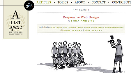
Exactly a year ago Ethan Marcotte’s article Responsive Web Design, http://www.alistapart.com/articles/responsive-web-design/, gave us an overview on the tools available to help us create this necessary flexibility. The title of his article is now used to represent the philosophy of designing to suit a very large range of screen sizes and device capabilities. To put his excellent article in a nutshell, the three strings to his bow were the use of fluid grids, flexible images, and media queries (and a fourth being an ability to think flexibly). These tools are very powerful and if used correctly can make a significant improvement in how your design responds to a device. However it is important to be aware of the limitations of these tools. As Jason Grigsby points out in his article CSS Media Query for Mobile is Fool’s Gold http://www.cloudfour.com/css-media-query-for-mobile-is-fools-gold/ applying Responsive Web Design philosophies is not as simple as it sounds. He has listed several short-comings and pit falls including things like CPU loading, backward compatibility, slow response and page weights. That’s not to say that these tools are unsuitable, but that they need some expertise to use properly and the creation fully flexible sites is not going to be as easy as your client thinks it is!
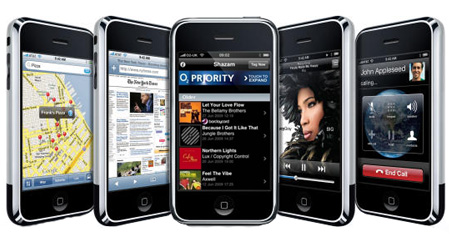
With the advent of iPhone and Android another solution is rearing its ugly head; platform specific solutions, otherwise known as Apps. More and more clients are requesting an iPhone app as part of the package. Provided that your shop has the skills then this isn’t such a bad thing. The client understands that it’s an extra and you can add something to the bill. Plus you can deliver something perfectly suited for the device. However not all shops are iPhone-abled; and anyway what happens next? What about an Android app solution? You can start to see that supporting multiple solutions starts to get very expensive and when the iPhone hype dies down your client isn’t going to be all that excited about single device solutions.
Mobile download speeds are increasing and network latency is decreasing, but right now we can’t pretend that it’s the same as a desktop. We still have to keep our mobile pages light. We still have to reduce the number of HTTP requests. For now we must marry client expectations with reality using fluid grids, flexible images, media queries, blood, sweat and tears.
About the Author

Peter Makeshoff
Peter Makeshoff is the founder and main author of Designer Daily.