Our modern world is undeniably complex. Society is obsessed with creating faster, bigger, more powerful technology that seeps into our everyday lives and makes us more connected to more people in more places. Everything is faster, more disposable and less connected to real life. This creates an atmosphere that some people embrace and others react against.
That is why many designers are looking back to simpler times for inspiration. Vintage-style logos have a certain charm that resonates with people in special ways. Vintage-style logos call to mind products made slowly by hand, by someone you know by name. They suggest a quality and style that will stand the test of time. They are everything modern society is not: slow, made to last and personable.
If you find yourself longing for days gone by in your designs, then check out this roundup of vintage-style logo designs.
This selection of logos for a Texas-based pie company calls to mind diners from the 1950s, where a woman named Flo slung cherry pies and bottomless coffees to miners.
Designed for a UK bike shop, this logo is much more industrial in feel, thanks to the large image of the gear that acts like a frame for the name of the shop.
This is a logo exercise for a butcher. The logo already looks like it has been printed on some rugged material, referencing the hardwearing aprons butchers don.
This logo was completely hand-drawn, so it incorporates the techniques of turn-of-the-20th-century logos as well as the aesthetic appeal of logos of that time.
This logo calls to mind the minimalism of logos in the 1950s and 1960s. Much like the iconic Shell logo of those years, this is not as minimalist as it could be, but the extra detail gives it extra charm.
Who would believe that Earl’s Best isn’t a longstanding, well-established brand? With a logo like this one, this brand of pickled veggies feels like it has had a place a picnics for generations.
It may have a modern colour scheme, but this logo is definitely 1900s in style. The delicate details and typography are sumptuous and classic, giving it a rich feel that modern logos can’t match.
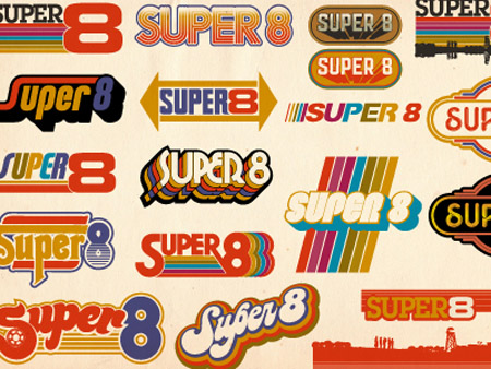
This selection of 1970s-style logos shows the range of feeling vintage logos can evoke, even when restricted to a certain decade.
This logo says the company was established in 1975, but the design is timeless. The geometric shapes, clean typography and colour palette can be found in logos both old and new.
These days, most coffee logos aim to make their coffees seem more luxurious or artisanal, but this logo takes us back to the days when coffee perked us up before a hard day’s work.
Back in the day, logos were quite literal: power companies would incorporate “electrified” fonts into their logos. This logo takes that idea and applies it to a t-shirt logo.
Owls have had a real comeback in the 2010s, referencing the owl trend of the 1960s and 1970s. The animal looks great as a series of circles, arcs and triangles, making it ideal for minimalist designs.
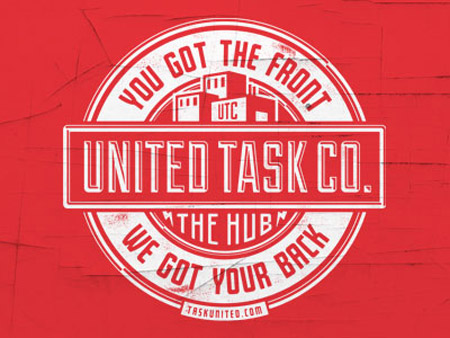
This vintage-style logo is utilitarian, industrial and wonderfully typographical. Plus, you can imagine it making a great rubber stamp.
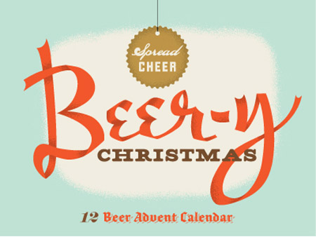
This logo – for a beer-based Advent calendar – uses the colours and fonts of Christmas designs in the 1940s. This is definitely a product you could see Bing Crosby endorsing.
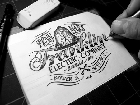
This tattoo-inspired logo has so many great vintage elements, including the abbreviated city and state names, the keys and the ribbons.
All of these logos are vintage inspired, but as you can see, they evoke a wide range of feelings. Perhaps that is why vintage styles are so enduring for logos: they give the impression of a classic product whilst affording the designer a range of options.
But whatever the reason they endure, the fact of the matter is, vintage style logos will continue to inspire modern designers for a long time to come.

