So Hillary Clinton thought that it was a good idea to become a candidate to the USA’s presidency, good for her. She knows that branding is important, so in hope of getting a decent logo for the campaign, she hired Pentagram, a top design agency known for its high-level work.
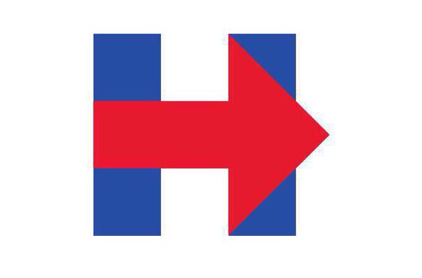
Turns out the logo they come up with is very, very simple. A bold capital “H” with a huge arrow. Way too simple according to numerous Twitter users and media outlets. I do feel like it is a bit unbalanced, but i wouldn’t go as far as to say it’s shit.
The Internet starts to criticize it
As usual with controversial logos that get big exposure, there were critics all over Twitter, blogs, and other social media sites. People have been comparing it to all kinds of things.
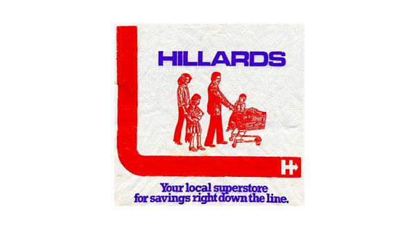
In no particular order, it has been compared to the Wikileaks logo (srsly?), a hospital sign (I would agree) a Republican logo, or a supermarket chain that doesn’t exist anymore.
Of course, this is not new. Pretty much any important presidential candidate had his logo compared with all kinds of stuff. I remember reading people explain that Obama’s logo looked like the Pepsi logo. It’s far from obvious if you ask me.
Then the Internet starts to make suggestions
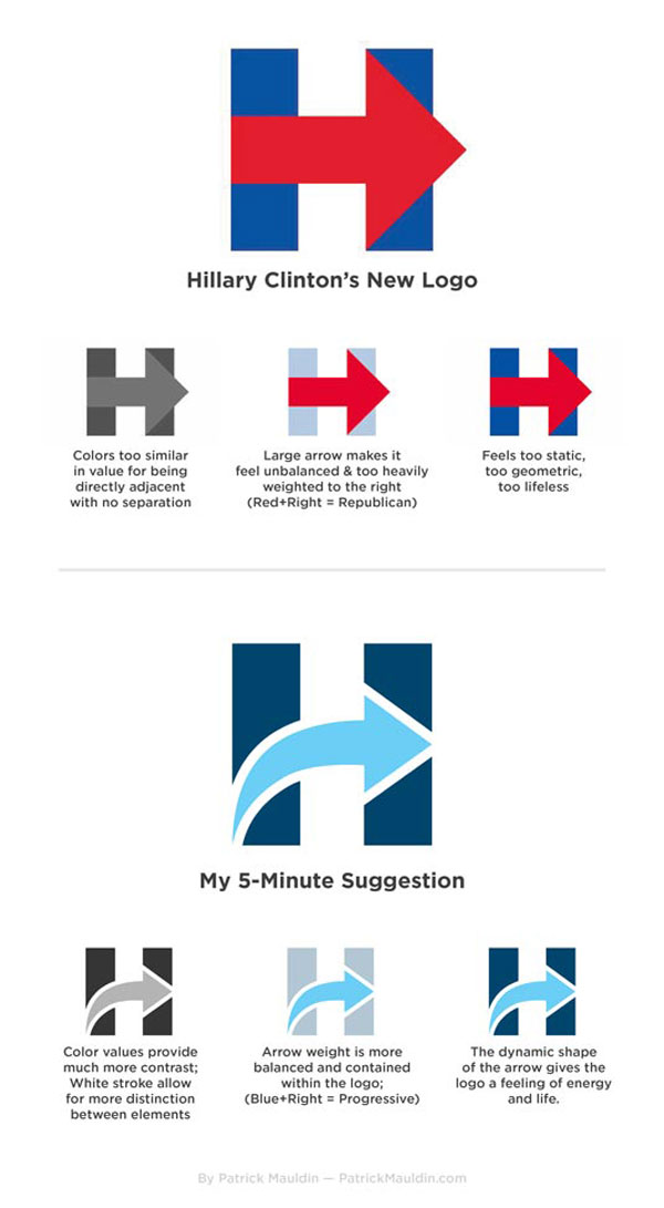
This is also pretty common. Some Internet “design heroes” start to show what they think the logo should look like. On imgur, user monkeysniffer08 quickly published a makeover of the Clinton logo. Using a more dynamic arrow and softer color contrasts, his logo is indeed more pleasing for the viewers eyes. I’m not sure it’s better than the original one though.
LogoMyWay also jumped on the opportunity to get even more exposure than they already do and organized a competition for the redesign. The designer gets paid much less than Michael Bierut, and so far the designs are not very good, as you can expect from this kind of site.
The logo has been mocked too…
It goes without saying that trolls were happy to see such a logo to make it look like a plane hitting the twin towers, fake t-shirts, and many other mocking visuals. Making fake Hillary logos has even become a kind of meme.
![]()
![]()
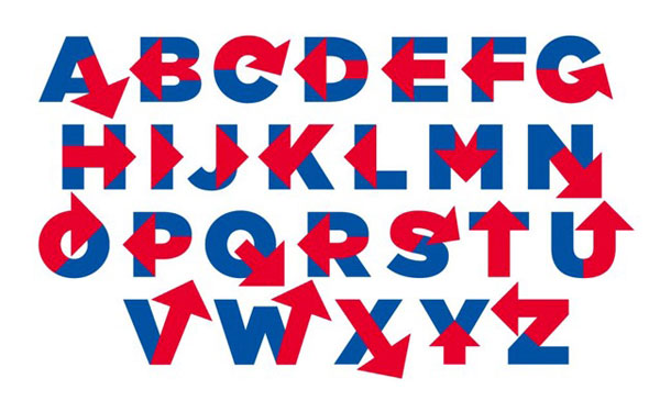
And last, it has become a typeface
Freelance graphic design Rick Wolff went as far as taking the time to build an entire typeface around the arrowed “H”. The typeface, named “Hillvetica”, isn’t amazing in itself, but you got to give him credit for pulling it out so quickly. The Washington Post reacted very quickly and allowed its readers to write campaign slogans with that font.
What’s Next?
As you can see, graphic design played an important role in the 2016 presidential race. It will obviously be the case again for the next elections, so I suggest that you check political campaign logo designs for 2020.
About the Author

Peter Makeshoff
Peter Makeshoff is the founder and main author of Designer Daily.