When creating a website one of the most important things to get right is the layout, the UI – user interface as you would call it, is something that is crucial to conveying the information and point of your website. There are many kinds of website layout designs that agencies and companies use. However the main point of a website is to convey understanding to the user.
One of the critical requirements of an informative website is that it gives the user confidence that their time is being well spent. If the user feels that the website is haphazard then they will lose confidence that they will be able to quickly find the information they need or that the website will be able to perform the function they want. This initial ‘feel’ for the website is used by users as a screening device, quickly filtering out websites that may be time wasters. The user wants signal, not noise.
So why use grids?
If a website is designed with a structured layout, then that feeling of structure comes through to the user in their first impression. It implies that thought has been given to how the website is to deliver its information to the user and therefore gives the user confidence in the website.
As designer you want to create that structured, designed impression for the user. So using a grid is just a formalisation of something that a designer is trying to do anyway. It makes it more explicit. It gives the designer a reference to help them realise their design.
But it is important to remember that the grid is only a reference. It would curtail a designer’s creativity if it was followed strictly. Some opponents of grids might imagine them to be some form of enforced constraint on what you design. This is wrong and it is important to realise that the grid is there to help you achieve your design aim. It should in no way ‘limit’ you.
Grids are utilised as a structural foundation for a website, it can enhance the overall look and feel by allowing you to create a stronger layout for your elements.
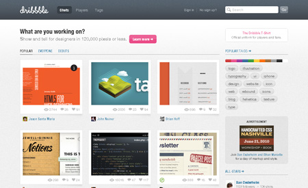
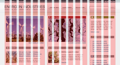
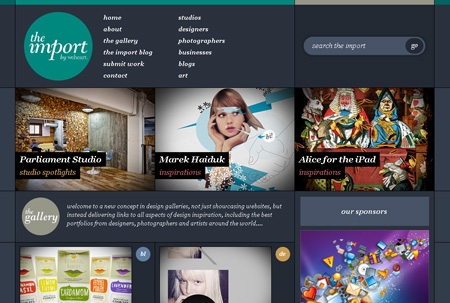
Dribble – Great site with strong grid layout.
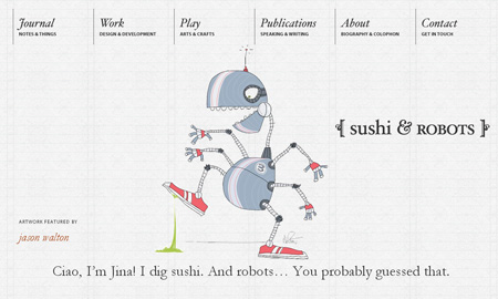
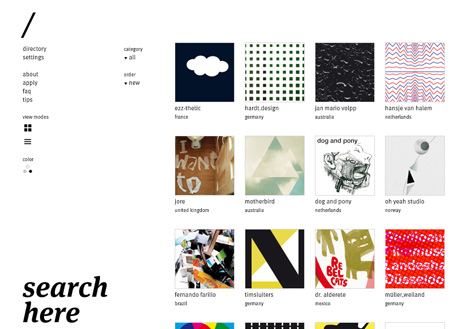
Sushi and Robots – You can actually see the grid in this one!
How do grids work?
Well, in your head you will already have a pre-conception of your layout. You need to find, or create, a back-ground image of vertical and horizontal lines that matches this preconception. Paste this image into a layer in Photoshop, lock it and make it your top layer. You can toggle it on and off as you need. Once it’s in there, when you choose to place an element, the presence of a grid line is a suggestion of an aesthetic location for that element. It’s not a Photoshop guide, as you may want to put these in as well. As it is a suggestion, most pre-made grids use soft colours or shading, rather than hard lines. At least for the columns anyway.
Your choice of grid will depend on your preconception of the website layout. But the essence of grid design is that the grid columns are all the same width, and that you then superimpose page layout columns as multiples of the grid columns. The principle is then to minimize the number of grid columns. If you have a two column page layout with a first column larger than the second column in the ratio of say, 4 to 3, then a 12 column grid is used, with the first layout column spaning 4 grid columns and the second layout column spanning 3 grid columns. Then, when setting out elements within the layout columns, if you align them to the grid columns it creates an appealing aesthetic. Aesthetic is subjective, and therefore it is ultimately your decision as to what resolution you want for your grid columns. Typically nicely divisible numbers are used, the most common being twelve, which is divisible by 2, 3, 4 and 6. Sixteen is also popular.
Vertical layout should also be structured and grids usually have horizontal lines ruled on them. These are typically the same height as the columns are wide although they are often spaced closer than that. One philosophy is that the baseline of all text aligns to this grid however designers tend to be less formal with vertical layout than horizontal columns.
12 Grid Layout:
Example of 960.gs Grid Layout:
So where are the Grids at?
There are many grid systems that can be downloaded. Templates are typically set to particular widths to suit standard websites. For example 960 pixels.
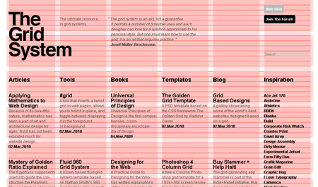
The Grid System, found at TheGridSystem.org, has great templates and information on different types of grid systems. You can download grids and learn about grid systems, design philosophies that use grids and also design in general.
960-Grid, found at 960.gs is used for 960 pixels width website design and comes in two forms, 12 column and 16 column. It is pretty comprehensive and comes with a css generator tool and an html generator tool. 960-Grid is good for sketching, wire-framing, designing and coding because it includes tools to help with all of these processes. Not just the grid image for the designer.
Note that like 960-Grid, Blueprint is also a css famework but doesn’t have templates for the designer.
GridSystem.org:

Design: Art and Science
“The grid system is an aid, not a guarantee. It permits a number of possible uses and each designer can look for a solution appropriate to his personal style. But one must learn how to use the grid; it is an art that requires practice.”
Josef Müller-Brockmann
Words like grid, structure, foundation and system are all very firm, hard words that are being used to describe something that in reality is a helpful guide, intended to be used in a fluid manner. Grids are a suggested alignment to be followed as a general rule but to be broken out of whenever the design calls for it. None-the-less, using a grid system does provide a foundation to the website, that when the elements of website are added, results in the impression of structure. It is this impression of structure that will give the user confidence that they are in the hands of a professional designer.
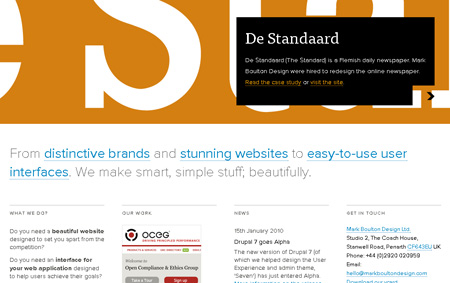
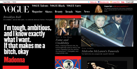
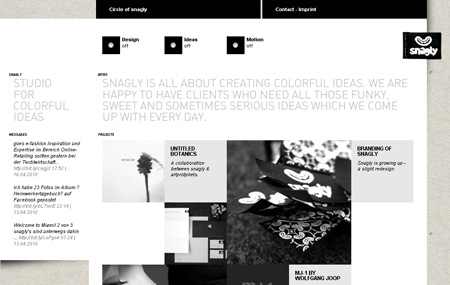
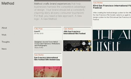
Some great examples of grid based websites:

About the Author

Peter Makeshoff
Peter Makeshoff is the founder and main author of Designer Daily.