The wonderful world of web design powers on relentlessly into 2010. Where is the juggernaut heading now? In the maelstrom of new design methodologies, styles and technologies it’s important to stay on top of the trends. Below are some of the new kids on the block who are making an impact on this ever-changing web design landscape.
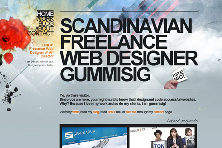
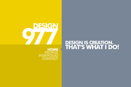
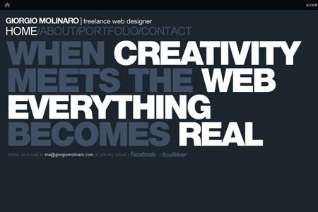
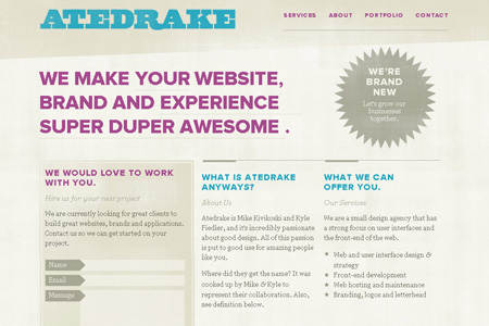
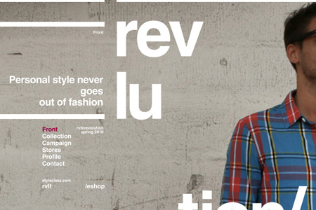
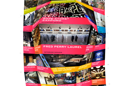
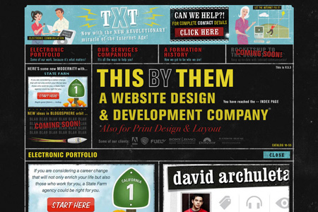
Typography rich sites
With the proliferation of tools such as Cufon, sFIR and Typekit designers can now much more easily put a bit of typography into their websites. But it’s not just these JavaScript tools that are out there.
HTML5 uploads fonts to the server to be downloaded to the client on request if required. This means the designer can rely on the site being displayed as he or she intended. So now we are seeing an art form that was once the domain of the print media coming across to web. Typography design is closely linked to structured grid design, which has also come across the print media.
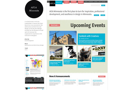
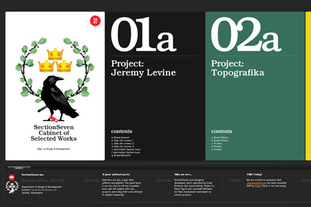
Grid based layouts
As with most controversy, the arguments for and against the use of Grids in web design becomes redundant when one understands more about who wants to use grids and why. For a designer designing a typography based website, they are looking to lay the site out in a structured manner and will typically use tools to help them do this. A grid template is an example of one such tool. The grid philosophy and the associated tools are becoming widely accepted amongst web designers and this trend will continue into 2010. The grid philosophy, such as the golden ratio, has been used in print for centuries and where there is overlap between print and web, it will also be used in web.
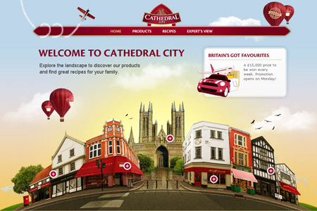
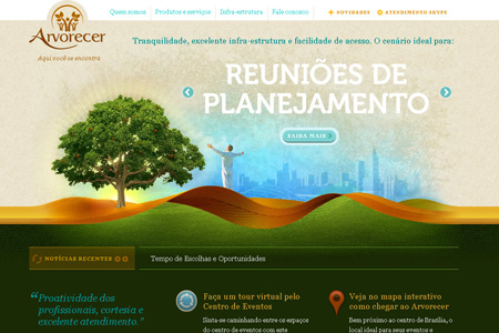
Big headers and introductions
With the coming of the LCD, in the last few years we have seen the almost complete disappearance of the CRT. Every user has been using any excuse to lose the behemoth display and put a sleek new widescreen LCD in its place. Design lags hardware, and we’re now seeing changes to web design that accommodates these higher resolution, widescreen ratio displays. Headers that run right across the screen for example.
Further, as more and more people come online, the demographic of the typical user shifts. Their content consumption habits are different and their expectations of how information is delivered are also different. We’re seeing bigger headers and simple, paraphrasing introductions in bold type. This shift in the average user will continue. Individual websites will cater to specific audiences, but more and more mainstream sites will be catering to easy consumption style.
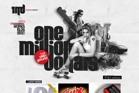
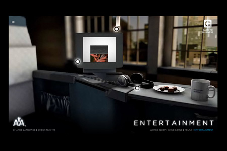
Flash/interactive sites
Interactive sites have been on the rise for a while now. For example it’s now expected that a website for a children’s movie will be interactive. For that matter, websites for movies for adults too! On mainstream business websites some level of interactivity is also becoming expected. As customers try to navigate their way around the modern business website, they are helped in their mission by a horde of created animations.
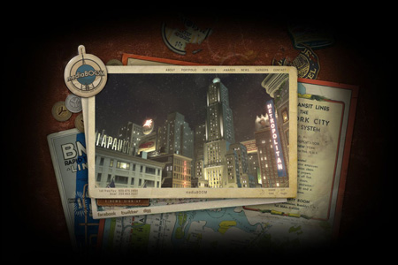
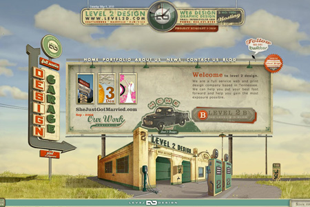
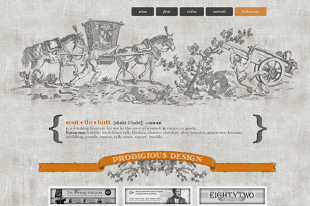
Retro Websites
Retro design is coming across into web design in a big way. But retro is such a broad word. Old style themed websites are drawing there inspiration from any of the decades of this century as well as even older. From 80’s tech back through 70’s and 60’s hippie to 50’s and 40’s austerity. The ever popular steam punk, which could be called future retro, slots in at this point. Then Art deco and turn of the century old timer styles. Our love for yesteryear is only growing and we are going to see more and more of this styling coming through into web design.
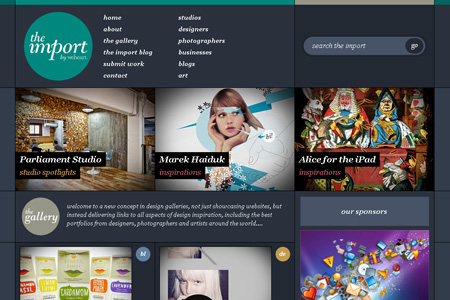
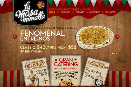
Carousels
Real estate on a website is always at a premium. It is the age-old problem of presenting many options to the user in a small a space as possible. Laying out all these options down the screen looks cluttered and is just too expensive it terms of real estate use. The Carousel is becoming a popular tool for this solving this problem. More and more websites are using carousels, not just for showcasing and for features, but also as a navigational tool. Other tools that also achieve this, like accordions and tabs, are still a growing trend.
And Much More
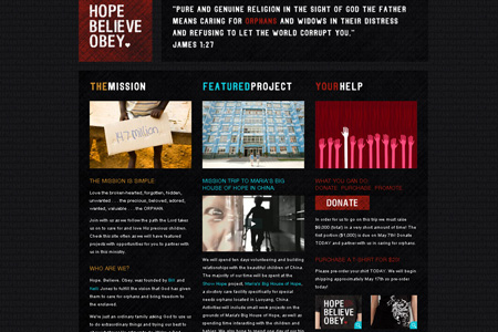
Users want clarity without clutter and what better way to give it to them but with icons! This has been more and more the trend of late with more and more icon use for navigation and simple graphic designation. But not just icons are being used to give a website graphical depth. Textures are also being used on backgrounds and graphical elements to give a layering effect and depth to websites. Textures are being used in combination with typography to make very effective websites.
As can be seen there’s a lot going on and there’s a lot for the busy web designer to stay on top of. Forewarned is forearmed. Good luck out there!
![]()
About the Author

Peter Makeshoff
Peter Makeshoff is the founder and main author of Designer Daily.