Not living up to your audience’s expectations can have its own consequences; design errors can immensely injure a site’s acceptance amongst its audience. Let us discuss frequently committed design mistakes from user point of view:
1. Considering only ideal scenarios
Development generally takes place with respect to the latest browser upgrades. But users may not always have the access to latest versions; some of them might also use elementary browser configurations. Being a designer you should exercise discretion while crafting your designs. A design must qualify the utility parameters – most important being browser adaptability. Apart from producing an advance level output with upgraded systems, the site should also fare decently with lower browser versions.
2. Device Prejudice
Flipkart closed down its web interface, focusing only on mobile apps. Businesses are witnessing a technology shift. And this is majorly predisposed towards mobile phones and tablets.
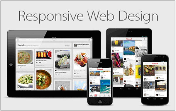
(Image Source: wowlocalmarketing)
Most websites are designed according to large screens, and this is where they fail when the user views it on a smaller screen. The components get distorted spoiling the user experience. And so for optimized viewing on small devices mobile friendly websites are needed. Broadly speaking not all businesses can afford to launch a mobile site, but they can take a middle lane by going for responsive website designing.
This device compatible website design adapts itself to screen resolution and displays components accordingly.
3. Optimize for Search Engine
You cannot expect all the internet surfers out there to know your website url. Neither linking gets you all the traffic. So which is the source that is capable of getting you notable traffic? You guessed it right the major director of traffic to your site remains search engine.
Search engine optimized content cannot just fetch you good rankings, compliance with standard guidelines improve the overall site experience as well. Optimization includes relevant content creation, precise site map, standard-markup language, meta tags etc.
4. Complicated Navigation
Navigation pattern should be synchronous with the entire site. Intuitive navigation is a widely used term, but what does it actually mean? Intuitive navigation can be defined as built-in navigation elements, placed correctly within the site, that behave according to user expectations leading them to their desired information.
A clumsy navigation will get your site shunned by people. Avoid ‘click here’ links in your site; they confuse rather than help. Instead use genuine text on navigational links or simply use icons to manoeuvre users.
A South African portal has been awarded as the best designed property portal internationally for its simplistic visuals and purpose oriented design that caters buyers, tenants, advertisers and even visitors.
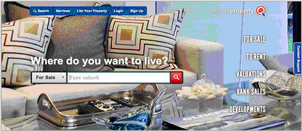
(Image Source: Privateproperty)
This ascertains that sites constituting a well-defined navigational structure stand higher in popularity charts.
5. Cloudburst of Pop-Ups
With an aim to prolong a user’s stay on the website, pop-ups are made a part of it. But a larger number of pop-ups beget contradictory results; it is unlikely for a user to stay on a webpage that instead of serving information relinquishes control to subsequent pages.
Predominantly these pop-ups are associated with advertisements and people tend to keep these pop-up windows blocked in browser settings. As far as my experience goes, it is not advisable to include those elements in your site which annoy users.
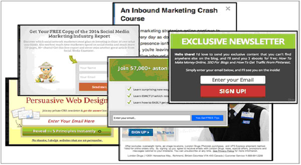
(Image Source: thesocialmediahat)
6. Mismanaged Search Box
When navigation does not serve sufficient, users turn to search box to avoid further meandering the site.
Especially if yours is a business website, in-browser search will not get your users closer to sale. Therefore an appropriately made and laid search box is a requisite for any business website whether ecommerce or not.

(Image source: vinemarket.com)
If you include advanced search options, eschew multiple fields; and if they are required don’t make them mandatory. Place the search box on top for visitors to locate it easily. And keep it of notable size.
7. Unorganized Content Layout
Overwhelming design and ambiguous content misleads visitors coming to your site. Ideally a user should be able to identify your sites’ purpose within a few seconds of arriving. And for this you just need to stick to the basics of things – ‘Simplicity is evergreen’. You can either adopt a simple layout with organized distribution of text or a minimal content layout. If your content embodies clickable elements make sure they are recognizable. A clear site map and inclusion of FAQ and Contact-Us segments addresses most queries.
8. Dearth of whitespaces
Whitespaces give breathing room to your content. By delimiting different elements they project an organized layout. Readers construe clear layouts better than messy ones.
Adequate space between content enhances visual receptivity. A text that is surrounded by a lot of whitespace automatically gets emphasized.
As discussed earlier websites with simple minimalist designs effortlessly convey their information to the reader.
(Image Source: Webdesignerdepot.com)
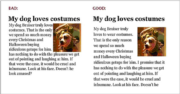
9. Fancy Fonts
Fonts should be in tandem with the page design. Anything that stands out from the page layout creates an imbalance. Unless innovation is on your list, it’s recommended to go with traditional font-background color combinations which have attained audience acceptance.

(Image Source: Pinterest)
While fancy fonts may turn heads, not everyone is comfortable reading stylized text. For that matter even highlighted text aids readability to some extent, but if overdone it can ruin the impact.
The primary requirement with written content is legibility. Select fonts (style as well as size) which are legible and supported by most operating systems. Your content needs to be reader friendly.
10. Complicated Graphics
When talking of a site’s reader retention what mainly matters is its interface. Every page can ordain a different theme but all of them should cohere to a uniform format across site. The different page themes should only help maintain heterogeneity and not flummox users. The objective of a website is not to provide entertainment but information to visitors. Avoid using heavy media components like images, sound, animation, videos unless necessary. Sites with light graphics load quickly and this is a major user satisfaction criterion.
Some sites also incorporate complicated registration forms that sweat users causing them to leave the site without registering. If your site requires users to fill up forms, make sure they are short and simple.
To err is human. People who never make mistakes are rare finding. But to learn something you don’t need to tread the path yourself, it is smart to learn from mistakes of others. There are books, interviews and a lot of material available to guide you on best website development practices. Master them and game up to create websites that users love visiting.
Author Bio: John Siebert is the President and CEO of Tranquil Blue – Tampa Website Design Company that focuses on all kinds of website design, mobile app development and search engine marketing.
About the Author

Peter Makeshoff
Peter Makeshoff is the founder and main author of Designer Daily.