Flyers can be extremely powerful when used wisely, but unfortunately, a lot of the flyers you see out there are catastrophically designed.
This is unfortunate for the many businesses that choose to invest in flyers as a marketing tactic, as poorly designed flyers very rarely generate a return on investment, and certainly don’t create the desired impact with potential customers/clients.
This is a big problem, as flyers aren’t cheap (at least not in small quantities) and neither is distribution, so you need to make sure you get your flyer design right before investing in print and distribution from Flyers ASAP printing.
But how exactly do you do this? How do you design a flyer that is guaranteed to create the desired impact with your target audience?
Well, it’s impossible to guarantee the positive outcome of a flyer, but there are a number of steps you can take during the design process which will help to give your flyer the best possible chance of success.
Here are a few design tips to get things started:
Use Imagery to Attract Peoples’ Attention
Making use of high-quality imagery is one of the “oldest tricks in the book” when it comes to creating a flyer that actually grabs peoples’ attention.
Why? Well, there are probably a few reasons:
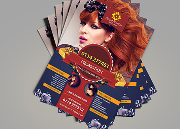
First, images are often of the real world and/or contain human faces. There have been a number of studies that show how people are naturally drawn to human faces and real life imagery when used in marketing (notice where your eyes are naturally drawn to when you view the flyer above? It’s probably the woman’s face, right?).
Imagery like this creates a bond between the viewer and the company.
Second, images are usually made up of many colours, and colours almost always attract attention as they can be seen from far away.
These images don’t always have to be photos though; they can just as easily be illustrations or even some for of abstract imagery.
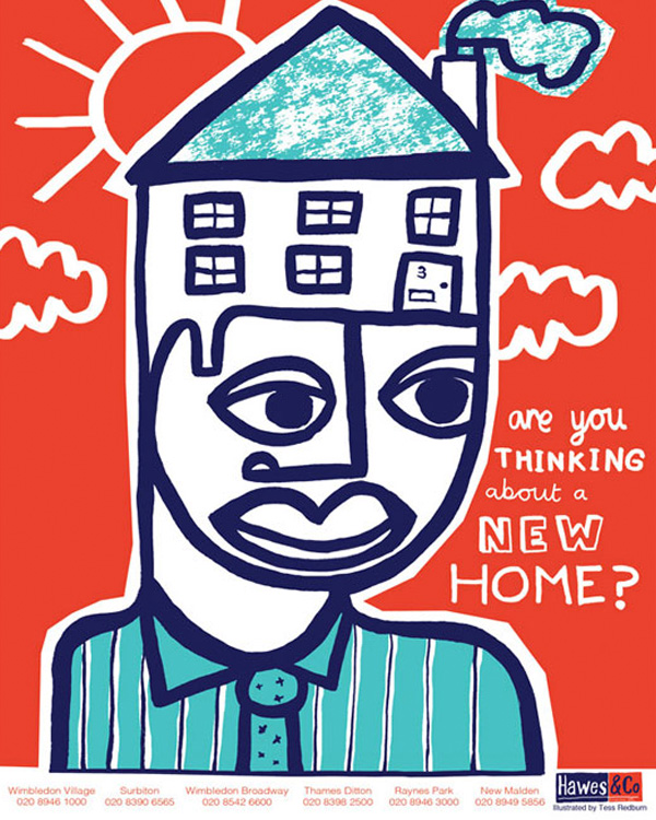
For example, take a look at the image above. This is nothing more than a quirky illustration, but it still has the same attention-grabbing effect that a photo might do.
Here’s another example:
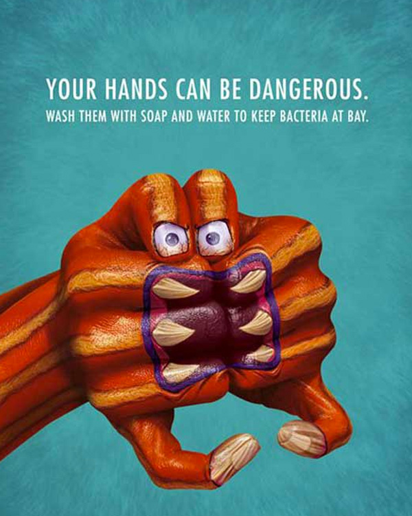
This time, it’s a sort of hybrid of photo and illustration. The image itself is an actual photo, but the hand in the photo has been illustrated upon.
One thing you’ll notice about this is that, once again, it serves as a focal point for the flyer. It stands out from the background and you can imagine that you’d be able to see this from quite a distance.
That’s the trick when designing a flyer: make sure it grabs peoples’ attention enough for them to actually make the effort to pick it up and investigate further.
Get Creative & Forget the Bog-Standard “Rectangular” Shape
When most people design a flyer, the process typically starts the same: they’ll open up Photoshop or Illustrator (or a design application of their choice) and create a blank rectangular document.
There’s nothing wrong with doing this, as there are some excellent rectangular flyers out there, but who says you have to stick to the same old rectangular design?
Nobody does.
So, why not get creative and make use of an entirely different shape altogether? You can almost guarantee that it’ll be more impactful than a bog-standard, boring, traditional rectangular flyer.
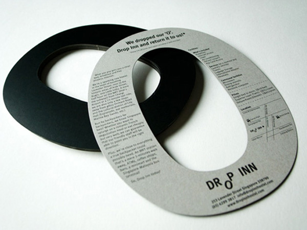
The exact shape to use is entirely up to you, but as you can see, a circular flyer can work extremely well.
The flyer above was created by the Drop Inn Hostel and as you can imagine, it invoked a sense of curiosity when people saw it on their travels.
It’s this level of curiosity that makes a flyer so impactful, as most people will be inclined to pick it up and have a closer look if you manage to pique their curiosity.
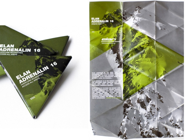
Another option is to opt for a triangular flyer (like the one above).
This is actually quite a popular option as the flyers can be printed on regular rectangular paper and then simply folded to achieve the desired triangular styling (you have to design them with the triangular styling in mind, though).
Again, the somewhat abstract shape helps to create a distinct flyer that will pique a person’s curiosity and lead them to investigate further.
Use Bright Colours
This one is a simple tip, but it’s one that people often don’t give enough weight to: making use of bright and eye-catching colours.
The whole point of a flyer is to grab a person’s attention and lead him/her to investigate/read further. Therefore, it usually pays to make use of bright colours to do so.
However, you don’t want to go ahead and use any bright colours, and you certainly don’t want to use bright colours if they don’t suit your brand. For example, if you’re Apple or another luxurious brand, bright colours might not necessarily be the way to go.
You want to use bright colours that compliment your brand, as in most cases, doing this will skyrocket the level of impact that your flyer will make on your target audience.
Here’s a great example of a colourful flyer:
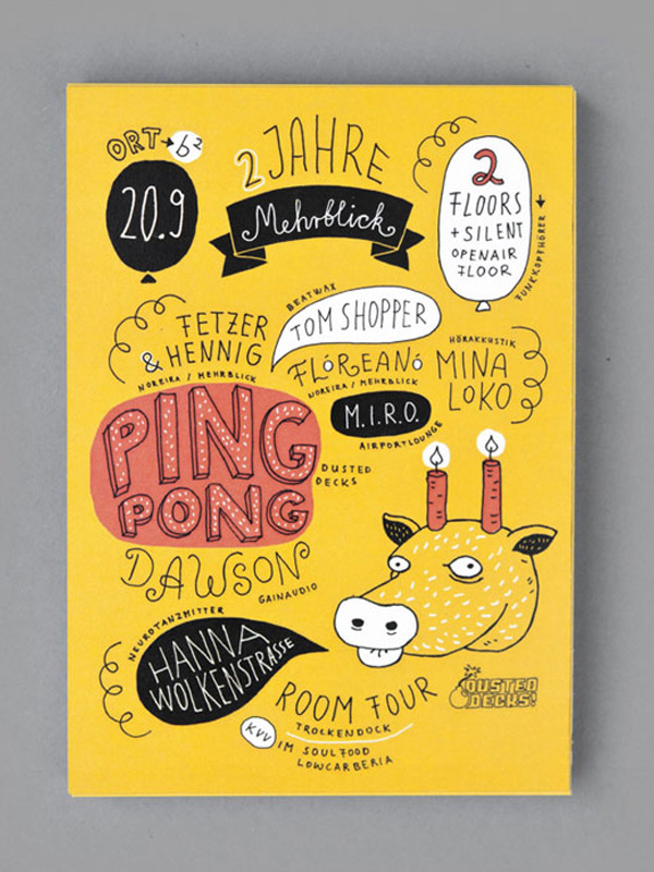
This flyer was created to promote an annual electronic music festival, which takes place in Germany.
As you can see, it makes use of a bright yellow colour, along with red, white and black.
The yellow is the main colour used throughout the flyer for one primary reason: it’s the brightest. Red, black and white are simply there to draw attention to different aspects of the design, such as the artists that were playing at the advertised event.
However, if colours this bright don’t suit your brand, it’s important to realise that things don’t have to be this “in-your-face”; you can use bright colours slightly more sparingly, like this flyer does:
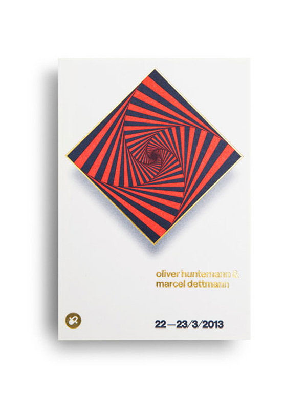
Red and gold are the “bright” colours here, but as you can see, it’s not as crazily bright as the last example. However, it’s still eye-catching and your attention is drawn to the big crazy spiral (optical illusion?) in the centre.
The bottom line: try to make your flyer have at least some bright eye-catching elements, but don’t use any colours that don’t represent your brand in a positive light.
Don’t Try to Include Too Much Information
Perhaps the biggest sin in the world of flyer design is trying to “cram in” far too much information.
This is something you want to avoid at all costs, as doing so will not only alienate the reader and confuse him/her, but also detract vital attention from important information on your flyer.
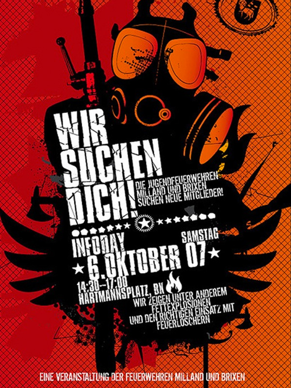
You can witness a good example of “too much information” in this flyer:
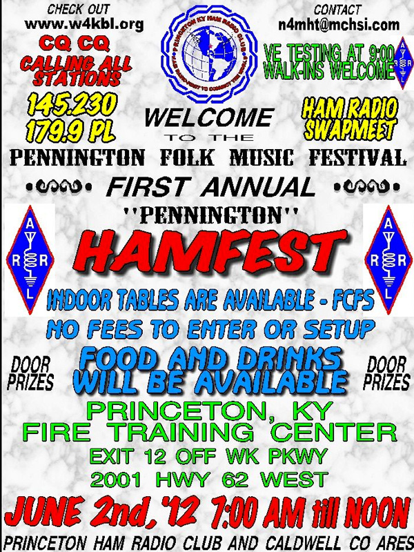
Instantly, you suffer from information overload, as there’s just far too much information crammed onto one flyer.
You’ve got information welcoming you to the event, information about what you can/can’t do when you get there, some vague information about “door” prizes, the date and time, and lots of other unnecessary clutter.
This flyer would be much more appealing if it only contained half of the information that it currently does.
For example, including the location, event title, time and date would be plenty. If you were worried that people need more information, you could always add a line that says “for more information, check out our website”.
Here’s a flyer that does exactly that (above).
It includes the vital information that you would probably need in order to attend the event, with a link to the website at the bottom of the flyer for those that might wish to find out more information.
It’s also simple and colourful (note point #3).
Keep It Minimalistic, Not Cluttered
Following on from the previous point, you should also note that the best flyers are extremely simple and minimalistic, rather than being too cluttered.
And we don’t just mean in the sense of the level of information included either, but also in the sense of their design features.
For example, most well designed flyers will make use of just a few colours (usually no more than three), a couple of typefaces (often just one), and no more than one or two high-quality images.
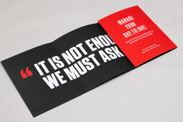
Check out the flyer above for example; you’ll notice that it fits this description perfectly. It uses no more than two typefaces, only three colours (red, white and black) and, well, no images at all in this case.
Here’s another flyer that perfectly fits the bill (above): it contains two typefaces, just a couple of colours (red and white), and one eye-catching, high-quality image for the background.
Make sure your flyer follows similar rules and is as simple, minimalistic and uncluttered as possible.
Conclusion
Designing an impactful flyer doesn’t have to be rocket science; you just need to follow a few basic principles (listed above) and you’ll be well on your way.
Of course, there’s no substitute for a designer oozing with creativity and an eye for design, but if you can at least guide them in the right direction and understand the principles that make up a good flyer, the process will be easier than ever before, whether you’re working with a designer or not.
Bio: Josh is a design enthusiast based in Sheffield, UK. He works for a graphic design agency and loves his job; he can also usually be found designing stuff in his spare time. He lives and breathes design.
About the Author

Peter Makeshoff
Peter Makeshoff is the founder and main author of Designer Daily.