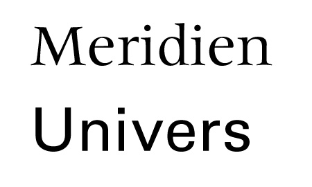
The Meridien and Univers typefaces have at least two things in common: they are made by the same person and are both meant to be friendly to any language.
Adrian Frutiger worked on the Meridien after noticing the problems he had for multi-languages book designs. Every language had its own specificities and tricks, for example German has much more capital letters than other languages, so the you’ll .
At first, font developers created typefaces for their language, so old fonts tend to have a stronger attachment to their language. Caslon is appropriate for english, Garamond for french and Bodoni for italien. Frutiger thought that this should change and the Meridien was aiming to give the same look and feel to text in different languages. For example, one of his tricks was to make the capital letters a little shorter, so that German would not look odd compare to other languages.
The Univers is the font that made him famous, and the same little capital letters trick is applied in it. Even its name was intended to be universal.

