Slab serif fonts are everywhere. After being disregarded by designers for too long, Egyptian styles typefaces are finally getting some good press and become very trendy. In this post we cover the best fonts with slab serifs for your designs.
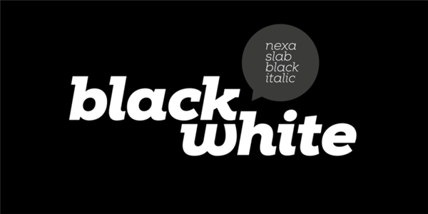
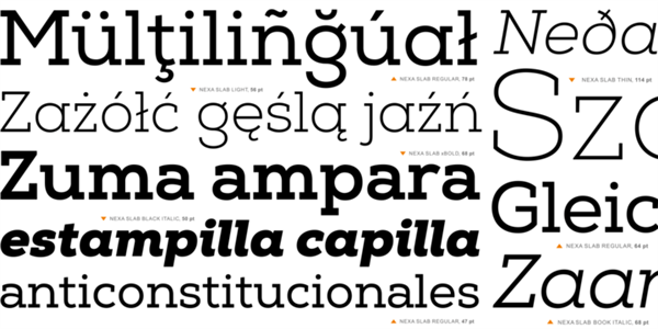
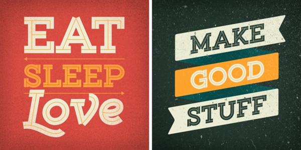
1. Nexa Slab
This font family contains 3 basic forms: italics, obliques and uprights, each of which has 8 different weights. This visual richness makes it the ideal slab serif font family for the web as well as for print, for motion graphics, logos, t-shirts and so on. It is also great for headings, fitting nicely with both small and large typesetting text blocks.
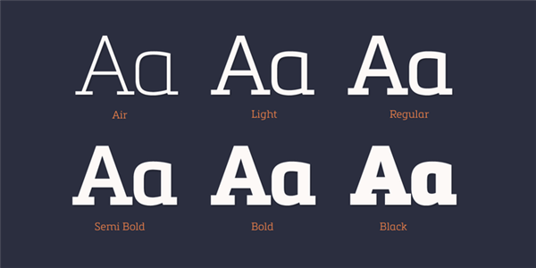
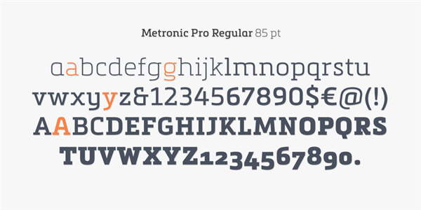
2. Metronic Slab Pro
Metronic Slab Pro is a slab serif typeface with a technological and minimalist look for text and headlines. It has six versatile weights from Air to Black with an alternative glyph set to improve its use in different graphic contexts. Metronic Pro has a wide range of OpenType features such as: old style and proportional figures, ligatures, case sensitive forms, fractions, stylistic alternates, arrows and an icons/ornaments set.
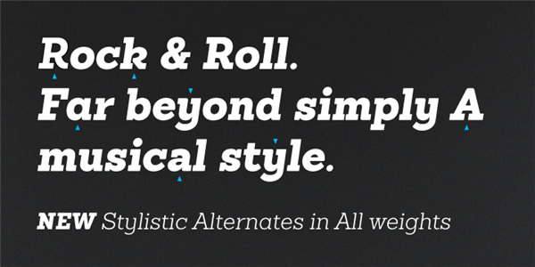
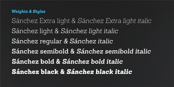
3. Sanchez
Sánchez, designed by Daniel Hernández, is a serif typeface belonging to the classification of slab serif fonts, or Egyptian, that bears a strong resemblance to the iconic Rockwell, but with rounded edges— offering contrast and balance to the square structure.
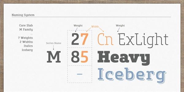
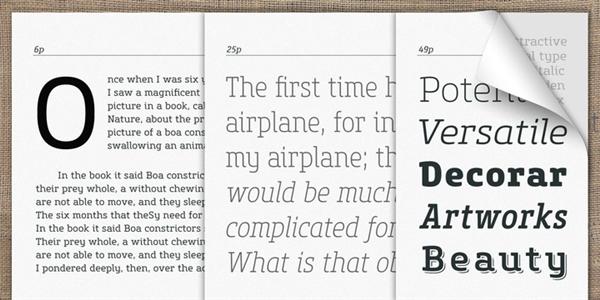
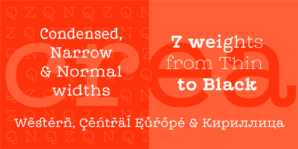
4. Core Slab M
This font family has open and square letter shapes, and overall rounded finishes and serifs provide a soft and friendly appearance but also it is strong in headline. Simple and modern shapes with a tall x-height make the text legible and the spaces between individual letter forms are precisely adjusted to create the perfect typesetting.
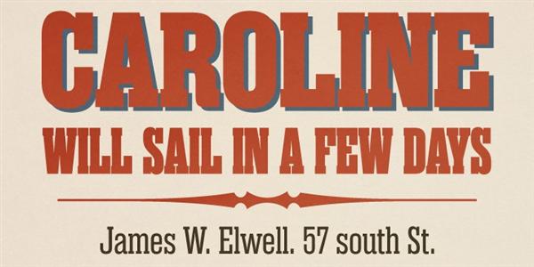
5. Rama Slab
Rama Slab is an antiqued slab serif designed inspired by 1800s-style wood type. All glyphs had been designed carefully to be retro-looking of the old time and to fill all with nostalgia. This condensed font family with 18 styles will be the best solution for posters, titles and anywhere you need impact.
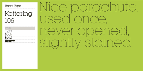
6. Kettering 105
Kettering 105 is inspired by the classic, geometric slab-serifs such as Lubalin, but has shallower ascenders and descenders for a more compact look. It’s a versatile, modern slab-serif, highly legible as a text font and with a clean, elegant look as a display font at larger sizes. The Kettering 105 family comprises of five weights and is closely related to Kettering 205.
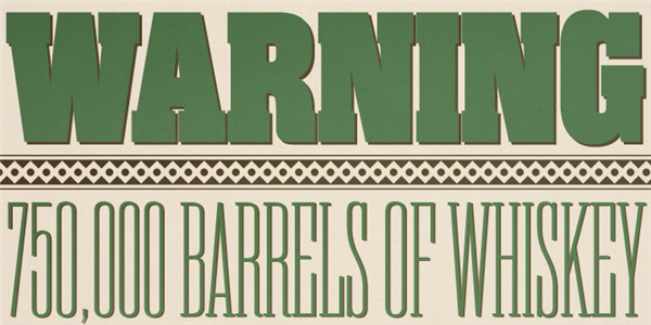
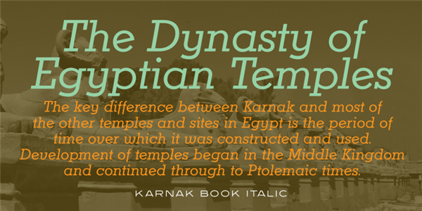
7. Karnak Pro
Karnak Pro is based on the original design by Robert Hunter Middleton. Digitally engineered by Steve Jackaman and Ashley Muir from the Ludlow’s slab serif fonts drawings, circa 1931–1942.
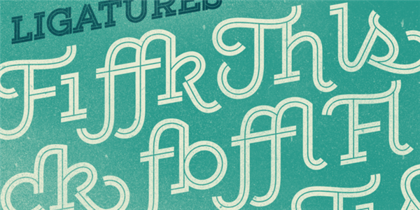
8. Gist
Gist from Yellow Design Studio is an inline slab serif with a retro yet modern vibe. It’s a collision between monoline slab and indie script. With 627 glyphs per weight, it’s highly customizable…either keep it simple with the base character set or use ligatures, alternates and swashes for extra flair.
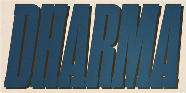
9. Dharma slab serif fonts
This condensed font family with 42 styles will be the best solution for posters, titles and anywhere you need impact. To complete your work perfectly, Gothic Extras family is ready for free. They include borders, ornaments and frames designed using vintage catalog of Hamilton in 1800s as a model.
10. Leto Slab
Leto Slab is one of the more decorative type of slab serif fonts. It comes in seven weights.
About the Author

Peter Makeshoff
Peter Makeshoff is the founder and main author of Designer Daily.