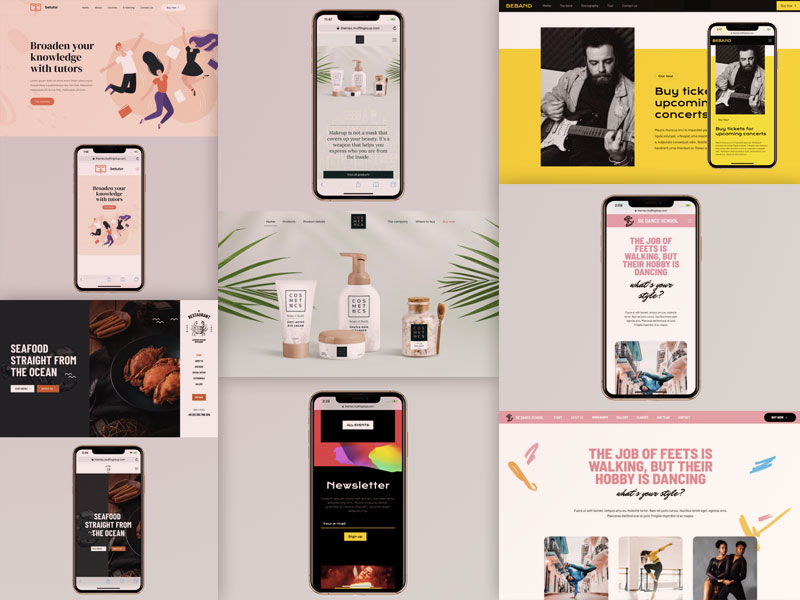
Making sure your website will look good on every browser and device needn’t be an insurmountable challenge. These responsive designs show you how it’s done.
When, according to data from StatCounter, more than half of today’s website traffic is viewed on mobile devices, a web designer is left with three options: (1) stick with desktop browsers, (2) go mobile, or (3) maximize traffic by going with both.
Going with Option 3 requires extra effort, but not all that much, and the rewards are great (if roughly twice the amount of traffic appeals to you).
There’s a list of specs and requirements that must be satisfied in designing a responsive website; but given today’s tools and techniques those specs and requirements needn’t be difficult to satisfy.
High-quality WordPress themes like those BeTheme provides do most of the heavy lifting for you to make designing a responsive website just like taking the proverbial walk in the park.
Both desktop and mobile users have easy access to your site, and Google will reward your responsive, mobile-friendly site with better search rankings
Which is why Responsive web design is a must.
It’s simply not true that responsive design takes desktop users out of the picture. Prioritize the mobile experience, and if you do it well everyone will be happy.
Let’s look at some examples of what “doing it well” involves.
How responsive web designs can encourage leaner yet highly engaging desktop experiences
One advantage of designing for desktop users is having more space, and therefore more pixels to work with. Trying to get the most out of “every pixel” is not only impractical but a poor design approach as well.
Consider the popularity of sites featuring minimalist design techniques or exhibit a generous use of white space.
Designers have in fact learned to create leaner and more efficient desktop experiences in their drive to create effective mobile experiences.
Take designer/developer Rob Grabowski’s website as an example.
On a mobile screen it looks like this:
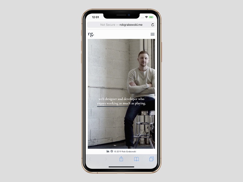
Website visitors have no problem focusing on the welcoming message and the photo behind it.
Desktop visitors encounter virtually the sameexperience:
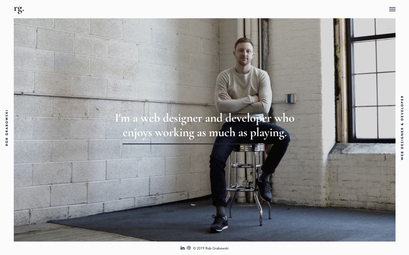
This is a great example of seamless transitioning between desktop and mobile displays. With the proper design techniques,it’s not hard to accomplish.
Mobile web designs that simplify and enhance the decision-making process
One of the pitfalls of an over-busy website is that it can present an overabundance of choices or options to the user, which in turn can make choosing between similar options more difficult.
Responsive design techniques force web designers to take a modular approach to designing a site, creating levels of website sections which in turn makes it easier to review one option at a time.
BeRepair, one of the 500+ pre-built sites in BeTheme’s library, does an excellent job of demonstrating this design approach.
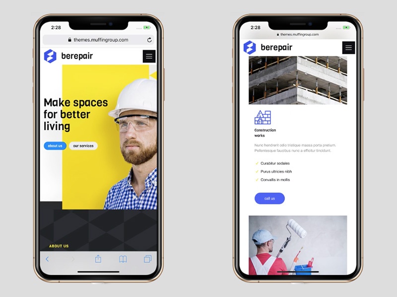
This responsive layout makes it easy for the viewer to focus on the message without being distracted by an overabundance of information.
Let’s take a look at a completely different websitetype, in this case the BeRestaurant pre-built desktop site:
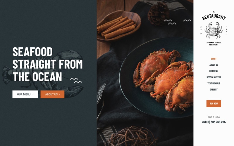
Great looking, right? The mobile version is every bit as attractive while featuring fewer details that could prove to be distracting.
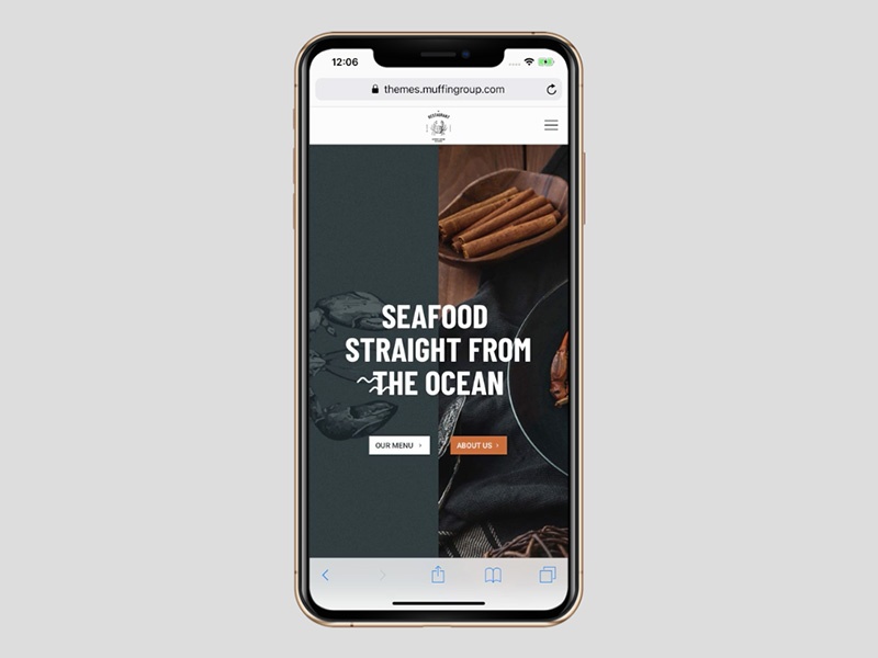
Note how the menu has been placed on a separate but readily accessible level by incorporating it into the hamburger menu, allowing the visitor to proceed one step at a time.
Responsive designs that excludeexcessive information
Consider paintings you might encounter in an art museum.
You’ll see landscape murals that are rich in beautiful details yet still tend to have a central focus.
That central focus is generally more clearly defined in portraits, even when surrounded by intricate details.
Responsive websites offer the best of both worlds. When you think of landscape, think desktop, where there is an abundance of space to work with. When you think of portrait, think mobile, there’s less space to work with but more than enough to focus on the message.
To get from one to the other, it’s a matter of knowing what details can be trimmed away as excess in such a way as to ensure the mobile experience remains worthwhile.
BeITService is a good example of this. First, the desktop version:
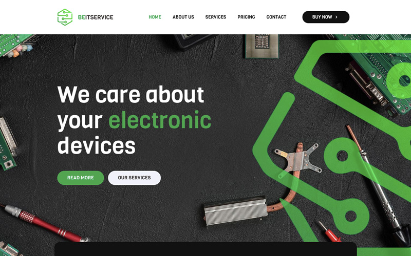
This is a great looking home page. Plenty of detail, and plenty of space as well in this responsive image. Note how easy it is to remove some of the detail to create the mobile version:
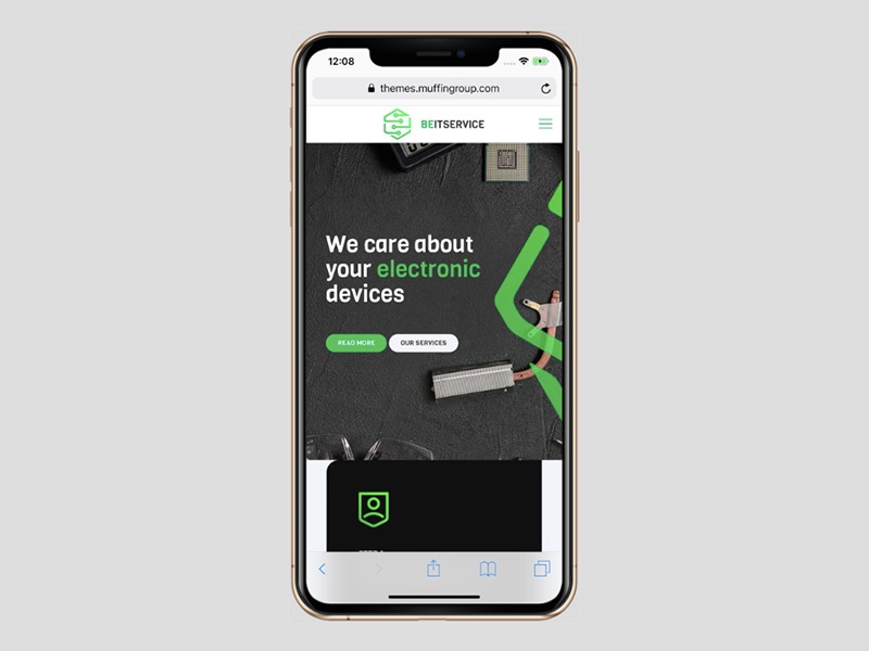
While some of the image has been trimmed away, it’s fair to say that nothing has really been lost in the transition and the message is still front and center.
Culturally Connected, while involving some rearranging to make the transition, takes a very similar approach.
The desktop version:
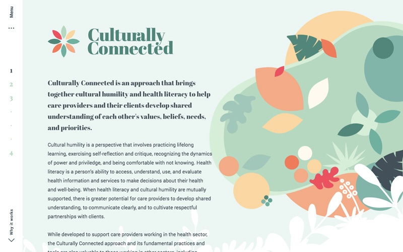
The desktop version features a rather elaborate background graphic. Much of the graphic can however be looked upon as excess, giving you this on mobile:
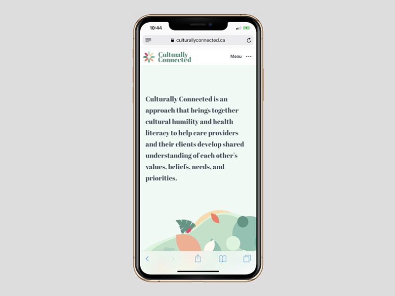
Again, nothing has been lost. The secondary text has been placed in a different section where it will not serve as a distraction.
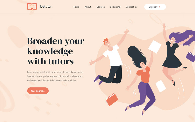
BeTutor is another great example of this technique. The desktop version looks like this:
To get to the mobile version, the designer simply omits the smaller text. The primary message remains intact.
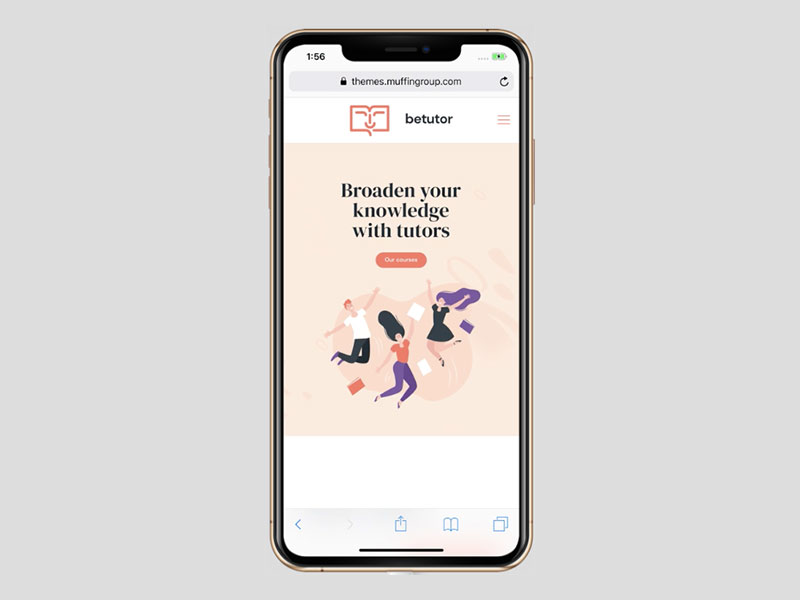
None of the subject matter that reveals the type of service offered has been removed.The graphic is unchanged, and the design as a whole remains uncluttered.
Responsive websites that leverage their space
The previous two examples removed secondary textin the mobile versions. In the following example, by leveraging space web designers can sometimes take advantage of different screen size ratios.
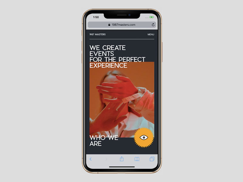
As the 1987 Masters demonstrates:
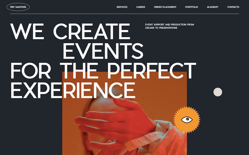
The mobile version on the other hand takes advantage of the vertical space to show additional content that will be of value to the viewer.
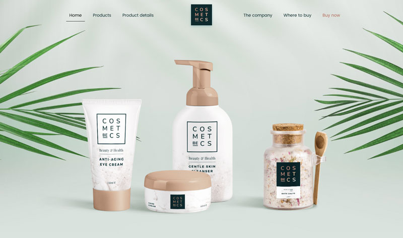
While mobile designs are sometimes forced to show less content to work effectively, it doesn’t always have to be that way. BeCosmetics is a good example of this.
The desktop view:
The mobile view leverages the added vertical space to provide the viewer with some useful introductory content plus a button that invites the visitor to check out the product line:
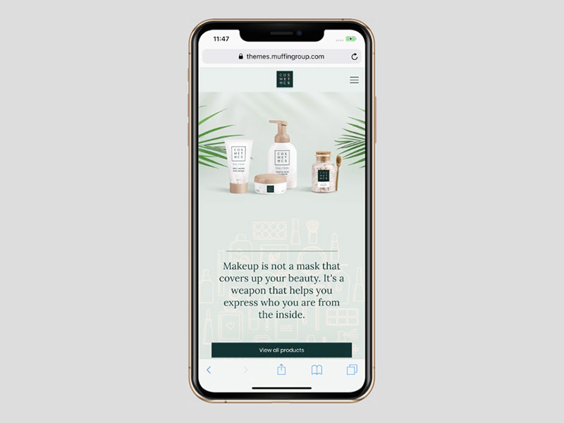
While it may sound counterintuitive, having less space doesn’t always limit the amount of comment if you are able to leverage that space.
Responsive websites that heighten readability
Internet users tend to be an impatient lot to begin with, and even when they find a site to their liking, they’re not apt to put up with text that, for whatever reason, is difficult to read.
It’s not only font type that matters. Too many words on a line or cramped lettering can be enough to cause a reader to bail out.
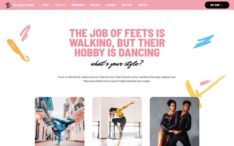
One helpful hint is to use visual elements to even out the text, as has been done in the BeDanceSchool site.
While it’s easy for visitors to focus on the content on the desktop version, thanks to the eye-catching graphics, the same design won’t work on mobile. By taking advantage of both the strengths and weaknesses of mobile screen size, the problem can be handled like this:
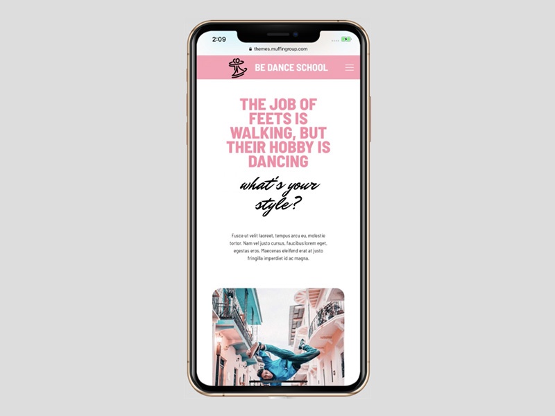
Significantly paring back the graphic designelements enables visitors to easily read the content. The text itself is beautifully styled to support readability.
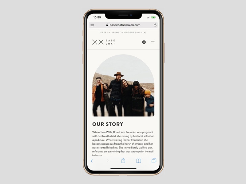
The choice of font size and type also matters of course. See what Base Coat has done to ensure the text is both readable and engaging:
Be mindful of the fact that, while a vertical format can often be used to advantage with respect to text, lengthy text that requires scrolling can prove to be daunting for mobile users.
Mobile sites that highlightvisual content
Turning from how best to deal with lots of text on mobile sites, let us now take a look athow storytelling elements can contribute to a highly positive mobile experience.
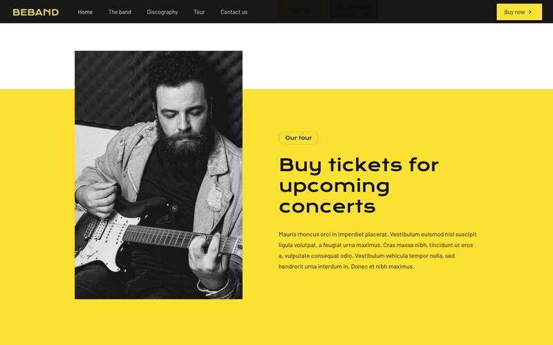
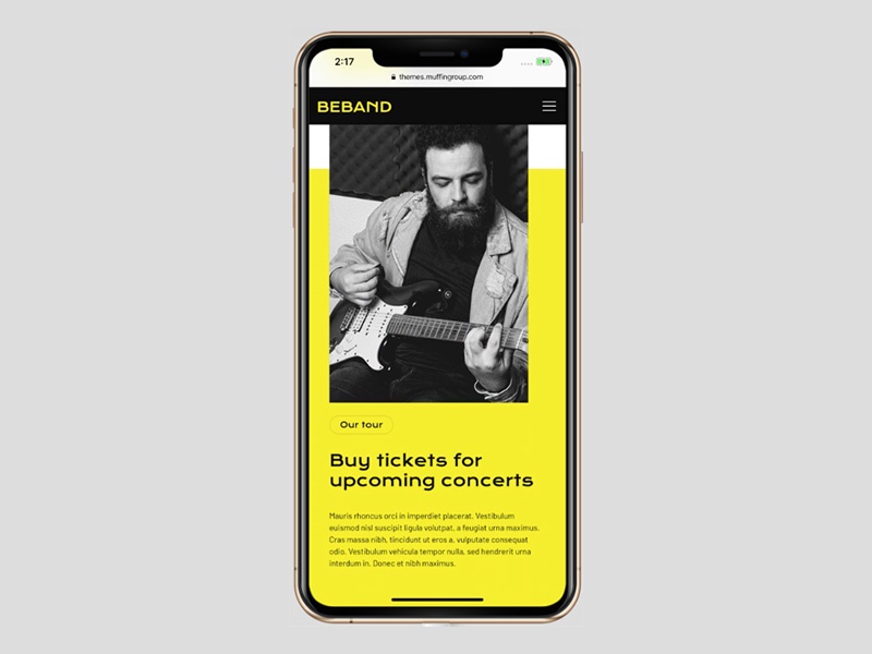
Starting with what visitors experience on BeBand on the desktop:
A mobile screen doesn’t provide nearly as many options to play with design balance as on a desktop, but it can nevertheless highlight whatever image you’ve chosen:
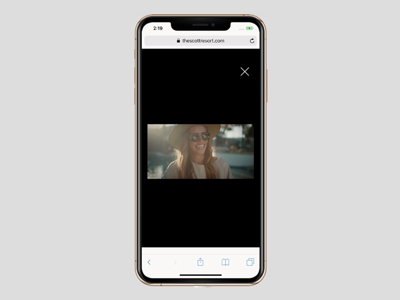
It’s not only website static images that work well on mobile. The Scott Resort, for example, invites its first-time mobile visitors to watch a brief video:
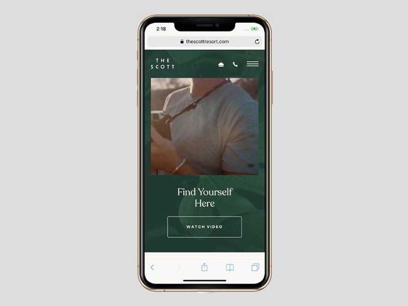
Regardless of the device a visitor is using, a responsive video will automatically conform to the width of the screen.
The video as seen on desktop:

The video on mobile looks like this:
A mobile responsive design gives the maximum number of users the experience you want them to enjoy by allowing your content to adapt to the devices they happen to be using.
Mobile responsive sites that do a great job of accumulating leads
It needs to be emphasized at this point that, while responsive websites will typically generate more traffic, mobile conversion rates are not as high as they are on desktop; a situation that is expected to improve over time.
Given than, a responsive site should be designed to capture as many leads as possible to help achieve an acceptable conversion rate.
The BeClub pre-built website illustrates how this can work:
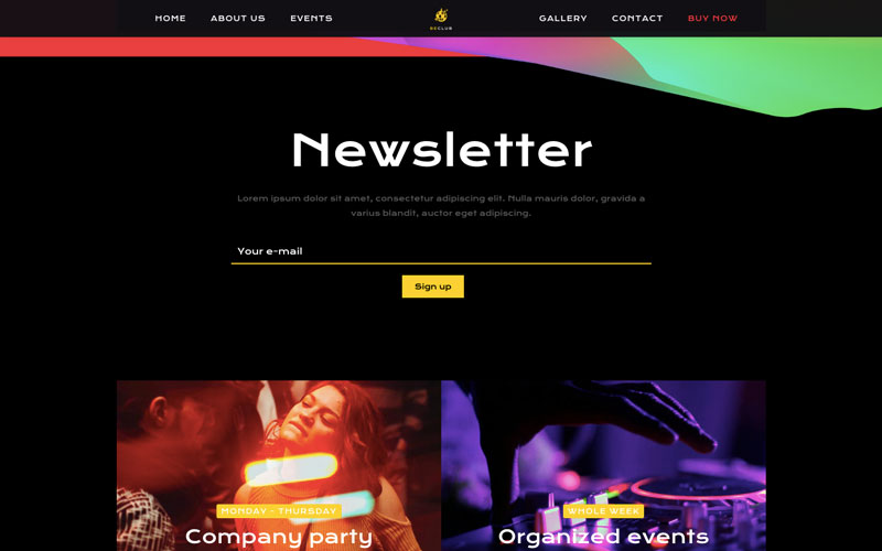
Note how effectively “Newsletter” is highlighted on the home page, and how it immediately precedes an invitation to subscribe.
The result? A ton of subscribers.
Here’s how the same page appears on mobile:
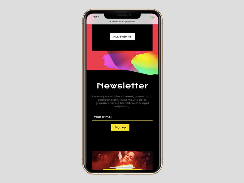
Not only is it very well done, but the mobile version may be even more effective in engaging potential subscribers due to its smaller,more dedicated space.
As is the case here, and with all the previous examples, website owners receive an extra benefit whenever a visitor uses both desktop and mobile devices.
Responsive web designs for the win
What do WordPress users look for in a theme to base their website design on? Most certainly, they look for many if not all of the following qualities:
- Easy to work with
- Cost effectiveness
- Key features
- Customizability
- Overall design quality, including performance
Yet another quality must be added, and that is responsiveness. Not every WordPress theme has been designed with mobile users in mind.
That’s not the case with BeTheme. Each of its more than 500 pre-built websites has mobile responsiveness baked right in. With BeTheme, you won’t have to agonize over how you think your pages might show up on mobile screens. You can spend the time you would have otherwise spent stressing yourself out with worry to getting your site online and building your business.
About the Author

Kate Dagli
Kate is a passionate web designer who loved WordPress from the minute she laid her eyes on its code. Writing about WordPress themes, plugins, and web design trends is her dream come true.