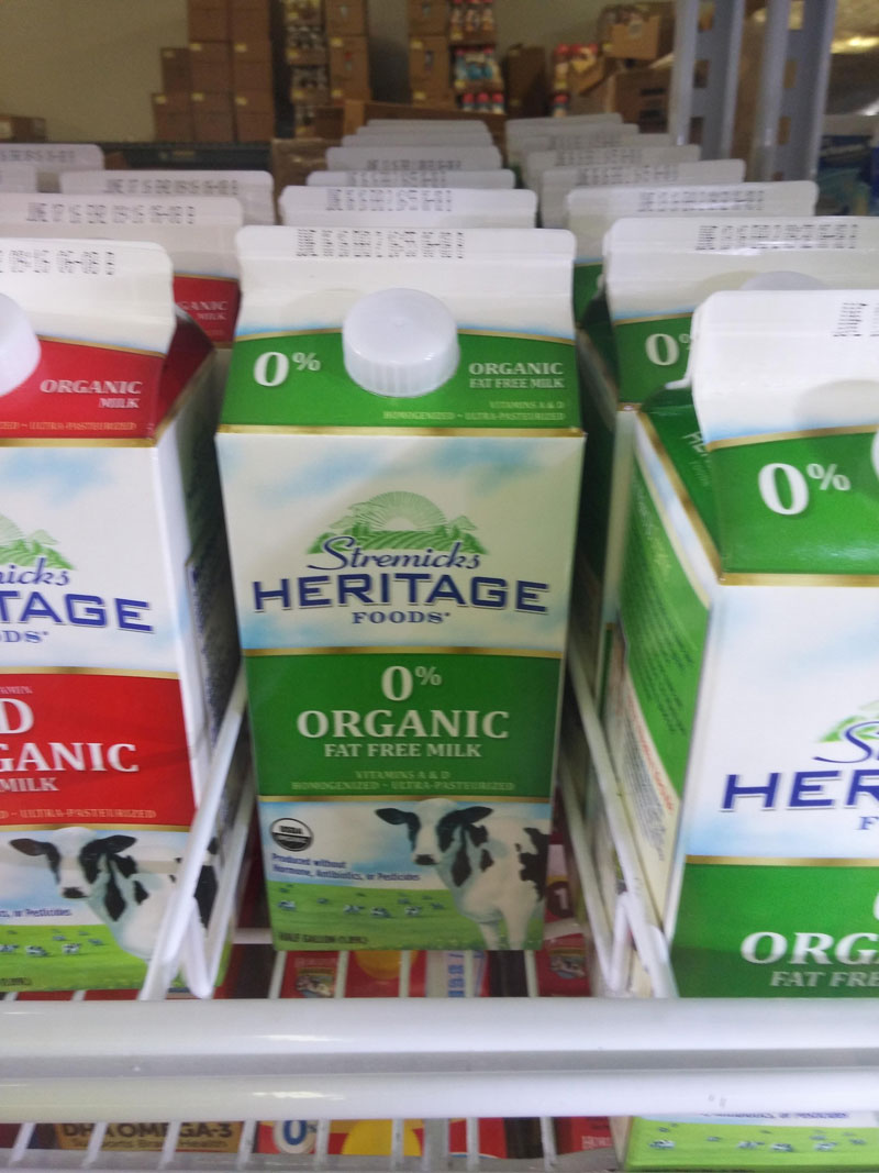
I don’t know where this picture was taken, I found it on the r/crappydesign sub-reddit. I found it was the perfect example of how bad handling of small design details could become a disaster.
In this case, it wouldn’t take much to improve it and turn it into a normal package design (although it would take more to make it a good-looking one). One way to do it would be to simply remove the 0% as it just repeats what the “fat free” the comes at the bottom. Alternatively, they could have written “0% fat” on the top and changed the font size to differentiate it from the word “organic”, which would have helped to ensure that people don’t read “0% organic”.
There could obviously be other ways to handle this, but it’s a bit scary to think that a designer did this and nobody noticed the problem before printing and putting the milk on the shelves of supermarkets.
About the Author

Peter Makeshoff
Peter Makeshoff is the founder and main author of Designer Daily.