One-page website design is approached by many people because they are easier to build. This is true, in terms of coding and features. Yet, there are principles that one needs to follow for pleasurable user experience.
In fact, a one-page website as close as possible to perfection is quite difficult to obtain. This is if you don’t know the exact elements that make it convenient for users. This is why we gathered five of the most important facts to keep in mind when building a one-pager.
The list you will find below consists of a thorough description of each aspect that influences your one-pager. We also provided several examples of websites. These respect the website design rules mentioned here. Don’t worry if you’re not much of a tech-savvy person because we won’t go into technical details. Everything you’ll find below is easy to understand. It can be applied to any one-page website to improve the user experience. Here’s what you should know:
1. Websites should always have a purpose
You can’t simply build a website if you don’t know what its purpose is. By starting to develop a site that has no goal whatsoever, you will end up with a mess. The whole structure of a website is based on what purpose it has. One-page websites are originally created for one purpose only. The design is focused on fulfilling this purpose. The most common reasons why people use one-pagers are:
- Presenting a portfolio
- Resume pages
- Announcing one-time events
- Landing pages
- Brochures
- Single-product sales etc.
These are just a few of the potential purposes that a one-pager may have, but each situation is different. Once the goals of the website are aligned, it can be designed appropriately. Below you will find a list of purpose-driven websites. They used design principles to meet their goals:
Bistro-Agency
Once accessing this website, you will be greeted by numerous interactive effects. Even so, these effects are not slowing down the website.
Be Moving 3
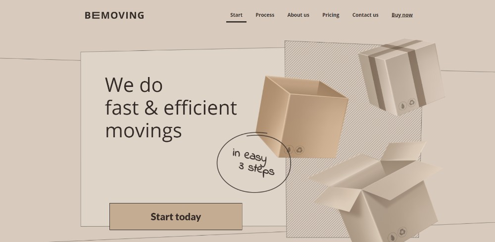
This is a one-page template provided by BeTheme. The website is simple, yet dynamic. The homepage features a static image and a CTA button.
Think Pixel Lab
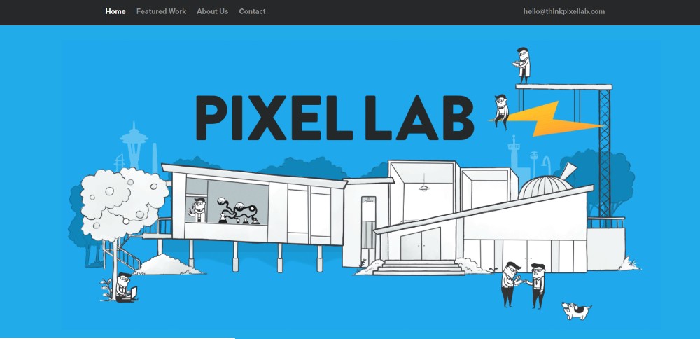
This website includes animated illustrations and a simple menu on the upper side of the screen.
Be Product 2
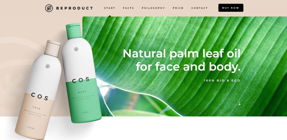
This is a product-selling website that is focused on emphasizing the looks and features of the item, as well as a CTA button to encourage people to purchase it.
Sheerlink
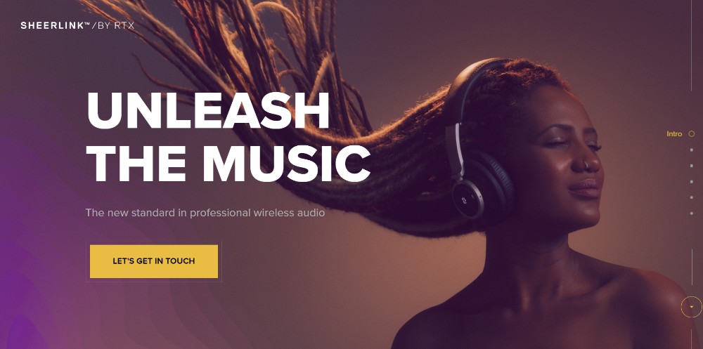
Sheerlink is a one-pager that uses warm-tone images and a minimalist design. A CTA button welcomes users when they access it.
Be App 4
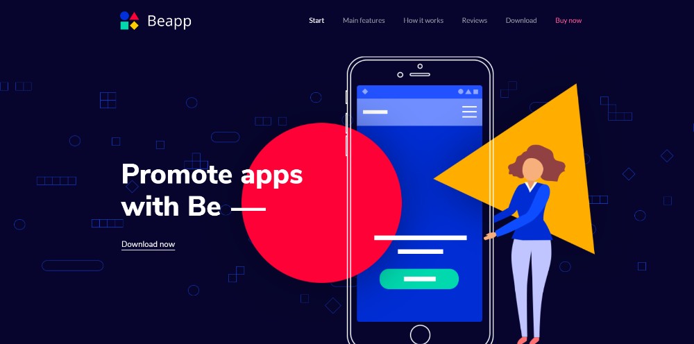
One-page websites are perfect for presenting mobile applications. There is a limited amount of copy and more visual content.
2. Delivering content
Single-page websites are usually selected by people who don’t have a lot of written content. When a lot of text needs to be included on the website, multi-page options are more suitable.
However, smaller amounts of text don’t mean that you can’t confuse users with it. One-page websites need to be designed according to a visual structure. In order to make it easy to follow, make sure to break content in small sections and combine it with visual effects.
The header style, color scheme, and scrolling effects matter a lot. They also influence how your users perceive the content. You can create a visual hierarchy through contrast, repetition, size, proximity and more.
Try to follow an F-shaped pattern for copy-oriented websites. A Z-shaped pattern should be used for visual websites. These websites present content in a structural, concise manner:
Dangerous Robot
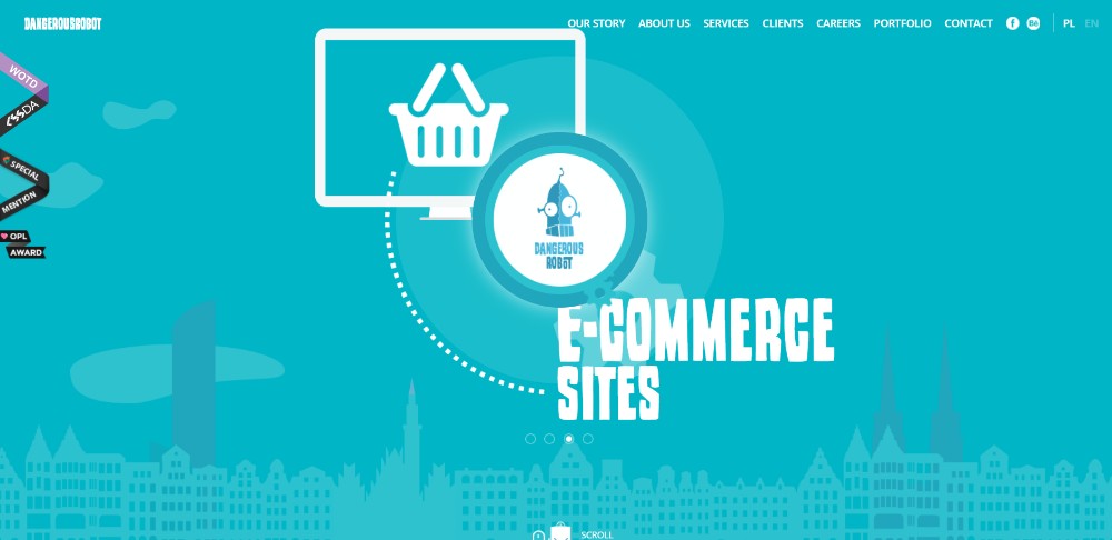
Text content is not excessive on this website, as it makes use of visual elements to transmit a message.
Be Tea 3
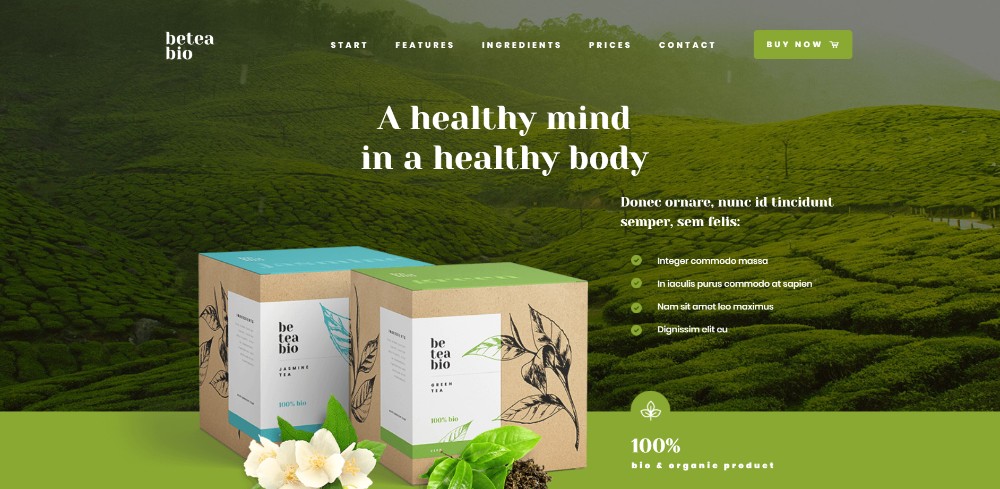
The first page of this website includes a beautiful product photo and a bullet point list of all the features the product has.
Hello Alfred
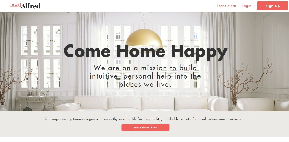
This website relies on high-quality images and little to no text content, as the interior design niche involves a lot of visual content.
Be Cakes
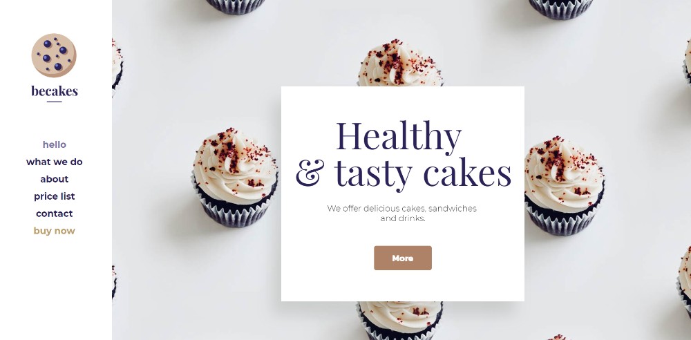
A minimal website that includes just the content that is necessary for informing the users about the products it presents.
Mercedes-Benz
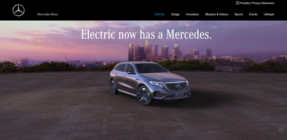
Presenting cars in an artistic manner is definitely not easy, but Mercedes-Benz surely knows how to do it.
3. Using negative space and visual elements
Negative space, also known as white space, is the area of your website that is left white on purpose. You can use white space to differentiate one element from another. Or, use it to give the user some breathing room between reading bits of information and so on. Using negative space in web design is a principle that was stated many years ago. It is considered an important element of visual performance.
For the best user experience, make sure to combine your visual elements with the use of white space. The composition will be more balanced and the website will be easier to navigate. Also, the overall design won’t look overloaded.
Moreover, the visual hierarchy of the content is enhanced by using white space. You can guide users to focus on elements that you consider paramount. The following one-page websites include white space:
Chris Connolly

This is a personal one-page website that makes use of negative space to accentuate the central photos.
WeShootBottles.com
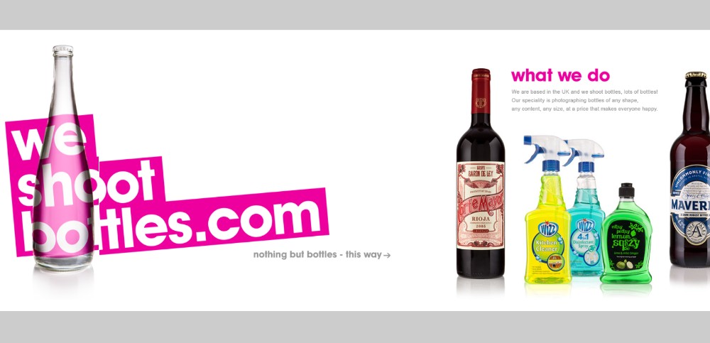
This website presents product photography, so a lot of white space should be used to emphasize their services.
Be Dietitian 2
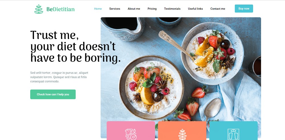
This site has a colorful design that attracts through its simplicity and flow. It balances both written content and visuals.
Dribble’s Year in Review
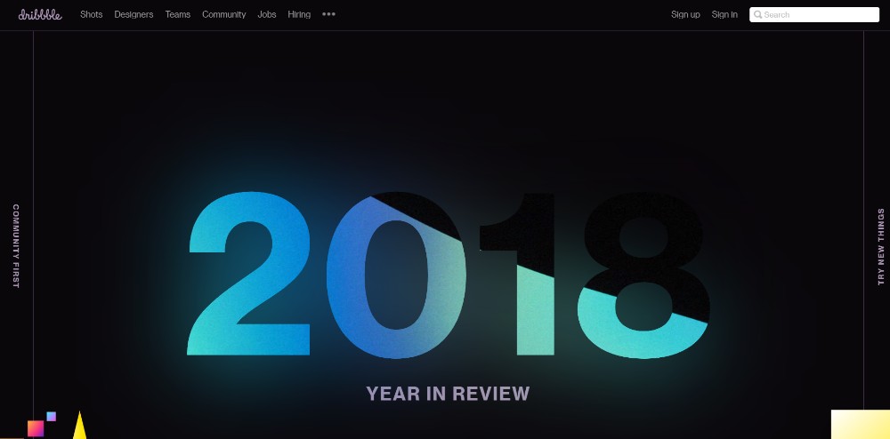
This website follows basic design principles that include negative space. In this situation, the space left empty is black for a more dramatic event.
Nasal Drops
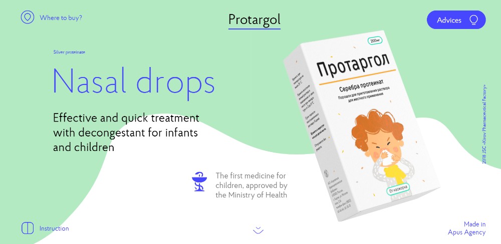
This is a great example of combining product photography with white space and text.
4. Make navigation intuitive
Endless scrolling is common for single-page websites that feature many visuals. But this can lead to making the user feel uncomfortable while navigating. Endless scrolling involves a series of downsides that are not convenient for users. Sticky menus of all sorts will make navigation easier.
Place a sticky menu horizontally or vertically on your one-pager. Or, opt for a transparent menu that pops up on hover. Auto-scrolling is another great way to help users reach the information they need.
Don’t forget to add a back-to-top button if users are required to scroll multiple times on your site. These details transform the user experience in a pleasant one. Here’s how these websites transformed their navigation in an intuitive one:
Sergio Pedercini
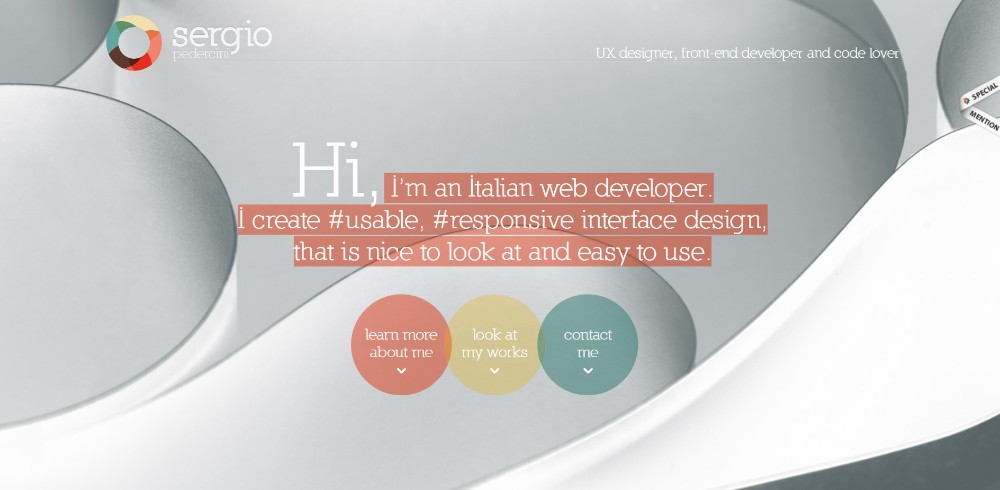
Users can click one of the three categories and the website will automatically scroll down to where it is presented.
Be Game
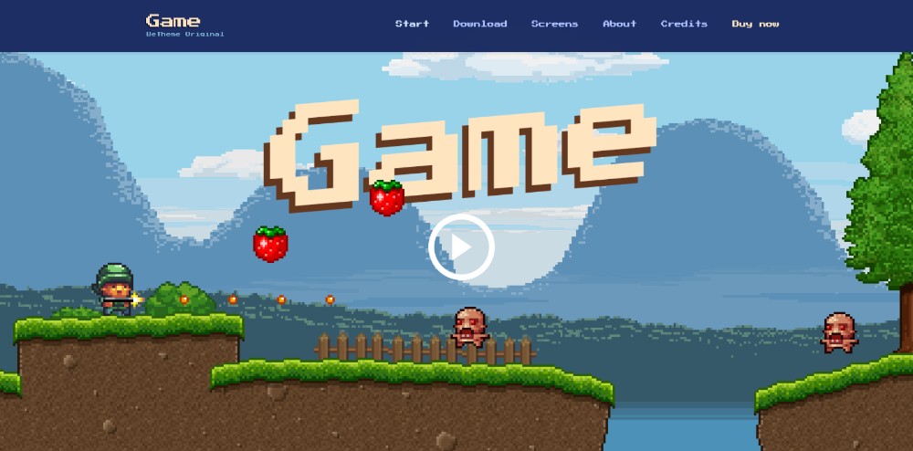
This is an interactive one-page website where people can play a short game as a preview.
Be Landing 2
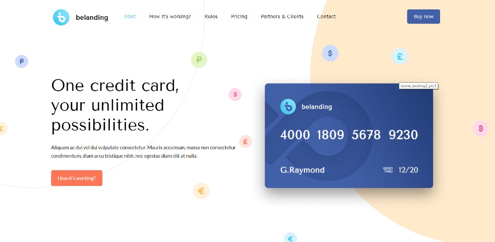
The color scheme selected for this website suits the product image perfectly. All information can be covered within three mouse scrolls.
Brainflop
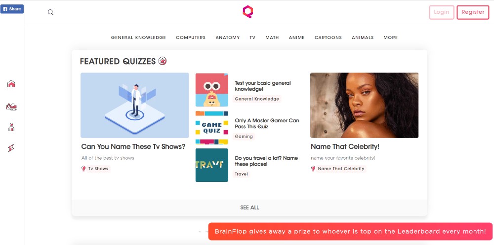
This is an example of effective navigation – an icon menu on the left side and a detailed menu on top.
5. CTA buttons
CTAs can help you meet the goals of your website. CTA is short from Call-To-Action. It refers to those buttons that are meant to convince users to do something.
Because website design is usually built around the purpose of the site, so should CTA buttons. Add noticeable CTAs with relevant text. It will encourage the visitors of a website to perform a certain action.
As you may notice, one-page website design heavily relies on the goals that are set beforehand. Here are several examples of including CTA buttons in one-pagers:
Be Hairdresser
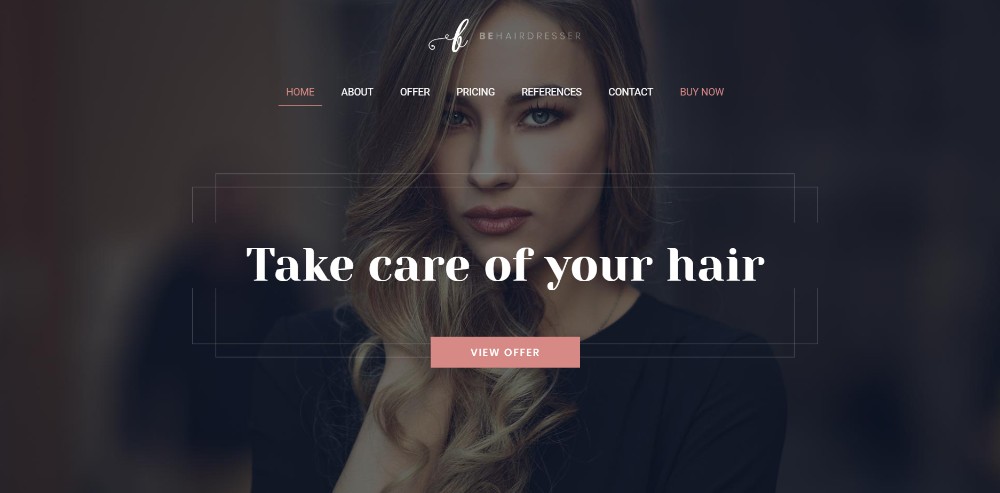
This is a pre-built template with customizable CTA buttons.
The Art of Texture
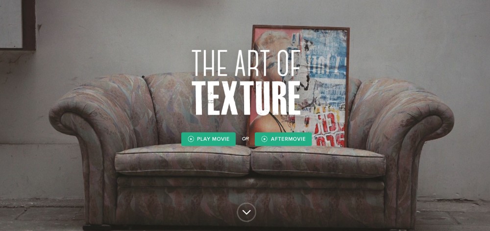
This website features two CTA buttons on the main page that send users to the service they are interested in.
Pyrismic

The CTA button is used with a different purpose here – encouraging users to sign up using the opt-in form.
Reneza
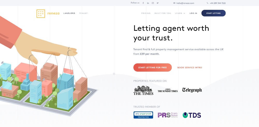
This website has multiple CTAs for any need that the user may have. This way, navigation is simplified and the purpose of the website is met easier.
Final thoughts
If you are able to master these principles, your website is very likely to become successful shortly. It’s not the end of the world if you can’t master them from the very beginning either. There are always alternative solutions to turn to.
For instance, Be Theme is a pre-built one-page website provider. It features no less than 60 templates you can choose from. See if any of them fit your needs and say goodbye to all the effort and stress.
About the Author

Peter Makeshoff
Peter Makeshoff is the founder and main author of Designer Daily.